
Introduction
Zwibbler is a full-featured javascript library that provides drop-in vector-graphics editing for your HTML5 application. This document describes how to get up and running with Zwibbler quickly, and includes full details on how to configure it for your purpose.
Use the Tutorial to get up and running quickly
Use the Configuration Playground to experiment with different settings.
Features
Drop in Solution : Easy to use. A web developer familiar with HTML can include the vector graphics editor in only 10 minutes
Flexible : Zwibbler functionality can be extended with custom javascript methods to add new shapes and alter the look and feel of the user interface.
Math Equations : HTML can be embedded in the diagram. You can use an off-the-shelf equation editor (not provided) to enter equations.
Touchscreen : Zwibbler does the hard part of handling mobile touch screens for you.
Quick Start using HTML
<!DOCTYPE html>
<html>
    <head>
        <style>
            zwibbler {
                position: absolute;
                top: 0; left: 0; right: 0; bottom: 0;
                display: flex;
                flex-flow: row;
            }

            [toolbar] {
                /* Don't allow stretching */
                flex: 0 0 200px;
                background: #ccc;
            }

            [pages] {
                flex: 0 0 150px;
            }


            .page {
                border: 3px solid transparent;
                box-shadow: 2px 2px 2px rgba(0,0,0,0.2);
            }

            .page.selected {
                border: 3px solid orange;
            }

            [z-canvas] {
                /* Stretch to fill available space. */
                flex: 1 1 auto;
                border: 5px solid purple;
            }
        </style>
    </head>
    <body>
        <script src="zwibbler-demo.js"></script>
        <zwibbler
            z-controller="MyFunction"
            showToolbar="false"
            pageView="true"
            defaultPaperSize="letter">
            <div toolbar>
                <button z-click="usePickTool()">Pick tool</button>
                <button z-click="useBrushTool()">Brush tool</button>
                <button z-click="useCircleTool()">Brush tool</button>
            </div>
            <div z-canvas></div>
            <div pages>
                <div class="page"
                     z-for="mypage in getPageCount()"
                     z-page="mypage"
                     z-width="120"
                     z-click="setCurrentPage(mypage)"
                     z-class="{selected: mypage==getCurrentPage()}">
                 </div>
            </div>
        </zwibbler>
        <script>
            function MyFunction(ctx) {
                // This is called with your zwibbler context, which has functions
                // like load(), save(), getPageCount().
            }
        </script>
    </body>
</html>
You have two choices for integrating Zwibbler. The quickest way is with the built-in Zwibbler framework. This method does not require you to write any Javascript.
- Include the Zwibbler script on an HTML page
- Create an element with the "zwibbler" attribute.
- Inside the element, create an element with the z-canvas attribute.
- Use the returned Zwibbler Context to control Zwibbler from javascript, or to open and save documents.
Try the complete example on JSFiddle, then read the Zwibbler Framework Reference.
Integrating Zwibbler using Plain Javascript
var context = Zwibbler.create("myelement", {});
Zwibbler can be integrated using code like this:
The Zwibbler.create() method takes the ID, selector, or node object of the DIV element in which to place Zwibbler, and the configuration options. It returns the ZwibblerContext.
Example
<!DOCTYPE html>
<html>
  <body>
    <div
      id="zwibbler"
      style="margin-left:auto;margin-right:auto;border:2px solid red;width:800px;height:600px;"
    ></div>
    <input type="button" onclick="onSave()" value="Save" />
    <input
      id="loadButton"
      type="button"
      onclick="onLoad()"
      disabled="disabled"
      value="Load"
    />
    <input type="button" onclick="onImage()" value="Open as image" />
    <input type="button" onclick="zwibbler.onResize()" value="Open as image" />
    <script src="http://code.jquery.com/jquery-1.8.2.min.js"></script>
    <script src="zwibbler2.js"></script>
    <script type="text/javascript">
      var zwibbler = Zwibbler.create("#zwibbler", {
        // configuration options would go here
      });

      var saved = null;
      function onSave() {
        saved = zwibbler.save("zwibbler3");
        $("#loadButton").removeAttr("disabled");
      }

      function onLoad() {
        zwibbler.load("zwibbler3", saved);
      }

      function onImage() {
        var dataUrl = zwibbler.save("png");
        window.open(dataUrl, "other");
      }
    </script>
  </body>
</html>
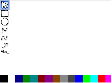
How it looks
Here is how Zwibbler looks with a minimal configuration:
var ctx = Zwibbler.create("mydiv", {
  showToolbar: true,
  showColourPanel: true,
});
Guide to Common Scenarios
Updating the User interface
var zwibbler = Zwibbler.create("MyZwibblerDiv", {});
zwibbler.on("document-changed", function () {
  var canUndo = zwibbler.canUndo();
  var canRedo = zwibbler.canRedo();
  var dirty = zwibbler.dirty();

  // enable/disable the undo/redo buttons

  // if the document is dirty, enable the save button.
});
Whenever the document changes for any reason, Zwibbler emits the event document-changed. This event is emitted whether the document is changed as a result of a user action, or if you changed it programmatically. Handle this event, and you can do things such as disable or enable buttons for saving or undo / redo.
Manipulating the Undo Stack
Certain API methods add to the undo stack when you call them, so the user will be able to undo them. By default, each time you call such a method, one undo item is created. Sometimes, you might not want the user to be able to undo the action. For example, if you create a document template with some pre-existing items. Other times, you might want multiple actions to be undone at once. For example, creating a rectangle, rotating it, and moving it to a specific location.
You can do these things using a transaction. To begin a transaction, call begin. You can then manipulate the document using the Javascript API, using methods such as createNode, translateNode, or addPage. After calling begin, you must call commit to allow future editing. If you begin a transaction and you are already in one, Zwibbler keeps track of the number of nested calls and does nothing until you call the commit method an equal number of times.
Functions in the Undo Stack :
See also
begin, commit, canRedo, canUndo, dirty
Using Multiple Pages
You can choose to use a paper size of "none" to allow infinite paper area. Otherwise, set the paper size using a configuration option or by the API after zwibbler has been created.
Another important consideration is zooming. Use the setZoom method to set a zoom. When passed a number, the document will be scaled. However, if you use the special values "width" or "page" then the document will always be scaled so that the page width or full page fits into the viewing area.
The Zwibbler API provides all of the methods needed to create your own page selector. The draw method allows you to create previews of each page. For your convenience, there is a built-in page selector that you can enable with the showPageSelector configuration option.
These configuration settings relate to pages.
- defaultPaperSize - eg, "letter" or "a4" or others
- defaultZoom - "width" or "page"
- pageView - whether the outline of the paper is drawn.
- showPageSelector - true to show the page selector
- showPageSelectorControls - true to allow the user to add/remove pages from the page selector.
See also
addPage, movePage, insertPage, deletePage, duplicatePage, getCurrentPage, getPageCount, nextPage, previousPage, setCurrentPage
Protecting parts of documents with Layers
You can make certain parts of documents immobile using layers. For example, you might have a "teacher" and a "student" layer. While marking, the teacher will not be able to change what the student has drawn, and vice versa. One or more layers can be active at once. Clicks pass through shapes that are not on the active layer.
Methods related to Layers :
Layers can be hidden and shown. However, the visibility of layers and the active layer is not saved with the document, so if you use these features, you will have to set them each time a document is opened or when a new document is created. When a document is opened, the active layer is set to "default".
See also
getLayerNodes, getAllNodes, isLayerVisible, setActiveLayer, getActiveLayer, showLayer, forEachNode, setLayerName
Creating a custom tool
class MyCustomTool {
  constructor(zwibblerContext) {
    this.ctx = zwibblerContext;
    // Note: Consider using enter() for additional initialization, which
    // is guaranteed to be called after the previous tool leave() is called.
  }

  enter() {
    // Called by zwibbler when the tool is activated, after the previous
    // tool has been destroyed.
  }

  leave() {
    // Called by Zwibbler when a different tool is selected
    // for any reason. Clean up here.
  }

  getToolName() {
    // Called to get the tool name returned by ctx.getCurrentTool()
    // If this method is not here, "custom" will be used.
    return "custom";
  }

  onMouseClick(x, y, e) {
    // The x, y coordinates are coordinates in the document, taking into
    // account zooming and scrolling. "e" is the DOM event that caused the
    // mouse click. This can be a mouse event, pointer event, touch,
    // or even keyboard event when the keyboard cursor is used.

    // Unless you explicily return false, Zwibbler will call
    // stopPropagation() and preventDefault() on the event.

    // use the snap method to snap to points, if the user is holding down
    // certain keys controlled by the settings.
    var snappedPoint = this.ctx.snap(x, y, e);
  }

  onDoubleClick(x, y, e) {}

  onKeyCommand(action, e) {
    // Action is one of the keys from the KeyboardConfiguration
    // settion, with the initial "key" removed and the first
    // letter converted to lower case. Example:
    // "cancel" "copy", "paste", "moveUp"
  }

  onMouseDown(x, y, e) {
    if (e.buttons & 6) {
      // it's the middle or right button. return false to allow
      // panning to take over..
      return false;
    }
  }

  onMouseUp(x, y, e) {}

  onMouseMove(x, y, e) {
    // Note that e may be a keydown, pointermove, mousemove, or touch
    // event.
  }

  onMouseDrag(x, y, e, startX, startY) {
    // after the user has pressed down and moved a certain amount,
    // the click is then becomes a drag and this method is called.
    // easily distinguish between the two. (x,y) is the current position of
    // the pointer, and startX, startY is the start position. This method is
    // called once per drag, and you can then set a flag to handle the
    // movements in your mousemove handler.
  }

  onMouseWheel(x, y, delta, e) {
    // The mouse wheel event.
  }

  onContextMenu(x, y, e) {
    // return false to allow the browser to show the right-click menu.
  }

  onGesture() {
    // when a two finger gesture is detected. Access to the event is not yet implemented,
    // but you can cancel some drawing operation here since the first two clicks would have been
    // part of the gesture. Return false so that Zwibbler will handle the pinch-zooming, or
    // anything else if you don't want that to happen.
    return false;
  }

  onColour(colourName) {
    // Called when the user selects a new colour
  }

  onOpacity(opacity) {
    // Called when the user selects a different opacity.
  }

  onRedraw(canvasCtx) {
    // called after the canvas is drawn, with the HTML canvasContext
    // scaled and translated.
  }

  // Returns any properties that should be returned by ctx.getPropertySummary() method
  // while the tool is active, but no objects are selected.
  getToolProperties() {
    return {};
  }

  // Returns the node types that would be created by this tool, if any. These will be
  // included in the result returned by ctx.getPropertySummary() when this tool is active.
  getToolNodeTypes() {
    return [];
  }

  // Changes a property of the shape about to be drawn. This is triggered whenever
  // ctx.setProperty() is called while the tool is active.
  setToolProperty(name, value) {}
}

// To activate the tool
ctx.useCustomTool(new MyCustomTool(ctx));
Zwibbler interprets mouse and touch events differently depending on which tool is selected. For example, when you move the mouse in the brush tool, a line is drawn, but with the pick tool, a selection box is drawn instead. You can create your own custom tool and use it by calling the useCustomTool method. To create a custom tool, make an object and implement the methods that you need. All of the methods are optional.
In general, if you implement the a method to handle a mouse event, Zwibbler assumes your tool has fully processed a mouse event and will stop propagation of that event and take no further action. If you want Zwibbler to continue processing the event, you must explicitly return false from the appropriate handler method.
Example of a Custom Text Stamp Tool
class TextStampTool {
  constructor(zwibblerContext, text, fontName, fontSize, doneFn) {
    // initialize any variables here here.
    this.ctx = zwibblerContext;
    this.text = text;
    this.fontName = fontName;
    this.fontSize = fontSize;
    this.doneFn = doneFn || function (nodeid) {};
  }

  enter() {
    this.ctx.setCursor("none");
  }

  leave() {
    // Called by Zwibbler when a different tool is selected
    // for any reason. Clean up here.

    // Redraw is necessary in this tool only because we have drawn the
    // "ghost text" in the onMouseMove method and we should not leave it
    // on the screen.
    this.ctx.redraw();
  }

  onMouseClick(x, y, e) {
    // The x, y coordinates are coordinates in the document, taking into
    // account zooming and scrolling. "e" is the DOM event that caused the
    // mouse click.
    this.ctx.begin();
    var node = this.ctx.createNode("TextNode", {
      fontName: this.fontName,
      fontSize: this.fontSize,
      text: this.text,
      scaleFont: false,
    });
    this.ctx.translateNode(node, x, y);
    this.ctx.commit();
    this.ctx.usePickTool();
    this.doneFn(node);
  }

  onMouseMove(x, y, e) {
    this.ctx.redraw((canvas) => {
      canvas.fillStyle = "rgba(0,0,0,0.5)"; // 50% black
      canvas.font = this.fontSize + 'px "' + this.fontName + '"';
      y += this.fontSize;
      canvas.fillText(self.text, x, y);
    });
  }
}
This tool will allow the user to stamp text down on the drawing.
See also
useCustomTool, setCustomMouseHandler, snap
Including HTML elements in the drawing
Example: Include a YouTube video in a drawing
Zwibbler.component("MyYoutubeVideo", {
  // you can optionally include styles for the HTML here. They
  // will be injected into the web page only if the component
  // is used.
  style: `
    .Youtube {
        border: 4px solid red;
    }`,

  // you can optionally include default values for node properties
  // here. These are the same properties you can set in
  // setNodeProperty, and they can be used inside the
  // HTML template.
  defaults: {},

  template: `<iframe class="Youtube" width="300" height="169" frameborder="0"
        allow="fullscreen"
        z-bind:src="'https://www.youtube.com/embed/'+props.videoID">`,
});
// This is the context returned by Zwibbler.create(), or available in
// your controller.
ctx.createHTMLNode("MyYoutubeVideo", {
  // The properties you specify are completely up to you.
  videoID: "ZxMl1SDJ7po",

  // As a special case, the style property is applied to the HTML.
  style: {
    left: "100px",
    top: "100px",
  },
});
You can include YouTube videos, MathML, Todo lists, and any other HTML in the drawing.
Zwibbler manages the placement of these HTML elements in the drawing, so the user can move them around like other shapes. In addition, they can be dragged and dropped into each-other. This dragging and dropping is controlled using special attributes on the HTML nodes.
Step 1: Create a component containing the HTML for the element.
Use the Zwibbler.component() method to tell Zwibbler the HTML for your node. You should call this one time, before calling any other Zwibbler methods.
Step 2: Insert a Zwibbler node
Insert the component into your drawing using createHTMLNode(). By specifying properties, you can change parts of the HTML using the Zwibbler framework.
See also
getNodeFromElement, getDomElement
Associating Data with the Drawing
You can set data associated with the document itself using the setDocumentProperty method, and retrieve it again using the getDocumentProperty method.
You can associate data with each object in a drawing in two ways. The first is to set the "customData" property of a node. This can be set to anything that can be converted to and from JSON. It will be saved with the document.
If you wish to store data outside of the document, every node in the drawing has a "tag" that can be set using ctx.setNodeProperty(). You may set this to a unique identifier that you can use to associated data with the node, or use it to easily find nodes of a certain type.
Methods related to Nodes and properties:
- setDocumentProperty
- getDocumentProperties
- getDocumentProperty
- findNode / findNodes
- getActiveLayer
- getLayerNodes
- getNodeProperty
See also
Node properties, setNodeProperties, setNodeProperty, getNodeProperty, getPropertySummary, setToolProperty, setProperty, setProperties, setDocumentProperty, getDocumentProperty, getDocumentProperties, getNodeObject
Spot Highlight
ctx.useCircleTool({
  spotHighlight: true,
});
When one or more PathNodes with the spotHighlight property exists, the entire drawing is darkened except for the area inside shapes.
Enable this property when activating the tool.
See also
spotHighlightZIndex setting, spotHighlightColour setting
Eraser
// METHOD 1: ------------------------------------------------------------
// When the "selection tool" is clicked
ctx.usePickTool();

// When the "delete" button is clicked
ctx.deleteNodes(ctx.getSelectedNodes());

// METHOD 2: ------------------------------------------------------------
// When the "eraser" button is clicked
ctx.useBrushTool({
  lineWidth: 10,
  strokeStyle: "erase",

  // optional: prevents the user from being able to move the erase stroke.
  layer: "my_eraser_layer",
});
Zwibbler is a vector graphics program. The user can always pick up items and move them. This presents challenges for erasing things the way people are used to. There are two methods to implement an eraser.
Method 1: Delete selection
The user clicks a button to go into selection mode. Then he or she may select the objects to delete. Upon clicking the delete button or pressing the delete key on the keyboard, the objects are deleted.
Method 2: Eraser tool
The user can use a special eraser brush. This brush paints in the same colour as the background, whether it is clear or a background image. Although it is intuitive to use, the user can still move objects from under the erased portions, or select the erased brush stroke itself. When this brush mode is active the tool-changed event now reports the tool name as "eraser", allowing toolbars to highlight a dedicated eraser button.
See also
useBrushTool, wheelAdjustsBrush setting
Drag and Drop
<img
  src="http://zwibbler.com/logo.png"
  draggable="TRUE"
  zwibbler-src="http://zwibbler.com/logo.png"
  zwibbler-width="100"
/>
The user can also drag images from the computer and they will be inserted into the drawing. You can control how these images are stored using the paste event.
Alternatively, you may present the user with a selection of images on the web page to be dragged. When one of them is dragged on to the canvas, Zwibbler will insert an image centred at the location that the user dropped the image, and scale it to the size you specify. To take advantage of this functionality, you must set one additional attribute on the image, in addition to the standard HTML draggable attribute.
| Attribute | Meaning |
|---|---|
| draggable | Must be set to "TRUE" |
| zwibbler-src | The url of the image that you want to insert. This may be a data-uri or an url to an image on the web. |
| zwibbler-width | (Optional number) If present, the image is scaled to be this wide after being inserted. |
| zwibbler-props | (Optional json string) If present, the properties in the JSON description will be added to the image properties. |
Accessibility
Zwibbler can be used without a mouse, using the keyboard. It has a built-in keyboard cursor that can be activated. When the keyboard cursor is shown on screen, it can be moved using the cursor keys. Pressing the Enter key will simulate pressing the mouse button, and pressing Enter again will simulate releasing it. In this way, the user can drag and draw shapes and move them.
The keyboard cursor is activated in one of two ways.
z-click method
<zwibbler>
  <button z-click="ctx.useRectangleTool()">Draw rectangle</button>
  <br />
  <div z-canvas style="width:500px;height:500px"></div>
</zwibbler>
If you are using the Zwibbler framework to create a toolbar, then use z-click instead of z-on:click to activate a tool. If a tool function is activated as a result of pressing Enter to click the button, then Zwibbler will automatically activate the keyboard cursor. Pressing ESC will automatically return keyboard focus to this button.
focus method
document.querySelector(".my-shape-tool").addEventListener("click", (e) => {
  ctx.useRectangleTool();

  if (e.screenX === 0 && e.screenY === 0) {
    // it was clicked using the keyboard, so activate the keyboard cursor.
    // When the user presses escape, return the focus to this button.
    ctx.focus(true, this);
  }
});
If you are not using the Zwibbler framework, and are instead calling javascript methods directly, then the focus() method will activate the keyboard cursor.
See also
Export formats
The following export formats are supported by the save() and download() methods.
| Format | Description |
|---|---|
| zwibbler3 | Zwibbler's format. This is a text string that can be opened again using load(). |
| image/svg+xml or svg | SVG file, in text format. |
| application/pdf or pdf | base64 encoded data-uri |
| image/png or png | base64 encoded data-uri |
| image/bmp or bmp | base64 encoded data-uri |
| image/jpeg or jpg | base64 encoded data-uri |
| changedata | Zwibbler's format as stored on the collaboration server. Like zwibbler3 format, it is a text string, but it also record of each change made to the drawing, including any deleted items, so it is larger. |
For completeness, we mention the clipboard format here. The zwibblerclip format is used for the clipboard. It is only exported by the copy method. The result can be used by the paste method or opened using load().
See also
save, load, download, openFromComputer, paste, document-opened, openFile
Zwibbler framework reference
Most of the work with Zwibbler involves creating toolbars and property panels. Therefore, Zwibbler includes a small framework to make this procedure easy. Most importantly, it does not require any javascript to be written. If you are familar with Vue or Angular, the syntax will seem natural.
Try the complete example on JSFiddle.
You can write small snippets of code inside the HTML to do things. When Zwibbler executes this code, it automatically prefixes any variables with the scope that was passed to the controller function. This way, you will be able to call functions that you define, or access the Zwibbler Context easily. However, you will not be able to access any external variables or functions such as alert(). If you want to call them, you will need to make them available by assigning them to the scope.
The javascript expressions are checked for changes each time the document changes, the user changes the tool, or new shapes are selected. If you need to have Zwibbler react to other changes, after a timeout or fetching data from the server, you must manually call scope.$digest() to update the screen.
// Modifying an array must be done with care to allow Zwibbler to check its value.
scope.mylist = scope.mylist.concat();

scope.mylist.push(newItem);
zwibbler
<zwibbler showToolbar="true" z-controller="MyFunction">
  <button z-click="helloWorld()">Say hello</button>

  <div z-canvas style="width:500px;height=500px"></div>
</zwibbler>

<script>
  function MyFunction(ctx) {
    // ctx is actually a Zwibbler context, with methods
    // like getPageCount() and save() and useBrushTool(). But
    // you can extend it.

    // Add an additional method to call here.
    ctx.helloWorld = function () {
      alert("Hello, world!");
    };
  }
</script>
When the page is loaded, Zwibbler will look for HTML elements of the form <zwibbler></zwibbler> or <div zwibbler></div>, that also contain a <div z-canvas></div> element. It will then create a Zwibbler canvas for that area and attach all appropriate event handlers, according to your directives. Finally, the <zwibbler> element has the name of a javascript function in the z-controller attribute, then it is called with the Zwibbler context as a parameter.
The attributes of this element are the configuration settings of Zwibbler.
To avoid processing the element upon page load, you can include the z-no-auto-init attribute. Then, you will need to manually call Zwibbler.attach(element) with the element, or a string selector for the element, to create it.
z-bind:
<img z-bind:src="imageFolder+'/brush.png'" />
This binds a javascript expression to an attribute value. The value is always kept up to date when the expression changes. The following are special cases:
z-bind:valuein a SELECT element will also executeelement.value = the result- Boolean attributes
disabled,readonlywill be added or removed if the value is true-like.
z-canvas
A div element with the empty z-canvas attribute will be filled with the Zwibbler drawing area. The drawing area will automatically size to the be size of the div, so it is best to style it somehow to set a size using styling.
z-class
<style>
  .selected {
    border: 4px solid purple;
  }
</style>
<div z-class="{selected: getCurrentTool()==='text'}">Text tool</div>
z-class must evaluate to a javascript object. Each key is a classname, with value true or false. The classes are added or removed to the element depending on whether their value is true.
z-click
This is similar to z-on:click, except that it provides greater accessibility from the keyboard for tool buttons. You should use this for buttons that activate a tool.
If the enter key is used to click, and it results in a Zwibbler tool being called, then the keyboard cursor is automatically activated and the user will be able to draw using the keyboard.
z-colour
<div z-has="strokeStyle">
  Outline colour:
  <div style="width:32px;height:32px" z-colour z-property="strokeStyle"></div>
</div>
Items with the z-colour attribute have two effects. The first is that their background-color style is always set according to the value of the currently selected shapes.
The second effect is that when clicked on, they will display a colour picker and allow the user to modify that property for the current selection.
z-destroy
Zwibbler.component("MyComponent", { template: `
<div z-destroy="ondestroy()">This is my component</div>
`, controller(scope) { scope.ondestroy = () => { console.log("The component was
destroyed."); }; } })
Evaluates the given expression when the element is destroyed. This happens if Zwibbler is destroyed, or if the element is no longer shown due to a z-if directive or z-for.
z-disabled
<button z-disabled="!canUndo()">Undo</button>
Zwibbler sets or removes the disabled property of the button depending the value of the expression.
z-for
Here are three fruits:
<div z-for="fruit in ['apple', 'orange', 'banana']">
  This is a <span z-text="fruit"></span>
</div>

Here are 100 buttons to press:
<button z-for="myIndex in 100">
  Here is button #<span z-text="myIndex"></span>
</button>

This will avoid deep-value comparison and unnecesarry destruction of objects if
irrelavant parts change:
<input
  type="text"
  z-for="field in fields"
  z-key="field.name"
  z-model="field.value"
/>
This attribute has two parts: The variable name before the "in", and the javascript expression that comes after it.
The expression must be an array. If it is a number, it is converted into an array of that number of elements.
To process this element, Zwibbler first removes it from the document. Then, whenever the javascript expression changes, it creates a copies of the node and variable scope. Each copy has its variable set to the value of the array element. Additionally, an $index variable is available that gives the numerical index.
Zwibbler will not detect a change in the array unless you assign a new array, usually using array = array.concat(). To know when to tear down and re-create HTML elements, Zwibbler does a deep-value comparison of each of the array's elements. The algorithm isn't very smart. Elements that are the same are preserved, but the algorithm isn't very smart. The first element that isn't equal, and all elements after that, will have their HTML completely destroyed and re-created.
You can override the comparison using z-key. Instead of doing a deep comparison, Zwibbler will then valuate the z-key expression on both objects and compare the result.
z-has
z-has names a property or node type. Zwibbler will only show this element when the property is applicable to the currently selected shapes. You may separate multiple properties with |. The element will be shown if any of the properties or nodes are in the selection. You may use AnyNode to show if anything is selected, or PathNode-open and PathNode-closed to differentiate between lines/arrows and shapes.
If you need to use z-if instead, you can write out a full expression using ctx.summary. For example, z-if="ctx.summary.properties.fillStyle" is the same as z-has="fillStyle".
z-hide
<div z-hide="!showToolbar"></div>
The z-hide directive will set the display style of the element to none if the expression evaluates to true. This is faster to evaluate than z-if since the elements are only evaluated once.
z-if
<div z-if="!hidden">
  Welcome. Here are some instructions for first time users.
  <button z-click="hidden=true">Click to make this go away</button>
</div>
The z-if directive shows the element only if the expression evaluates to something like true. Unlike z-hide, the element is removed from the DOM and no children are processed when the expression evalulates to false.
z-init
<div z-init="mode='paint'">
  <div z-if="mode=='paint'">
    <!--- painting tool buttons -->
  </div>
</div>
When first started, Zwibbler executes any code in the z-init attributes. You can use it to avoid writing a controller function. See also z-destroy.
z-model, z-value
Please enter your email: <input type="text" z-model="email">

Please choose a fruit:
<label
    <!-- when clicked, "ctx.fruit = ctx.orange" is executed -->
    <input type="radio" name="fruits" z-model="fruit" value="orange"> Orange
</label>
<label>
    <input type="radio" name="fruits" z-model="fruit" value="apple"> Apple
</label>

<select z-model="vegetable">
    <!-- When selected, "ctx.vegetable = ctx.carrotVeggie" is executed -->
    <option z-value="carrotVeggie">Carrot</option>
    <option z-value="lettuceVeggie">Lettuce</option>
</select>
// Define a component that toggles its value when clicked.
// You can then use this in your HTML with z-model, like this,
// which will automatically synchronize the value of
// 'mysetting':
//
// Reticulate Splines: <ToggleButton z-model="mysetting"></ToggleButton>
Zwibbler.component("ToggleButton", {
  template: `
    <button z-on:click="value=!value">
        <span z-if="value">On</span>
        <span z-if="!value">Off</span>
    </button>`,
});
This keeps the variable in the z-model attribute up to date with what is in the input box. Also, changes to the vaiable will cause the input to change.
If you want to use anything other than a string as the value, you must use the z-value attribute intead of value.
You may define your own components that can provide a value for z-model. In this case, instead of getting and setting the value of an HTML element, the value is syncronized to scope.value in your component.
z-property (on buttons)
<button z-property="lineWidth" z-value="8">Make line thick</button>

<button z-property="bold" z-value="true">Bold</button>
When the button is clicked, Zwibbler will set the indicated property of the currently selected nodes to the literal value. In addition, it will add or remove the selected class of the button according to whether the selected shapes all have the given property set to the named z-value. This allows you to highlight it.
As another special case, when the value is set to "true", then pressing the button will toggle the value between True/False.
This example is shorthand for <button z-on:click="setNodeProperty(getSelectedNodes(), 'lineWidth', 8)" z-class="{selected: getPropertySummary().properties['lineWidth'] === 8}">
z-property (on inputs)
<div z-has="lineWidth">
  Line width: <br />
  <select z-property="lineWidth">
    <option value="0">None</option>
    <option value="1">Hairline</option>
    <option value="8">Thick</option>
  </select>
</div>
When an input element has the z-property attribute, Zwibbler will keep its value synchronized with the properties of currently selected nodes.
z-on
<button z-on:mousedown="download('pdf', 'drawing.pdf')">Download as PDF</button>
This attribute is written with an HTML event name after the colon. Zwibbler will execute the code in the attribute's value when the event occurs.
z-page
<div z-sort="movePage($from,$to)">
  <div
    z-for="pageNumber in getPageCount()"
    z-page="pageNumber"
    z-selected="getCurrentPage()==pageNumber"
    z-click="setCurrentPage(pageNumber)"
    z-width="100"
    z-height="100"
    draggable="TRUE"
    z-sortable
  ></div>
</div>
This draws a page preview for the page indicated by the value of z-page. You can optionally add the following additional attributes.
| Attribute | Evaluated or literal | Effect |
|---|---|---|
| z-width | literal | The maximum width of the preview image |
| z-height | literal | The maximum height of the preview image |
| z-rect | evaluated | The source rectangle of the page. Default: ctx.getPageRect(page) |
z-popup and z-show-popup
<style>
  [z-popup] {
    background: #ccc;
    box-shadow: 3px 3px 3px rgba(0, 0, 0, 0.2);
  }
</style>
<button z-show-popup="mypopup">New document</button>

<div z-popup="mypopup" z-show-position="centre">
  Are you sure you want to abandon your changes? <br />
  <button z-click="newDocument()">New document</button>
  <button>Cancel</button>
</div>
You declare a popup by name with z-popup. These elements then hidden and absolutely positioned. You will most likely want to style them in other ways, by setting a background colour at least.
Elements with z-show-popup will show the named popup when clicked. Additionally, if you
include the empty attribute z-click-dismiss along with z-popup, the dialog will
automatically close when clicked.
By default, the popup is shown at the mouse position. You can change this using z-show-position
on either the popup or the element clicked.
| Value | Meaning |
|---|---|
centre |
Keep it in the centre of the screen. |
tr tl |
Show to the right of the element clicked, aligning top edges (Top/right against top/left) |
bl tl |
Show under the element clicked, aligning left edges (Bottom/left against top/left) |
br tr |
Show under the element clicked, aligning right edges |
tl tr |
Show to the left of the element clicked, aligning top edges |
tl bl |
Show on top of the element clicked, aligning left edges |
tc bc |
Show on top of the element clicked, aligning centres. |
Additional combinations of the letters t, l, b, r, c are possible.
z-click-dismiss may optionally have a value.
| Value | Behaviour when user clicks inside popup | Behaviour when user clicks outside the popup |
|---|---|---|
| (nothing) | Popup is hidden if they didn't click on a text input area. | Popup is hidden and click is not propagated to underlying HTML. |
none |
Nothing | Nothing |
outside |
Nothing | Popup is hidden and click is passed through to underlying HTML where the user clicked. |
inside |
Popup is hidden if they didn't click on a text input area. | Popup is hidden and click is passed through to underlying HTML where the user clicked. |
z-selected
The "selected" classname is added or removed from the element, depending on the value of the expression. z-selected="condition" is shorthand for z-class="{selected: condition}".
z-style
<button z-style="{backgroundColor: 'red'}">This is a red button</button>
Like z-class, the expression must be a javascript object. Each key is a javascript style name, such as backgroundColor, border,
width, etc. The style of the element is always kept up to date with the given values.
z-text
There are <span z-text="getPageCount()"></span> pages in the document.
Zwibbler will replace the text content of the HTML node with the result of the javascript. It is kept up to date, so whenever the value changes, the text will too.
z-sort, z-sortable
You can make a drag-and-drop sortable list. The user will be able to drag and drop elements to reorder them, and a function of your choosing will be called to indicate moved elements.
There are two parts to this. The container must have the z-sort attribute. It's value is equal to a javascript expression to call. The expression will have $from and $to equal to the index moved from and moved to. You can put movePage($from, $to) here.
The elements that the user can drag must have both the draggable="TRUE" attribute and z-sortable. See the example for z-page, which creates a page selector in which the user may drag and drop to reorder pages.
z-html
Zwibbler will replace the HTML content of the node with the result of the javascript.
z-use-component
<!-- The following lines are equivalent -->
<MyCustomComponent></MyCustomComponent>
<div z-component="MyCustomComponent"></div>
When instantiating a custom component, you can either use its name as an HTML tag, or reference it using z-use-component.
Custom Directives
<zwibbler>
  <div z-alert-click="I'm tired">Don't click me!</div>
  <div z-alert-click="I don't feel like it.">Don't click me either!</div>
</zwibbler>

<script>
  Zwibbler.directive("alert-click", function (info) {
    info.element.style.color = "red";
    info.listen("click", function (e) {
      alert("I said don't click me because " + info.value);
    });
  });
</script>
You can create your own directives using Zwibbler.directive. All of the built-in Zwibbler directives described above were created this way. The first argument is the same of the directive, without the 'z-' prefix that is required to use it. The second is a function. When the directive is bound to an element, the function is called with information about the element. The object passed to the function includes these members:
| Member | Description |
|---|---|
| scope | The object which properties are assigned and read from when expressions are executed. If the main <zwibbler> div includes a div with z-canvas, then it is a ZwibblerContext. |
| element | The HTML element |
| name | The attribute name, including the z- prefix which is added. |
| value | The value of the attribute. |
| listen(eventName, fn:(event)) | Call this to listen for an event on the HTML element. |
| watch(expr, fn:(newValue)) | Call this to watch the value of an expression, evaluated on the scope. fn will be called with the new value whenever the value of expression changes. |
| destructor(fn:()) | Call this to attach a destructor to the element. When the element is no longer needed by Zwibbler, your function will be called. This can happen if a parent is z-if or z-for or you call the destroy method. |
| eval(expression) | Call this method to evaluate the expression passed in using the current scope. This lets you execute code contained in the HTML attribute. |
Zwibbler will automatically detach event listeners you created using the listen method if you destroy the context using the destroy method.
Custom components
You can define custom HTML elements, and keep their CSS / Javascript and HTML together within the same javascript file. These elements can be used and reused inside the <zwibbler> element. During the attach procedure, Zwibbler will replace any custom elements that you have defined with the HTML of the component that you defined, and call its controller method.
You instantiate a component by using its name in the HTML. For example, if it is named "MyComponent" you can create copies of it using <MyComponent></MyComponent>. Note that both the end and start tags are needed. If you are writing your application in React, this is not possible, so you can instead use the directive <div z-use-component="MyComponent></div>
Components can also be used as objects in the drawing, through the createHTMLNode method.
Defining a component
// We will define a reusuable component called ZoomButtons.
// If you write <ZoomButtons></ZoomButtons> anywhere in the main <zwibbler> element,
// it will be replaced with the HTML defined where and the controller method will be
// run on it.

// As a further example, we will show you how to access the attributes of the element.
// When you write <ZoomButtons mycaption="'A caption'"></ZoomButtons>,
// this text will be shown and kept synchronized to the value of the expression.
Zwibbler.component("ZoomButtons", {
  // This CSS will be injected into the document when the component is used.
  // It is good practice to limit the effects of the style to your component
  // using selectors, since this is not automatically done for you.
  style: `
        .ZoomButtons {
            display: flex;
            flex-flow: row;
            align-items: center;
        }

        .ZoomButtons span {
           border-radius: 3px;
           margin: 5px;
           background: pink;
           padding: 3px;
        }
    `,

  template: `
        <div class="ZoomButtons">
        <button z-on:click="ctx.zoomIn()">Zoom in</button>
        <button z-on:click="ctx.zoomOut()">Zoom out</button>
        <span z-text="getDisplayedZoom()"></span>
        <span z-text="mycaption"></span>
        </div>
    `,

  // This part is optional.
  // Here is a list of attributes that Zwibbler should look at when you use the <ZoomButtons> element.
  // Everytime something changes in document, zwibbler will set
  // scope.mycaption to the value of this parameter. That is why they have to be
  // double-quoted when you use them. They must be a valid javascript expression that
  // can be evaluated.
  properties: ["mycaption"],

  controller(scope) {
    // scope.$parent refers to the parent scope that this one is defined in. We will
    // reach into it and get the main zwibbler context.
    let ctx = (scope.ctx = scope.$parent.ctx);

    // We define this method on the scope to get the zoom level to display.
    scope.getDisplayedZoom = () => {
      return `${Math.round(ctx.getCanvasScale() * 100)}%`;
    };
  },
});
You define a custom component by calling the global Zwibbler.component method, passing it the name of the component and an object that defines the HTML, CSS, controller method, and any optional properties of the element.
The example is available at codepen.io.
See also
createHTMLNode, createHTMLNodeFromDrag
Usage in node.js
var Zwibbler = require("./zwibbler-node").Zwibbler;
var fs = require("fs");

let format = "png"; // png, jpg, svg, pdf, or bmp are also valid.
let filename = "my-drawing." + format;

// Obtain the zwibbler3 format file from your database or elsewhere
var savedDrawing =
  'zwibbler3.[{"id":0,"type":"GroupNode","matrix":[1,0,0,1,0,0],"layer":"default","fillStyle":"#cccccc","strokeStyle":"#000000","lineWidth":2,"shadow":false},{"id":1,"type":"PageNode","parent":0,"matrix":[1,0,0,1,0,0],"layer":"default","fillStyle":"#cccccc","strokeStyle":"#000000","lineWidth":2,"shadow":false},{"id":8,"type":"ImageNode","parent":1,"matrix":[1,0,0,1,73,345],"layer":"default","shadow":false,"url":"https://zwibbler.com/logo.png"},{"id":3,"type":"PathNode","parent":1,"matrix":[0.9629995236061194,1.1643486397275327,-1.2272864040371292,0.9136149326519594,197,235],"layer":"default","fillStyle":"#e0e0e0","strokeStyle":"#000000","lineWidth":2,"shadow":false,"fontName":"Arial","fontSize":20,"dashes":"","shapeWidth":0,"smoothness":0.3,"sloppiness":0,"closed":true,"arrowSize":0,"arrowXOffset":null,"arrowStyle":"simple","doubleArrow":false,"text":"","roundRadius":0,"wrap":false,"commands":[0,-50,-50,1,50,-50,1,50,50,1,-50,50,1,-50,-50,7],"seed":2849,"lockSize":true},{"id":5,"type":"PathNode","parent":1,"matrix":[1.3,0,0,0.99,224,349.5],"layer":"default","fillStyle":"rgba(136,0,136,0.5)","strokeStyle":"#000000","lineWidth":2,"shadow":false,"fontName":"Arial","fontSize":20,"dashes":"","shapeWidth":0,"smoothness":0.3,"sloppiness":0,"closed":true,"arrowSize":0,"arrowXOffset":null,"arrowStyle":"simple","doubleArrow":false,"text":"","roundRadius":0,"wrap":false,"commands":[0,-50,-50,1,50,-50,1,50,50,1,-50,50,1,-50,-50,7],"seed":22010},{"id":6,"type":"TextNode","parent":1,"matrix":[2.292263610315186,0,0,2.292263610315186,116,247],"layer":"default","fillStyle":"#880000","strokeStyle":"#000000","lineWidth":0,"shadow":false,"textFillStyle":"#880000","fontName":"Arial","fontSize":20,"wrap":false,"textAlign":"left","bold":false,"italic":false,"background":"rgba(0,0,0,0.0)","textDecoration":"","text":"test text"},{"id":7,"type":"BrushNode","parent":1,"matrix":[1,0,0,1,0,0],"layer":"default","fillStyle":"#880000","strokeStyle":"#880000","lineWidth":10,"shadow":false,"points":[106,194,108,192,109,187,112,180,114,176,114,174,115,173,116,170,119,165,123,158,123,156,123,162,116,169,113,177,109,182,102,188,99,191,99,194,98,197,97,200,95,204,94,207,93,211,91,215,89,221,87,226,85,231,85,235,84,238,84,241,84,248,84,254,84,260,86,267,87,276,89,284,91,292,92,299,93,303,95,307,97,312,101,316,103,320,106,324,108,326,111,331,112,333,115,336,117,338,118,341,120,343,123,347,125,350,127,353,129,355,129,356,130,356]}]';

// Zwibbler is the main Zwibbler namespace.
Zwibbler.save(savedDrawing, format).then(
  (result) => {
    // Result is a string containing the binary contents of the file.
    // Because it is a string, you must take care that it is not
    // interpretted as utf8 when saving by passing the "binary" encoding
    // when writing the file.

    fs.writeFile(filename, result, "binary", function (err) {
      if (err) {
        console.log(err);
        return;
      }

      console.log("The file was saved as " + filename);
    });
  },
  (error) => {
    // an error occurred, so a javascript Error object is returned.
    console.log("Error saving drawing: ", error);
  }
);
It is common practice to use the browser to render Zwibbler drawings as images, SVG, or PDF files. However, if you wish to render them on the server, you may do so using the packaged Zwibbler node.js library.
The library is provided to you as a single file, zwibbler-node.js. It requires the node-canvas package version 2.2.
Running the example
- Copy the zwibbler-node.js file into your project.
- Create a file "convert.js" from the example at the right.
- Install node-canvas by typing
npm install canvas@2.2.0 - Run the example by typing
node convert.js
The example should run and create the image file my-drawing.png.
Using other methods from node.js
let ctx = Zwibbler.create(Zwibbler.NODEJS_INSTANCE);
ctx.createNode("TextNode", {
    text: "Hello, world.");
});
ctx.createNode("ImageNode", {
    url: "https://zwibbler.com/logo.png",
});

// We need to wait for Zwibbler to load the image before continuing.
ctx.onComplete(() => {
    let dataURI = ctx.save({
        format: "image/png",
        encoding: "data-uri",
    });
    console.log("Saved document: ", dataURI);

    // remember to call ctx.destroy() when done to clean up memory.
    ctx.destroy();
});
Zwibbler is designed to be run in a web browser. However, experimentally, it may be used in a node.js environment to create documents and run other methods on the Zwibbler context. To create an instance of Zwibbler in node for these experimental features, use Zwibbler.create(Zwibbler.NODEJS_INSTANCE);
Only a few methods have been tested. Please contact support if a method you need does not work.
Node Properties
Shapes and objects in a Zwibbler document are called Nodes. There are several major types of nodes, and they each have properties that describe the way they look.
// Create an image url
var node = ctx.createNode("ImageNode", {
  url: "http://zwibbler.com/logo.png",
});

// Later change its image
ctx.setNodeProperty(node, "url", "http://zwibbler.com/logo-white.png");
You can create a node using the createNode method or update the properties of an existing node using the setNodeProperty method.
Types of nodes
| Node Name | Node Description |
|---|---|
| RootNode | The root is a group node that contains all the other nodes. It will only contain PageNode as children. The properties of the RootNode are for your use and can be set using setDocumentProperty() |
| PageNode | Represents a page. Its size and background can be set, and its chilren represent everything on a page. |
| GroupNode | A group is a group of nodes. Whenever one is selected, all the others in the group are selected as well. You cannot create a group node directly. Instead, use the createGroup method |
| PathNode | The path node is a very complex node. It contains code and logic that will draw arbitrary lines or shapes. Paths can be closed or open. For example, an open path is a line, curve, or can have an arrow head. A closed path can have a fill colour or contain text. The path node is used to implement squares, circles, lines, curves, and arrows. When checking the current selection, you can differentiate between open paths (lines/arrows) and closed paths by the special alias PathNode-open and PathNode-closed in the getPropertySummary() method and z-has directive. |
| BrushNode | The brush node is a simpler path. It has a series of points and is drawn as a series of line segments. |
| ImageNode | An image node can contain an image. Due to browser security restrictions, the URL of the image must come from the same server as the zwibbler script file. |
| SvgNode | An SVG image. By setting the property fillMode='custom', you can let the user override the lineWidth, fillStyle and strokeStyle for certain types of SVGs. |
| TextNode | Text |
Properties of nodes
| Property | Description |
|---|---|
| allowCrop | (ImageNode) If set, and lockEditMode is not set to false, then the user will be able to click again on the selected image to reveal its crop handles. |
| arrowSize | (PathNode) If non-zero, it is the size of the arrow head(s). The corresponding values shown in the user-visible property panel are: None=0.0, Tiny=10.0, Small=15.0, Medium=20.0, Large=30.0 |
| arrowSize1 | Same as arrowSize, but for the start of the line. |
| arrowStyle | (PathNode) Use simple for an open arrow head or solid for a closed arrowhead, or circle for an unfilled circle, ball for a filled circle. |
| arrowStyle1 | Applies to the start of the line. |
| arrowInnerOffset | (PathNode) Adds an offset to where the back of the arrowhead touches the stalk, bringing it closer to the point of the arrow, and making the two shoulders more acute. |
| arrowInnerOffset1 | Applies to the start of the line. |
| arrowXOffset | (PathNode) This specifies how far down the arrow ends reach, along its trunk, from the end of the line. When set to 0, there will be no descent, so the arrow will take the shape of a T. When set to the default of null, the arrowSize is used for this value, so the arrow's sides will be at a 45 degree angle from the line. |
| arrowXOffset1 | Applies to the start of the line. |
| background | (TextNode) A colour for the background of the text box. |
| blendMode | (BrushNode) A compositing operation for canvas, as listed here. Not all operations are compatible with SVG and PDF export. |
| bold | (TextNode) When set to true, the text will be drawn in boldface. |
| border | (TextNode) A width and colour for the border of the text box. Example: "1px red" |
| border-width | (TextNode) Allows separate setting of the border width |
| border-color | (TextNode) Allows separate setting of the border color |
| brightness | (ImageNode) the brightness of each pixel will be multiplied by this number. 1.0 results in no change. |
| contrast | (ImageNode) Increases the contrast of each pixel using this value. 0.5 results in no change. |
| colour | (ImageNode) When set to a string, make all non-transparent pixels this colour. |
| crop | (ImageNode) This is a string containing the crop rectangle of the image, in the format "x,y,width,height". |
| customData | For your use. This can be set to anything that can be converted to and from JSON. See also "tag". Note: Now Zwibbler allows you to set any property starting with "_" for your use. |
| cloudRadius | (PathNode) When set to a value greater than 0, the path is drawn as a cloud shape using overlapping semicircles of the given radius. |
| commands | (PathNode) an array of path commands, before the transformation is applied, that define a PathNode. Each command consists of 1 to 7 numbers. They are described below. |
| dashes | (PathNode) A string. If non-empty, it is a comma-separated list of numbers, for example, "5,2". This means draw the line in dashes, five pixels on, then skip two pixels, and so forth. The corresponding values shown in the user-visible property panel are: Solid="", Short dashes="5,5", Long dashes="10,5". |
| doubleArrow | (PathNode) When set to true, the values of arrowSize, etc are applied to both ends of the line. |
| distortQuad | (ImageNode) The array of eight numbers are the four corners of a quadrilateral. As they are moved, the image distorts to fit within the bounds of the quadrilateral. Thie is the opposite of what perspectiveQuad does. When distortQuad is used, other filters (eg. brightness, contrast) will be ignored. |
| fillStyle | The HTML or CSS colour code of the inside of a shape. For text, use textFillStyle instead. |
| filter | Can be either 'invert(100%)' or 'invert(0%)'. Applies only to SvgNode, allowing you to invert the colours of an SVG image. |
| fontName | The name of the font. |
| fontSize | The size of the font, in pixels. |
| gamma | (ImageNode) Changes each pixel value as newValue = Math.pow(oldValue / 255, gamma) * 255 |
| italic | (TextNode) When set to true, the text will be drawn in italics. |
| layer | The name of the layer on which the shape is created. This is, by default, "default" |
| lineHeight | (TextNode) The spacing of the line, as a percentage of the fontSize. Default is "100%". |
| lineWidth | The thickness in pixels of the line. The corresponding values in the user-visible property panel are: Pencil=1.0, Pen=2.0, Marker=4.0, Brush=10.0. |
| lockAspectRatio | If set to true, the user will be able to make this shape larger or smaller, but will not be able to stretch it horizontally or vertically. |
| lockEditMode | Every shape may have an "edit mode" engaged if the user clicks on it after it is already selected. If set to true, the user will not be able to slow-click and edit the points, or crop the image if applicable and allowCrop is also set to true. |
| lockPosition | If set to true, the user will not be able to move this node. |
| lockRotation | If set to true, the user will not be able to rotate this node. |
| lockSize | If set to true, the user will not be able to resize this node. |
| lockText | If set to true or false, overrides the allowTextInShape setting for this shape. |
| matrix | The transformation matrix of the node. At this time, you cannot set this directly. Use the translateNode method and scaleNode method to update it. |
| opacity | A number from 0.0 to 1.0 that affects the transparency of the node. 0.0 is fully transparent. |
| padding | (TextNode) Padding, in pixels, around all four sides of a TextNode |
| perspectiveQuad | (ImageNode) An array of eight numbers, representing the four corners of a quadrilateral. The image will be remapped with a perspective transform so that the quadrilateral is becomes a perfect rectangle. For example, encircle the points of a poster on a wall, and it will appear as if the camera took the photo straight on. Note this is the opposite of the distortQuad. |
| roughness | (PathNode) When set to a positive value, the PathNode will be drawn in a sketchy style. This is the maximum number of units to move the drawn points from their true positions to give the appearance of a hand drawn effect. |
| roundRadius | (PathNode) The radius by which the corners or bends of the line are rounded. This is different from path smoothness because the rest of the line is drawn straight and only the corners are rounded. |
| rotationHandles | This is an array of groups of four numbers, [x1, y1, y1, y2, ...]. x1, y1 define the location of the rotation handle, and x2, y2 define where this handle rotates around. There may be multiple rotation handles specified. The coordinates are in the node's coordinate space, so they are affected by its transformation matrix. |
| shadow | (PathNode, BrushNode) Example: set to "2px 3px 4px #ff0000" to create a shadow with X offset 2, Y offset 3, blur 4, of colour red. Leave blank or unset for no shadow. Set to true to use a default shadow. |
| sides | (PathNode) If set to a value of 3 or more, the commands property of the PathNode is ignored, and instead a polygon is generated of the given number of sides. It is controlled by the radius property (default 50), rotation (default: Math.PI/sides), oddRadiusScaling (default: 1), and skewX and skewY (defaults: 0). See also usePolygonTool(). |
| snap | If set, snap to this number of pixels during transformations. |
| spotHighlight | (PathNode) Set to true to darken the entire document except for the contents of this closed shape. See Using Spot Highlight |
| strokeAlign | (PathNode) Set to inside to have the outline drawn along the inside of the edge of the shape, and outside to have it hug the outside of the shape. Whe set to any other value, the outline is stroked exactly in the centre of the line. Default: "" |
| strokeStyle | The HTML or CSS colour code of the outline of a shape. For the brush tool, you may set this to "erase" to create an eraser. For text, use textStrokeStyle instead. For a PathNode you can set this to "url()" with an image inside the brackets, and the lines will be drawn by repeating the given image from start to finish. |
| text | The text of the textNode or centered in a path. |
| textAlign | (TextNode, PathNode) "left", "right", or "center" |
| textCenterMethod | (PathNode) Determines how the centre of the shape is found for positioning text. bbox, the default, takes the position of the bounding box. maxdist finds a point that is inside the shape and furthest from any edge. |
| textDecoration | (TextNode) A string containing the words "underline" or "line-through". The text will be drawn with these decorations. |
| textFillStyle | (TextNode, PathNode) The colour of text. |
| textIndent | (TextNode, PathNode) A string such as "0" or "1em" or "10px" for how much to indent the first line. |
| textOrientation | (TextNode, PathNode) Affects orientation of characters when writingMode is vertical-rl. Default: mixed. Can be set to upright |
| textStrokeStyle | (TextNode) The colour of the text outline. Note: you will need to set lineWidth to a positive value to see the outline. |
| url | (ImageNode, SvgNode) The url to the image. |
| verticalAlign | (PathNode, TextNode) Alignment of text. "top", "middle", "bottom". In TextNode, this applies only when "wrap" is set to true. |
| wrap | (TextNode) When set to true, the font size will remain the same when the user stretches the text box. By default, this is set to the value of the multlineText setting, but you can override it in the call to the useTextTool method. |
| writingMode | (TextNode) When set to vertical-rl, text is layed out in columns from the right to the left side. |
| zIndex | Nodes with a higher zIndex value are drawn on top of those with a lower one, regardless of the ordering in the document. Default: 0. |
See also
setNodeProperties, setNodeProperty, getNodeProperty, getPropertySummary, setToolProperty, setProperty, setProperties, setDocumentProperty, getDocumentProperty, getDocumentProperties, Associating Data with the Drawing, getNodeObject
Configuration settings
var ctx = Zwibbler.create("myDivId", {
  showPropertyPanel: false,
  showColourPanel: true,
  debug: true,
});

// set a setting afterwards:
ctx.setConfig("snap", 10);
When a zwibbler instance is created using Zwibbler.create(), the first parameter is the identifier of the DIV element to contain Zwibbler. The second parameter is a javascript object containing configuration settings. For example:
Use the configuration setting playground to experiment with the settings.
You can quickly override a configuration setting without changing the source code. Simply append the setting to the url. For example:
http://zwibbler.com/#showDebug=true
allowCrop setting
This sets the default value of the allowCrop property for images inserted into the document.
Values
| Value | Description |
|---|---|
false (Default) |
The user will be unable to crop images dragged or pasted onto the canvas. |
true |
The user will be able to crop images dragged or pasted onto the canvas by selecting them and clicking again. |
allowDragDrop setting
This controls whether the user can drag and drop images into the canvas from her computer.
Values
| Value | Description |
|---|---|
true (Default) |
The user can drop images from her computer onto the canvas, generating a paste event |
false |
The user cannot drop images onto the canvas from her computer. |
See also
allowSystemClipboard setting, paste event, insertImage
autoGroup setting
When set to true, and the user clicks on a shape using the pick tool, Zwibbler will also select any shapes that are fully contained inside that shape.
Values
| Value | Description |
|---|---|
false (Default) |
Do not automatically select other shapes. |
true |
Automatically select other shapes. |
See also
createGroup, ungroup, getGroupParent, getGroupMembers, addtoGroup, getNodeIndex, start-transform
adaptiveBrushWidth setting
Controls whether the Brush tool's lineWidth property is in screen or document units. By default, document units are used. When the user zooms in the brush width will appear larger on the screen.
Values
| Value | Description |
|---|---|
false (Default) |
When the user zooms in and out, the brush width will appear larger too. |
true |
When the user zooms in and out, the brush width is changed so it appears to remain the same size on the screen. |
adaptiveLineWidth setting
Controls whether the line and shape tool's lineWidth property is in screen or document units. By default, document units are used. When the user zooms in the line width will appear larger on the screen.
Values
| Value | Description |
|---|---|
false (Default) |
When the user zooms in and out and draws, the drawn outlines will appear larger too. |
true |
When the user zooms in and out and draws, the drawn outline is changed so it appears to remain the same size on the screen. |
allowPointerEvents setting
Determine whether to register for browser PointerEvents when available instead of MouseEvents.
Values
| Value | Description |
|---|---|
true (Default) |
Allow the use of pointerdown / pointermove / pointerup when available. |
false |
Register for mousedown / mousemove / mouseup |
See also
useTouch setting, multitouch setting
allowSystemClipboard setting
Determine whether to use the system clipboard in preference to localStorage. In particular, using the system clipboard will allow the user to paste images into the document.
Values
| Value | Description |
|---|---|
true (Default) |
Allow the use of the system clipboard when available. |
false |
Use browser localStorage to implement copy/paste. |
See also
paste event, insertImage, allowDragDrop setting
allowResize setting
Determines whether the user is allowed to resize items in the drawing.
Values
| Value | Description |
|---|---|
true (Default) |
Allow the user to resize shapes |
false |
Do not allow the user to resize shapes |
allowSelectBox setting
If you drag an empty area while using the pick tool, a blue box will appear and the shapes inside will be selected. This box is referred to as the selection box. However, if zwibbler takes up most of the screen, the user will be unable to scroll the web page. You can turn off the selection box with this setting, thus allowing the user to scroll the web page when they swipe against the drawing.
Values
| Value | Description |
|---|---|
"auto" |
(Default) Enable the selection box for pointing devices only. When touch is used, dragging an empty area will pan the drawing. |
true |
Enable the selection box in all cases. Scaling and rotating a shape with two-finger gestures is disabled. |
false |
Disable the selection box. Dragging an empty area will have no effect. |
"pan" |
Disable the selection box, and dragging an empty area will pan the drawing. |
See also
addSelectionHandle, removeSelectionHandles, decoration, useSelectionHandles setting, selectBoxColour setting
allowTextInShape setting
This allows the user to write text inside a closed shape, when the user double clicks or uses the tool on a closed shape. Note that this can be annoying if it's not what the user intended.
Values
| Value | Description |
|---|---|
true (Default) |
Enables user to write text inside a closed shape. |
false |
Disables user to write text inside a closed shape. |
allowScroll setting
When set to false, the user will be unable to scroll. This setting is separate from the scrollbars, which controls visibility of the scrollbars.
Values
| Value | Description |
|---|---|
true |
(Default) The user can scroll. |
false |
The user cannot scroll. The viewport can be changed using setViewRectangle() |
See also
scrollbars setting, scroll, allowZoom setting, scrollbarStyle setting
allowZoom setting
This option allows the user to zoom in and out using the keyboard or pan tool.
Values
| Value | Description |
|---|---|
true (Default) |
Enables zooming in and out using keyboard / pan tool. |
false |
Disables zooming in and out. You can only zoom using the setZoom method |
See also
scrollbars setting, allowScroll setting, scroll, scrollbarStyle setting
autoPickTool setting
When a shape is drawn, Zwibbler will return to pick tool immediately.
Values
| Value | Description |
|---|---|
true (Default) |
Revert back to pick tool once shape is drawn. |
false |
Allow user to draw shapes of same type once shape is drawn. |
See also
usePickTool, autoPickToolText setting
autoPickToolText setting
When a text is drawn, Zwibbler will return to pick tool immediately.
Values
| Value | Description |
|---|---|
true (Default) |
Revert back to pick tool once text is drawn. |
false |
Remain in the text tool after text is drawn. |
See also
usePickTool, autoPickTool setting
autoZoomTextSize setting
When auto-zoom is triggered when the user is editing the text, controls how much to zoom in.
Values
| Value | Description |
|---|---|
| 0 (Default) | Use the value of the minAutoZoomTextSize setting. |
| number | Zoom to make the apparent font size match this value. |
See also
editNodeText, stopEditingText, edit-text-shown event, edit-text-hidden event, minAutoZoomTextSize setting
background setting
Set the background of a canvas.
Values
| Value | Description |
|---|---|
"clear" (Default) |
Renders the background transparent. |
"grid" |
A grid will be used as a background with the dimensions of each square given in the gridSpacing option. |
colour |
The colour will be used as the background colour for the canvas. Set it to "white" if you do not want to save transparent images. The supported formats are hex or rgb() or rgba() or a standard CSS colour name. |
See also
backgroundImage setting, setCustomBackgroundFn, setPageBackground, getPageBackground
backgroundImage setting
Sets the background image for the canvas.
Values
| Value | Description |
|---|---|
null (Default) |
No image. |
| URL | The image will be used as the background image |
See also
background setting, setCustomBackgroundFn, setPageBackground, getPageBackground
broadcastMouse setting
// Turn on mouse pointers and use an image
ctx.setConfig("broadcastMouse", {
  image: "https://i.pravatar.cc/300",
});
Allows broadcasting the mouse position to other users in the same shared session. It will appear on screen as a dot, or an image.
If you define the MousePointer component using Zwibbler.component, then you can provide template HTML for the mouse pointer.
Values
| Value | Description |
|---|---|
false (Default) |
Do not broadcast mouse position. |
true |
Broadcast mouse position. |
| label (string) | Broadcast mouse position and show user name label. |
| object | An object used as the scope for a MousePointer component. The scope may contain a username member, or image which is a link to an image. The object must be able to be converted to JSON to be send to the other participants in the session. |
See also
showOwnPointer setting, showOtherPointers setting
clickToDrawShapes setting
In a shape tool, you usually have to drag from one corner to the other to draw a shape. You can allow the user to place a shape by clicking by setting this to true.
Values
| Value | Description |
|---|---|
false (Default) |
User must drag to draw a shape. |
true |
User may drag or place a shape with a single click. |
clipToPage setting
When the page outline is shown, this determines whether to draw shapes outside of the page area. This applies only when drawing the page in Zwibbler. When the document is exported, and a document or page size is set using setDocumentSize() or setPageSize(), shapes outside of the page area will be cut off regardless of this setting.
Values
| Value | Description |
|---|---|
true (Default) |
Shapes outside the page are hidden. |
false |
Shapes outside the page are shown. |
See also
pageInflation setting, outsidePageColour setting, pageShadow setting, pageBorderColour setting, pagePlacement setting, pageView setting, viewMargin setting
confine setting
When dragging a shape, you can restrict it so that it cannot be dragged out of view.
Values
| Value | Description |
|---|---|
none (Default) |
Allow shapes to be dragged offscreen. |
page |
Confine dragging within the page or document. |
view |
Confine dragging so that the shape remains fully in the view. |
debugOutlineColour
Internal canvases have a red outline that should never display except if there is a missed resize event. It can also be visible for brief periods while resizing the browser window. This can set the colour of that outline to make it unobtrousive.
Values
| Value | Description |
|---|---|
| "red" | (Default) Red outline |
| "transparent" | Do not display. |
| colour | Sets the colour of the outline that should never be displayed. |
defaultArrowSize setting
Controls the size of arrowhead in the arrow tool.
Values
| Value | Description |
|---|---|
15 (Default) |
Default size for the arrowhead. |
| number | The offset in pixels from the tip of the arrow head to the bottom of the arrow head along the shaft. |
defaultArrowStyle setting
Controls the style of the arrowhead in the arrow tool.
Values
| Value | Description |
|---|---|
"simple" (Default) |
An open arrow head is drawn. |
"solid" |
The arrow head will be filled with a solid colour, using the path node's strokeStyle property. |
defaultArrowXOffset setting
Controls the size of the arrowhead when an arrow is drawn.
| Value | Description |
|---|---|
null (Default) |
Use the value of defaultArrowSize |
See Properties of Nodes.
defaultBold setting
The default font weight for new text.
Values
| Value | Description |
|---|---|
false (Default) |
Does not display emboldened text. |
true |
Displays emboldened text. |
defaultBrushColour setting
Sets the default brush colour when the brush tool is used.
Values
| Value | Description |
|---|---|
"#000000" |
The default brush colour |
| colour | Supported Formats: hex or rgb() or rgba() or a standard CSS colour name |
defaultBrushWidth setting
Sets the default brush width, in pixels.
Values
| Value | Description |
|---|---|
| 10 | The default brush width |
| number | The width in pixels |
defaultFillStyle setting
Sets the default fill colour.
Values
| Value | Description |
|---|---|
"e0e0e0" |
default |
| colour | The colour value to use for filled shapes. To fill with a transparent colour, use "rgba(0,0,0,0.0)" |
defaultFont setting
Sets the default font to be used for text.
Values
| Value | Description |
|---|---|
"arial" |
The default font for text. |
| font | Sets the default font to be used for text |
defaultFontSize setting
Sets the default font size to be used for text.
Values
| Value | Description |
|---|---|
| 20 | The default font size for the text. |
| fontSize | Sets the default font size for the text. |
defaultItalic setting
The italic setting for new text.
Values
| Value | Description |
|---|---|
false (Default) |
Text is not italicized. |
true |
Italicizes the text. |
defaultLineWidth setting
Sets the default line width to be used for outlines of shapes, other than the brush tool.
Values
| Value | Description |
|---|---|
| 2 | The default line width for the outlines of shapes. |
| number | Sets the line width for outlines of shapes. |
defaultPaperSize setting
Sets the paper size for the document.
To set a custom size, use the ZwibblerContext.setPaperSize(width, height) method and pass the width and height as numbers. Otherwise, use one of these values for the default. To specify landscape, you add it to the name, for example "letter landscape".
Values
| Value | Description |
|---|---|
"none" (Default) |
The document is always sized large enough to fit all objects. |
"letter" |
Sets the document paper size to letter. |
"legal" |
Sets the document paper size to legal. |
"11x17" |
Sets the document paper size to 11 by 17. |
"tabloid"" |
Sets the document paper size to tabloid. |
"A1" |
Sets the document paper size to A1. |
"A2" |
Sets the document paper size to A2. |
"A3" |
Sets the document paper size to A3. |
"A4" |
Sets the document paper size to A4. |
defaultRoundRectRadius setting
Sets the rounding radius for paths. Whenever two connected lines are drawn, the corner is smoothed by this amount. This is a different algorithm than for curves, which are set using the defaultSmoothness setting.
Values
| Value | Description |
|---|---|
| 10 (Default) | The default rounding radius for paths. |
| number | Sets the default rounding radius for paths. |
defaultRoughness setting
Sets the roughness for paths. With non-zero roughness, the paths are drawn in a sketchy style.
Values
| Value | Description |
|---|---|
| 0 (Default) | No roughness |
| number | Pixel for random sketchiness |
defaultSmoothness setting
Sets the default smoothness for the curve tool.
Values
| Value | Description |
|---|---|
| smooth (Default) | A medium amount of smoothness for the curve tool. |
| smoothest | The smoothest option for the curve tool. |
| sharp | Sharp corners when drawing curves |
| sharper | Sharper corners. |
| sharpest | The curve tool has very sharp corners. |
defaultStrokeStyle setting
Sets the default colour for the outlines of the shapes.
Values
| Value | Description |
|---|---|
"#000000" |
Default |
| colour | hex or rgb() or rgba() or a standard CSS colour name. |
defaultTextAlign setting
Sets the default text alignment
Values
| Value | Description |
|---|---|
"left" |
Default is left aligned |
"right" |
Right aligned |
"center" |
Centre aligned |
defaultTextBackground setting
Sets the default background colour for the text.
Values
| Value | Description |
|---|---|
"rgba(0,0,0,0.0)" |
Default |
| colour | hex or rgb() or rgba() or a standard CSS colour name. |
defaultTextDecoration setting
Sets the default underline style for text.
Values
| Value | Description |
|---|---|
"none" |
Default is no underline |
"underline" |
Text is underlined. |
"line-through" |
Text is strike-through. |
defaultTextFillStyle setting
Sets the default colour for the text.
Values
| Value | Description |
|---|---|
"#000000" |
Default |
| colour | hex or rgb() or rgba() or a standard CSS colour name. |
defaultTextStrokeStyle setting
Sets the default outline colour for the text.
Values
| Value | Description |
|---|---|
| `"#000000" | Default |
| colour | hex or rgb() or rgba() or a standard CSS colour name. |
defaultTextLineWidth setting
Sets the default outline width for the text.
Values
| Value | Description |
|---|---|
| 0 | Default |
| number | Sets the default outline width for the text. |
defaultTextOrientation setting
Sets the text orientation in vertical writing mode.
Values
| Value | Description |
|---|---|
"mixed" |
Default. Non-full width characters are rotated in vertical-text mode. |
"upright" |
Non-full width characters are written upright in vertical-text mode. |
defaultWritingMode setting
Sets the text direction.
Values
| Value | Description |
|---|---|
"" |
default |
"vertical-rl" |
Text characters are formatted in columns starting at the top right, and proceeding down and to the left. |
defaultZoom setting
Sets the default zoom level of the drawing area.
Values
| Value | Description |
|---|---|
| 1.0 | default |
"width" |
Zoom to the width of the document. |
"page" |
Zoom to fit the entire document. |
| number | Set the zoom factor between 0.0 and 1.0 |
drawShapeStyle setting
Sets the default behaviour drawing circles and polygons.
Values
| Value | Description |
|---|---|
"box" (Default) |
Allows the user to draw ellipses and shapes from the top-left to bottom right, like in PowerPoint. |
"radial" |
Allows the user to draw perfect circles and regular shapes by dragging the centre to the outer edge. |
fastDraw setting
ctx.setConfig("fastDraw", false);
// record video of canvas, when done:
ctx.setConfig("fastDraw", true);
Set to allow Zwibbler to use multiple stacks of canvas elements for efficient drawing. When set to false, Zwibbler will avoid doing this, and instead draw all operations on a canvas with the class ".zwibbler-main-canvas"
Values
| Value | Description |
|---|---|
true (Default) |
Zwibbler will use multiple canvases to speed up drawing. |
false |
Zwibbler will use only a single canvas to draw. |
fonts setting
var ctx = Zwibbler.create("#mydiv", {
  fonts: ["Arial", "Times New Roman", "Courier New"],
});
Sets the fonts available for use in text in the properties panel. It is not necessary to set this unless you are using the built-in properties panel.
Values
| Value | Description |
|---|---|
| ["Arial", "Times New Roman"] | The default font array available for use. |
| array | To use custom fonts, make them available in the CSS3 and refer to their names here in this array. |
gridBlocks setting
Sets the number of blocks in each grouping when background is set as grid.
Values
| Value | Description |
|---|---|
| 10 (Default) | Draws grouping of 10 by 10 squares with thicker ink. |
| 0 | All grid squares are drawn with the same line thickness. |
gridColour setting
Sets the colour of lines when background is set as grid.
Values
| Value | Description |
|---|---|
"#cccccc" |
Default |
| colour | hex or rgb() or rgba() or a standard CSS colour name. |
gridSpacing setting
Sets the dimension of each square when background is set as grid.
Values
| Value | Description |
|---|---|
| 20 | Default |
| number | Sets the default dimension of each square. |
hintFont setting
Sets the font to use for hint text and the dimensions while drawing a shape.
Values
| Value | Description |
|---|---|
| "15px sans-serif" | Default |
imageFolder setting
Sets the path for directory of images for the built-in toolbar. If you are not using the built-in toolbar, this setting has no effect.
Values
| Value | Description |
|---|---|
"$SCRIPT" (Default) |
Use "$SCRIPT" in the path to refer to the place where zwibbler2.js is placed. For example, to store the .png images in a folder called "images", which is in the folder where zwibbler2.js is stored, then set it to "$SCRIPT/images". |
See also
showToolbar setting, toolbarButtonSize setting
keepPagesInDom setting
Controls whether pages that are not visible are hidden or removed from the DOM entirely. This can be relevant when injecting components onto the pages using Angular or React, which do not expect their elements to disappear.
Values
| Value | Description |
|---|---|
false |
Default. Pages are removed from the DOM when not visible |
true |
Pages are kept in the DOM but set to not display. |
language setting
Sets what language in which Zwibbler displays prompts and hint text.
Values
| Value | Description |
|---|---|
"en" |
Default |
| string | You may choose es for Spanish, or fr for french. Other languages may be defined using the addToLanguage API. |
leaveTextToolOnBlur setting
When the text box is displayed for text entry, this property determines whether it should immediately disappear when the user clicks anywhere else.
Values
| Value | Description |
|---|---|
false |
(Default) Do not hide the text box when it loses focus. |
true |
Immediately hide the text entry box when it loses focus. |
maxReconnectSeconds setting
When attempting to reconnect to the collaboration server, sets maximum amount of time to wait between attempts.
Values
| Value | Description |
|---|---|
| 300 | (Default) Wait up to 300 seconds. |
| number | Maximum backoff timeout. |
maximumZoom setting
Restrict the zoom level that the user can set to the given maximum. The setZoom method is unaffected
Values
| Value | Description |
|---|---|
| 0.0 (Default) | No restriction |
| number | Zoom level is restricted. |
minAutoZoomTextSize setting
Controls when the screen automatically zooms in when the user is editing text.
Values
| Value | Description |
|---|---|
| 15 (Default) | If the apparent font size is less than 15 px, zoom until it matches the value of the autoZoomTextSize setting |
| number | Zoom in if the apparent font size is less than this value. |
See also
editNodeText, stopEditingText, edit-text-shown event, edit-text-hidden event, autoZoomTextSize setting
minimumZoom setting
Restrict the zoom level that the user can set to the given minimum. The setZoom method is unaffected.
Values
| Value | Description |
|---|---|
| 0.0 (Default) | No restriction |
| number | Zoom level is restricted. |
multilineText setting
Sets newlines to be allowed in the text tool.
Values
| Value | Description |
|---|---|
false (Default) |
Disables newline in the text tool. |
true |
Enables newline in the text tool. |
See also
multitouch setting
Sets whether to listen for multiple touches at the same time. They are disabled by default, because users will often contact the surface with their knuckles while drawing, resulting in extra lines being drawn. However, on very large screens, you can enable this feature to allow two or more people to use the whiteboard at the same time.
Setting multitouch to true will disable two-finger panning/zooming in some tools, because the touches will be interpreted separately.
Values
| Value | Description |
|---|---|
false (Default) |
Disables multitouch features. |
true |
Enable multitouch features. |
See also
useTouch setting, allowPointerEvents setting
nudge setting
Sets the x and y offset to use when user moves the shapes using the cursor keys.
Values
| Value | Description |
|---|---|
| 10 | Default |
| number | Sets the default nudge value. |
To change the offset when the Ctrl key is held, use preciseNudge
outsidePageColour setting
Set the colour of the area outside the page, when pageView is set to true.
Values
| Value | Description |
|---|---|
"#707070" |
Default |
| colour | hex or rgb() or rgba() or a standard CSS colour name. |
See also
pageInflation setting, pageShadow setting, pageBorderColour setting, pagePlacement setting, pageView setting, viewMargin setting, clipToPage setting
pageBorderColour
Sets the colour of the 1 pixel border draw around the paper.
Values
| Value | Description |
|---|---|
"rgba(0,0,0,0.0)" |
Default |
| colour | hex or rgb() or rgba() or a standard CSS colour name. |
pageInflation setting
Sets the minimum size in pixels of the gray border around the page when pageView is set to true. The true size on screen is affected by the zoom level, and the pagePlacement setting.
Values
| Value | Description |
|---|---|
| 20 (Default) |
See also
outsidePageColour setting, pageShadow setting, pageBorderColour setting, pagePlacement setting, pageView setting, viewMargin setting, clipToPage setting
pagePlacement setting
Sets the position of the page when pageView is set to true and zoomed to page. This takes effect only while zoomed to the page or the page width. See the defaultZoom setting or the setZoom method.
Values
| Value | Description |
|---|---|
"centre" (Default) |
Centres the page on the screen. |
"left" |
Aligns the page to the left of the screen. |
See also
pageInflation setting, outsidePageColour setting, pageShadow setting, pageBorderColour setting, pageView setting, viewMargin setting, clipToPage setting
pageShadow setting
Enables or disables the shadow around the page to indicate the borders.
Values
| Value | Description |
|---|---|
true (Default) |
Enables the shadow around the page, if pageView is enabled. |
false |
Disables the shadow. |
See also
pageInflation setting, outsidePageColour setting, pageBorderColour setting, pagePlacement setting, pageView setting, viewMargin setting, clipToPage setting
pageView setting
Draws the outline of the page.
Values
| Value | Description |
|---|---|
false |
(Default) Disables the outline. |
true |
Enables the outline around the paper. |
See also
pageInflation setting, outsidePageColour setting, pageShadow setting, pageBorderColour setting, pagePlacement setting, viewMargin setting, clipToPage setting
pasteOffset setting
Sets the offset in X and Y directions when pasting items. If snap is also non-zero, this value will be rounded to the snap value.
Values
| Value | Description |
|---|---|
| 10 | Default |
| 0 | When set to 0, the value of pasteOffsetX and pasteOffsetY will be used. |
| number | Sets the default offset when pasting items. |
pasteOffsetX setting
Sets the offset in X direction when pasting items. This value is only used when pasteOffset is set to 0. Setting the snap value will override any pasteOffset.
Values
| Value | Description |
|---|---|
| 0 | Default |
| number | Sets the default offset when pasting items. |
pasteOffsetY setting
Sets the offset in the Y direction when pasting items. This value is only used when pasteOffset is set to 0. Setting the snap value will override any pasteOffset.
Values
| Value | Description |
|---|---|
| 0 | Default |
| number | Sets the default offset when pasting items. |
persistent setting
Preserves the document between page loads.
Values
| Value | Description |
|---|---|
false (Default) |
Does not preserve the document between page loads. |
true |
Preserves the document between page loads. Use the newDocument method to clear it. |
pixelsPerUnit setting
Sets the scale of the on-screen ruler.
Values
| Value | Description |
|---|---|
1 (Default) |
Units are pixels |
| number | Each marking on the ruler will be this far apart. |
See also
showRuler setting, units setting, rulerColour setting, rulerBackgroundColour setting, rulerNumbers setting
preciseNudge setting
Sets the x and y offset to use when the user moves shapes using the cursor keys while holding Ctrl Key.
Values
| Value | Description |
|---|---|
| 1 | Default |
| number | The offset to use when the user moves shapes using cursor keys. |
readOnly setting
Disallow the user from interacting with the drawing. When set to true, the drawing acts like an image.
Values
| Value | Description |
|---|---|
false (Default) |
Allows the user to alter the drawing. |
true |
Disallows the user from altering the drawing. |
rightButtonPans setting
Configures whether the right mouse button enters panning mode.
Values
| Value | Description |
|---|---|
false (Default) |
Right mouse button does not pan the document. |
true |
Holding down the right mouse button allows the user to pan the document. |
rulerBackgroundColour setting
Configures the colour of the of the onscreen ruler that is displayed when showRuler is set to true.
Values
| Value | Description |
|---|---|
#ccc (Default) |
Light grey |
| Colour value | Colour value |
See also
showRuler setting, pixelsPerUnit setting, units setting, rulerColour setting, rulerNumbers setting
rulerColour setting
Configures the colour of the markings of the onscreen ruler that is displayed when showRuler is set to true.
Values
| Value | Description |
|---|---|
#000000 (Default) |
Black |
| Colour value | Colour value |
See also
showRuler setting, pixelsPerUnit setting, units setting, rulerBackgroundColour setting, rulerNumbers setting
rulerNumbers setting
Determines whether to show the numbers in the on screen ruler when showRuler is set to true.
Values
| Value | Description |
|---|---|
true (Default) |
Display numbers and tick marks |
false |
Display only tick marks |
See also
showRuler setting, pixelsPerUnit setting, units setting, rulerColour setting, rulerBackgroundColour setting
scrollbarStyle setting
Configure the appearance of the scrollbars.
Values
| Value | Description |
|---|---|
"auto" (Default) |
Scrollbars will match the target platform. |
"macos" |
Scrollbars will be drawn in Mac OS style. |
"default" |
Scrollbars will be drawn in the default style. |
See also
scrollbars setting, allowScroll setting, scroll, allowZoom setting
scrollbars setting
Enables or disables the scrollbars in the document viewing area.
Values
| Value | Description |
|---|---|
true (Default) |
Scrollbars will appear when document size exceeds the viewing area. |
false |
Scrollbars will not appear. |
See also
allowScroll setting, scroll, allowZoom setting, scrollbarStyle setting
selectBoxColour setting
The colour used for the selection box and selection handles.
Values
| Value | Description |
|---|---|
"#0050B7" (Default) |
The default blue colour for selections. |
See also
addSelectionHandle, removeSelectionHandles, decoration, useSelectionHandles setting, allowSelectBox setting
selectMode setting
Determines how to select shapes inside the selected region.
Values
| Value | Description |
|---|---|
"surround" (Default) |
Shapes must be completely enclosed in the selected region to be selected. |
"overlap" |
All shapes that overlap the selected region are selected. |
See also
selectTransparent setting
Determines how to select shapes when clicking on a transparent area.
Values
| Value | Description |
|---|---|
false (Default) |
Clicking on a transparent region of the shape will have no effect. |
true |
Clicking on a transparent portion will select the shape. |
See also
setFocus setting
Determines whether Zwibbler grabs the keyboard focus when the HTML page is loaded.
Values
| Value | Description |
|---|---|
true (Default) |
Zwibbler will obtain the keyboard focus when created and when the user clicks in the drawing area. As a side effect, the browser will scroll Zwibbler to be in view of the page. |
false |
This will set the keyboard focus to false. Zwibbler will be unable to intercept any keyboard commands. For keyboard support, you will need to set the focus manually using the focus method. |
showArrowTool setting
Determines whether to show the arrow tool in the built-in toolbar.
Values
| Value | Description |
|---|---|
true (Default) |
Displays the arrow tool. |
false |
Hides the arrow tool. |
showBrushTool setting
Determines whether to show the brush tool in the built-in toolbar.
Values
| Value | Description |
|---|---|
true (Default) |
Displays the Brush tool. |
false |
Hides the Brush tool. |
showCircleTool setting
Determines whether to show the circle tool in the built-in toolbar.
Values
| Value | Description |
|---|---|
true (Default) |
Displays the Circle tool. |
false |
Hides the Circle tool. |
showColourPanel setting
Determines whether to show the colour palette at the bottom of the canvas.
Values
| Value | Description |
|---|---|
true (Default) |
Displays the Colour Panel. |
false |
Hides the Colour Panel. |
showCopyPaste setting
Determines whether to show the copy / paste buttons on the built-in toolbar.
Values
| Value | Description |
|---|---|
true (Default) |
Displays the copy and paste buttons. |
false |
Hides the copy and paste buttons. |
showCurveTool setting
Determines whether to show the curve tool in the built-in toolbar.
Values
| Value | Description |
|---|---|
| true (Default) | Displays the curve tool. |
| false | Hides the curve tool. |
showDebug setting
Determines whether to show debugging information to the right of the canvas. This can help with diagnosing problems and viewing logging information about Zwibbler.
Values
| Value | Description |
|---|---|
false (Default) |
Hides the Zwibbler Debug Area. |
true |
Displays the Zwibbler Debug area. |
showFontNameProperty setting
Determines if the user is allowed to choose a font in the property panel.
Values
| Value | Description |
|---|---|
true (Default) |
Allows the user to choose font from the property panel. |
false |
Disallows the user from choosing the font. |
showFontSizeProperty setting
Determines if the user is allowed to choose a font size in the property panel.
Values
| Value | Description |
|---|---|
true (Default) |
Allows the user to edit font size from the property panel. |
false |
Disallows the user from editing the font size. |
showHints setting
Displays a set of hints in the top left to help users draw lines and curves.
Values
| Value | Description |
|---|---|
true (Default) |
Displays default set of hints in the top left. |
false |
If you would like to show the hints some other way, set to false, and listen for the "hint" event. |
showLineTool setting
Determines whether to show the line tool in the built-in toolbar.
Values
| Value | Description |
|---|---|
true (Default) |
Show the line tool button |
false |
Hide the line tool button |
showMoveToFrontBack setting
Determines whether to show the move to front and send to back buttons in the built-in toolbar.
Values
| Value | Description |
|---|---|
false (Default) |
Show the buttons for "bring to front" and "send to back". |
true |
Hide the buttons for "bring to front" and "send to back". |
showOwnPointer setting
When in a collaborative session, and broadcastMouse is enabled, determines whether to highlight the user's own mousepointer on his or her own screen.
Values
| Value | Description |
|---|---|
true (Default) |
The user's pointer will be highlighted |
false |
The user's pointer will not be highlighted. |
See also
broadcastMouse setting, showOtherPointers setting
showOtherPointers setting
When in a collaborative session, and broadcastMouse is enabled, determines whether to display the mouse pointers of other users.
Values
| Value | Description |
|---|---|
true (Default) |
The users' pointers will be highlighted |
false |
The users' pointer will not be highlighted. |
See also
broadcastMouse setting, showOwnPointer setting
showPageSelector setting
Shows the page selector, which allows the user to insert, delete, and switch between pages. Consider also setting the pageView and defaultPaperSize options.
Values
| Value | Description |
|---|---|
false (Default) |
Disables the page selector. |
true |
Enables the page selector. |
showPageSelectorControls setting
Allow the user to add or remove pages using the built-in page selector.
Values
| Value | Description |
|---|---|
true (Default) |
Allow the user to add or remove pages. |
false |
Prevent the user from adding or removing pages. |
showPickTool setting
Determines whether to show the selection tool in the built-in toolbar.
Values
| Value | Description |
|---|---|
true (Default) |
Shows the pick tool button. |
false |
Hides the pick tool button. |
showPropertyPanel setting
Display the property panel to the right of drawing area.
Values
| Value | Description |
|---|---|
false (Default) |
Do not show the property panel. |
true |
Displays the property panel at it's usual place. |
showRoundRectTool setting
Determines whether to show the rounded rectangle tool in the built-in toolbar.
Values
| Value | Description |
|---|---|
false (Default) |
Do not show the rounded rectangle tool. |
true |
Show the rounded rectangle tool |
showRuler setting
Determines whether to show the on-screen ruler.
Values
| Value | Description |
|---|---|
false (Default) |
Do not show the on-screen ruler |
true |
Show the on-screen ruler. |
See also
pixelsPerUnit setting, units setting, rulerColour setting, rulerBackgroundColour setting, rulerNumbers setting
showShapeBrushTool setting
Determines whether to show the magic shape brush tool in the built-in toolbar.
Values
| Value | Description |
|---|---|
false (Default) |
Do not show the magic shape brush |
true |
Show the magic shape brush. |
showSize setting
Enable or disable the display of a size when a shape is created or resized.
Values
| Value | Description |
|---|---|
true (Default) |
Show sizes when creating or resizing shapes |
false |
Do not show sizes when creating or resizing shapes |
See also
showSloppinessProperty setting
Allow the user to edit the Sloppiness property from the Property Panel.
Values
| Value | Description |
|---|---|
true (Default) |
Allows the user to edit the Sloppiness property. |
false |
Prevent the user from editing the Sloppiness property. |
showSmoothnessProperty setting
Allow the user to edit the Smoothness property from the Property Panel.
Values
| Value | Description |
|---|---|
true (Default) |
Allows the user to edit the Smoothness property. |
false |
Prevent the user from editing the Smoothness property. |
showSquareTool setting
Determines whether to show the square tool in the built-in toolbar.
Values
| Value | Description |
|---|---|
true (Default) |
The square tool is shown. |
false |
The square tool is hidden. |
showTextTool setting
Determines whether to show the text tool in the built-in toolbar.
Values
| Value | Description |
|---|---|
true (Default) |
The text tool is shown |
false |
The text tool is hidden. |
showToolbar setting
Determines whether to show the built-in toolbar. This toolbar helps you get up and running quickly. However, most users create their own toolbar so they can customize it.
Values
| Value | Description |
|---|---|
true (Default) |
Show the built-in toolbar |
false |
Hide the built-in toolbar |
See also
imageFolder setting, toolbarButtonSize setting
showUndoRedo setting
Determines whether to show the undo/redo buttons in the built-in toolbar.
Values
| Value | Description |
|---|---|
true (Default) |
The undo/redo buttons are shown |
false |
The undo/redo buttons are hidden. |
singleStrokeBrush setting
Determines the behaviour of the brush tool.
Values
| Value | Description |
|---|---|
false (Default) |
The brush tool will allow more than one brush stroke after the user releases the mouse, even when autoPickTool is set to false. |
true |
The pick tool is selected after the user releases the mouse. |
snap setting
Allows the shapes to snap to a grid with spacing.
Values
| Value | Description |
|---|---|
| 0 (Default) | No snapping is performed. |
| number | This will make all shapes snap to the grid with the given spacing. |
See also
snapAngle setting
When holding down the snapping key and drawing a line, snap it to this angle.
Values
| Value | Description |
|---|---|
| 45 (Default) | 45 Degrees |
| number | This will make make the line a multiple of the given angle. |
See also
spotHighlightColour setting
Sets the colour of background used for the Spot Highlight feature.
Values
| Value | Description |
|---|---|
"rgba(0,0,0,0.2)" |
Default |
| colour | This should be a partially transparent colour. Hex or rgb() or rgba() or a standard CSS colour name is supported. |
See also
Spot Highlight, spotHighlightZIndex setting
spotHighlightZIndex setting
Sets the z-index of the spot-highlight mask. It will cover shapes with a lower zIndex property, and those with a higher zIndex property will be drawn on top. Ideally, you would choose a Z-Index higher than the highest you already use, unless you want to draw on top of the spot highlight itself.
Values
| Value | Description |
|---|---|
| 1 (Default) | The default z-index for the spot-highlight mask. |
| number | Sets the zIndex for the spot highlight mask. |
See also
Spot Highlight, spotHighlightColour setting
toolbarButtonSize setting
When showToolbar is true, this controls the dimensions of the buttons in the built-in toolbar.
Values
| Value | Description |
|---|---|
| 50 | default |
| number | Sets the dimensions of buttons, in pixels. |
See also
showToolbar setting, imageFolder setting
touchRadius setting
Determines how far the user can click from the centre of a selection handle to move that handle. When set to zero, the default setting is used instead.
This setting affects only the default selection handles. It has no effect on image handles that were configured using addSelectionHandle.
Values
| Value | Description |
|---|---|
| 0 | (default) Use the zwibbler default setting. |
| number | Explicitly sets the touch radius. |
See also
getDocumentCoordinates, getScreenCoordinates, getNodeCoordinates, getNodeUnderPoint, getNodesUnderPoint, getTouchRadius, isPointOverHandle, getNodesInRectangle
units setting
The units displayed in the on-screen ruler. Example: m, ft, ", px.
Values
| Value | Description |
|---|---|
"" (Default) |
Do not display units. |
| string | Display this unit in the ruler. |
See also
showRuler setting, pixelsPerUnit setting, rulerColour setting, rulerBackgroundColour setting, rulerNumbers setting
useSelectionHandles setting
Controls whether the selection box is displayed around selected shapes.
| Value | Description |
|---|---|
true |
(Default) Display the selection box and handles around selected shapes. |
false |
Selection box and handles are not available. Shapes can only be dragged using the mouse, or scaled and rotated using two-finger gestures on a touch screen. |
"auto" |
Equivalent to true when a mouse is used, and false when a touch screen is used. |
See also
addSelectionHandle, removeSelectionHandles, decoration, allowSelectBox setting, selectBoxColour setting
useTouch setting
Determines whether Zwibbler is optimized for touch screens. When touch is enabled, the selection handles and colour palette are larger, and a trash can appears when shapes are selected so that the user can delete them without using the keyboard.
Values
| Value | Description |
|---|---|
"auto" (Default) |
By default, Zwibbler automatically detects touch screens. However, many browsers advertise support for touch screens even when they don't have one. |
true |
Forces touch to be on. |
false |
Forces touch to be off. Note: The user will still be able to interact using touch, but the user interface will not be optimal. |
See also
allowPointerEvents setting, multitouch setting
viewMargin setting
// Leave spage for a top toolbar that overlaps the drawing area.
ctx.setConfig("viewMargin", [60, 0, 0, 0]);
When zooming to a page, or drawing width, or setting the view rectangle, Zwibbler will try to leave a margin of the given number of screen pixels around the drawing. This can be useful if you want to place a toolbar over the drawing area but do not want it to obscure the drawing when zoomed to a full page.
This configuration option may be set as either an array of numbers, or in string form by separating the numbers with commas. When retrieving the value using getConfig("viewMargin"), an array of four numbers will always be returned.
| Value | Description |
|---|---|
| [0,0,0,0] | (Default) |
| [top,right,bottom,left] | You can set it to an array four numbers and they will be interpreted this way. You can also set it to an array of comma-separated numbers, and it will be transformed into an array. |
| [top/bottom, left/right] | Set all four margins using two numbers |
| margin | Set all four margins to the same value. |
See also
pageInflation setting, outsidePageColour setting, pageShadow setting, pageBorderColour setting, pagePlacement setting, pageView setting, clipToPage setting
wheelAdustsBrush setting
The wheelAdjustsBrush setting changes how the brush tool reacts to the user scrolling the mouse wheel.
| Value | Description |
|---|---|
| "down" | (Default) Scrolling down will increase the brush size. |
| "up" | Scrolling up increases the brush size. |
| "none" | The brush tool does not react to the mouse wheel. Scrolling will scroll the drawing canvas, if possible, otherwise it will be passed to the underlying web page and possibly scroll the page. |
zoomOnResize setting
When set to true, Zwibbler will automatically scale the document to keep it in the viewport when the window is resized. Normally, this scaling will only happen when the zoom setting is set to "page" or "width".
Values
| Value | Description |
|---|---|
false (Default) |
When the window resizes, keep the zoom setting the same unless it is set to "page" or "width" |
true |
When the window resizes, zoom in or out to keep the viewed document area about the same. |
See also
getConfig, setConfig, removeConfig
Keyboard Configuration
You can change the keyboard configuration in the initial call to Zwibbler.create(). The key description is easy to learn. For example, "Ctrl+Shift+Alt+Z". Case or ordering does not matter. Spaces are ignored. Multiple key combinations for the same action can be separated by commas.
Zwibbler understands these keys in a key description
- alt
- backspace
- cmd, command, meta, ⌘
- control, ctrl
- del, delete
- left, right, up, down
- home, end
- esc, escape
- enter
- f4
- home, end
- pageup, pagedown
- shift
- any single lowercase letter, number, or symbol
| Option | Default | Description |
|---|---|---|
| keyAspectLock | "" | If this is set, holding down this key while dragging a corner handle will temporarily keep the aspect ratio the same, and keyAspectUnlock is ignored. |
| keyAspectUnlock | "Shift" | Holding down this key while dragging a corner handle to allow you to change the aspect ratio of a shape. Must be one of "Alt", "Ctrl", "Shift", "Cmd", "⌘", or a multi-key combination using +. You can have several options by separating them with commas. |
| keyBringToFront | Home | Move selected shapes to the front. |
| keyCancel | ESC | Cancel text entry. |
| keyCopy | Ctrl+C, ⌘+C | Copy to Zwibbler clipboard. Ignored when the system clipboard is used. |
| keyCurveTool | C | Draw curves. |
| keyCut | Ctrl+X, ⌘+X, Shift+Delete | Cut the selection. Ignored when the system clipboard is used. |
| keyDelete | Delete, Backspace | Delete the selection. |
| keyDown | Down,Ctrl+Down | Nudge a shape in the downward direction |
| keyDragDuplicate | Ctrl+Alt, Ctrl+⌘ | Hold while clicking and dragging shape to duplicate instead of move. |
| keyDuplicate | Ctrl+D | Duplicate the selection. |
| keyEnter | Enter | The enter key |
| keyLeft | Left | Nudge a shape in the left direction |
| keyGroup | Ctrl+G, ⌘+G | Group the selected shapes. |
| keyLineTool | L | Activate the line tool. |
| keyMoveDown | PageDown | Move the selected shapes under other shapes. |
| keyMoveUp | PageUp | Move the selected shapes up from under other shapes. |
| keyMultiselect | Shift | Hold while clicking to select multiple objects. |
| keyNextPage | Shift+PageDown | Switch to next page. |
| keyPan | "" | Pan the display while holding this key down and moving the pointer. |
| keyPaste | Ctrl+V, ⌘+V, Shift+Insert | Paste from Zwibbler clipboard. Ignored when the system clipboard is used. |
| keyPrevious | Left,Up | |
| keyPreviousPage | Shift+PageUp | Switch to the previous page. |
| keyRedo | Ctrl+Shift+Z,⌘+Shift+Z,Ctrl+Y | Redo. |
| keyRight | Right | |
| keySelectAll | Ctrl+A | Select all on the current page. |
| keySelectNone | ESC | When shapes are selected, deselect them. |
| keySendToBack | End | Send selected shapes to the back. |
| keySnappingOff | Alt | Holding down this key temporarily disables snapping to the grid or angle. Must be one of "Alt", "Ctrl", "Shift", "Cmd", "⌘", or a multi-key combination using +. You can have several options by separating them with commas. |
| keySnappingOn | "" | If set, snapping will be disabled unless the key combination is being pressed. |
| keyUndo | Ctrl+Z, ⌘+Z | Undo. |
| keyUngroup | Ctrl+Shift+G, ⌘+Shift+G | Break apart any selected groups of shapes. |
| keyZoomIn | + | Zoom in. |
| keyZoomOut | - | Zoom out. |
| keyZoomNormal | = | Zoom to 100%. |
| keyZoomToPage | F4 | Zoom to view entire document. |
| keyZoomToWidth | Shift+F4 | Zoom to document width. |
Events
You can be notified when certain events happen, by calling the on function
blur
This event is sent when Zwibbler loses the keyboard focus due to pressing the ESC key. For keyboard accessibility, the application should handle this by moving the keyboard focus back to the currently used tool on the toolbar, if any.
See also
focus, hasFocus, Accessibility
connected
When using the Zwibbler collaboration server, this event nofities you that you are currently connected.
See also
resource-loaded, onComplete, loading, document-opened
connect-error
When using the Zwibbler collaboration server, this event notifies you that Zwibbler has lost the connection and is retrying to connect. The user may continue to draw and the changes will be synchronized when successfully connected.
colour-clicked
ctx.on("colour-clicked", (colour, useFill) => {
  if (usingHighlighter) {
    // set somewhere else
    colour = Zwibbler.setColourOpacity(colour, 0.5);
  }

  return colour;
});
When the user clicks a colour, you can intercept the event and modify it by returning a new value. This is called by the setColour method.
If you return null or empty string, the request to change colour is ignored.
If you do not return anything, the colour is unchanged.
See also
setOpacity, setColour, generatePalette
destroy
ctx.on("destroy", () => {
  console.log("Zwibbler is being destroyed.");
});

ctx.destroy();
Handlers for the destroy event are called just before Zwibbler is destroyed by the destroy function.
See also
isDestroyed, setTimeout, setInterval, clearTimeout
draw
ctx.on("draw", function (canvasContext) {
  // undo the zoom and scrolling so the overlay does not move
  canvasContext.setTransform(1, 0, 0, 1, 0, 0);

  // overlay some text on the drawing
  canvasContext.font = "50px Arial";
  canvasContext.fillStyle = "rgba(0, 0, 0, 0.3)";
  canvasContext.fillText("DRAFT", 0, 0);
});
The draw event is sent whenever the document is drawn. The parameter of the function is the canvas rendering context, already transformed based on the zoom and scrolling. You can overlay things on top of the canvas by handling this event.
document-changed
ctx.on("document-changed", function (info) {
  if (ctx.dirty()) {
    // enable save button
  } else {
    // disable save button
  }

  if (info.remote) {
    // the change was made by another user in the shared session, not us.
  }
});
A supported event is "document-changed". It is triggered whenever the document changes for any reason. This can be used, for example, to display undo/redo buttons correctly by information about keyboard commands is shown in the property calling canUndo and canRedo.
If you need to know what the changes were, use the nodes-added, nodes-removed, or nodes-changed events.
document-opened
// When a document is opened, zoom to page.
ctx.on("document-opened", () => {
  ctx.setZoom("page");
});
This is emitted whenever a new document is created, or a document is opened, or you connect to an existing document using a shared session.
See also
double-click
// Below is an example. However, this behaviour may be best implemented using
// a custom tool.
ctx.on("double-click", function(x, y, node) {
    if (node && ctx.getNodeProperty(node, "tag")) {
        alert("You clicked on the X");
    } else {
        // Insert an image at the given point.
        ctx.begin();
        var nodeid = ctx.createNode("ImageNode", {
            url: "x-marks-the-spot.png"
        });
        ctx.translateNode(nodeid, x, y);
        ctx.commit();
    }
}
The "double-click" event is sent when the canvas is double clicked and the pick-tool is active. The first two parameters, x, y, are the coordinates in the document (not the screen). The last parameter, nodeid, is the node that was clicked, if any. If no node was clicked, it is null.
drop-shape
// In this hypothetical example,  we allow the user to drag text over a trash can to
// delete it.
ctx.on("drop-shape", (details) => {
  for (let node of details.nodes) {
    if (this.ctx.getNodeType(node.id) === "TextNode") {
      // isPointOverTrashCan is a method that you would provide.
      if (isPointOverTrashCan(details.docX, details.docY)) {
        // delete it instead
        this.ctx.deleteNode(node.id);
        return false;
      }
    }
  }
});
This is sent when the user has moved a shape from one position to another. You can return false to cancel the move. The event will receive a structure giving information about the move.
The event is also emitted when the stamp tool is used.
| Member name | Description |
|---|---|
| docX | The document coordinate of the mouse cursor when the item is dropped. |
| docY | |
| nodes | An array of node descriptions that were moved. Each entry has an "id" member, rect (the new rectangle where it moved to) and "shift", where shift.x/shift.y indicate how it was moved. |
edit-text-hidden event
ctx.on("edit-text-shown", (editBox) => {
  // currently editing text on the screen
  // editBox is the HTMLTextAreaElement
});

ctx.on("edit-text-hidden", () => {
  // User has stopped editing text
});
When the user has finished editing text, this event will be fired.
See also
editNodeText, stopEditingText, edit-text-shown event, autoZoomTextSize setting, minAutoZoomTextSize setting
edit-text-shown event
When the user activates the text tool, an HTML TextArea element is used to allow the text editing, and this event will be fired.
See also
editNodeText, stopEditingText, edit-text-hidden event, autoZoomTextSize setting, minAutoZoomTextSize setting
focus
Sent when the canvas obtains keyboard focus, usually as a result of the user clicking on it or calling the ctx.focus() method.
See also
hint
// disable showing hints on the canvas
ctx.setConfig("showHints", false);

ctx.on("hint", function (text) {
  $("#hint-text").text(text);
});
The "hint" event is sent when the user is drawing lines. The text passed to the function will help guide the user through the procedure of drawing lines and curves.
html-resize
ctx.on("html-resize", (nodeid) => {
  let el:HTMLElement = ctx.getDomElement(nodeid);
  console.log("An HTML node on the canvas changed size:", el);
});
The html-resize event is emitted if an HTML component that is part of the document spontaneously resizes.
loading
The loading event is emitted when starting and finishing loading resources such as images, or while connecting to a shared session. You can use it to show a spinner or other indication that the document is not yet ready. The single argument is true when loading starts and false when it completes.
See also
resource-loaded, onComplete, connected, document-opened
local-keys
This is emitted when you call the setSessionKey() method. It has no parameters. A list of the keys can be obtained by calling getNewLocalSessionKeys(). You should not normally need this unless implementing your own collaboration protocol. To monitor the session keys of other users on the session, use the set-keys event.
See also
set-keys, getSessionKeys, getLocalSessionKeys, getNewLocalSessionKeys, Using your own collaboration protocol, markChangesSent, addRemoteChanges, getLocalChanges, local-changes
local-changes
This is emitted when there are new local changes to send to the collaboration server, and all outstanding changes have been marked as sent. You should not normally need this unless implementing your own collaboration protocol.
Once you have received this event, you will not receive another one until you have marked the changes as sent. At that time, if the user has made more changes, this event will be emitted again.
See also
set-keys, getSessionKeys, getLocalSessionKeys, getNewLocalSessionKeys, Using your own collaboration protocol, local-keys, markChangesSent, addRemoteChanges, getLocalChanges
mousedown
// Below is an example. However, this behaviour may be best implemented using
// a custom tool.
ctx.on("mousedown", function(x, y, e) {

}
The "mousedown" event is sent whenever the user clicks down on the canvas. The first two parameters, x, y, are the coordinates in the document (not the screen). The last parameter, nodeid, is the HTML event that triggered the action, if any. The mousedown event is there for your convenience. However, it is often better to implement a custom tool or use setCustomMouseHandler()
node-clicked
ctx.on("node-clicked", function (node, x, y) {
  var tag = ctx.getNodeProperty(node, "tag");
  if (tag) {
    alert("You clicked on a special node");
  }
});
The "node-clicked" event is sent when a node is clicked. The first parameter of the callback is the id of the clicked node. The x and y are in document coordinates.
"nodes-added", "nodes-removed", and "nodes-changed"
function showNodes(nodes) {
  for (var i = 0; i < nodes.length; i++) {
    console.log("Node id %s is %s", nodes[i], ctx.getNodeType(nodes[i]));
  }
}

ctx.on("nodes-added", function (nodes, _unused, remote) {
  console.log("Added %s nodes", nodes.length);
  showNodes(nodes);
});

ctx.on("nodes-removed", function (nodes, properties, remote) {
  console.log("Removed %s nodes", nodes.length);
  showNodes(nodes); // error! The nodes are no longer available.
  // properties is a map from nodeid to its properties.
});

ctx.on("nodes-changed", function (nodes, properties, remote) {
  console.log("Changed %s nodes", nodes.length);
  showNodes(nodes);

  for (let nodeid in properties) {
    for (let key in properties[nodeid]) {
      console.log(
        "   Updated property %s of node %s to %s",
        key,
        nodeid,
        properties[nodeid][key]
      );
    }
  }
});
The "nodes-added", "nodes-removed", and "nodes-changed" events are sent whenever the user changes the document. The parameter is an array of the nodes that have changed. Note that when nodes are removed, you cannot retrieve information about them because they no longer exist, so in this case the second parameter is a mapping from nodeid to their saved properties. This is only implemented for the nodes-removed event, so the second parameter is unused in the others. The third parameter, remote is true if the change originated from another user in the collaboration session.
These events are also fired when the user uses the undo/redo functions, as the nodes disappear and reappear.
paste event
// If this function returns anything other than false, Zwibbler will
// insert the image into the document as a data-uri
ctx.on("paste", function (file, docX, docY) {
  // file is a File object.
  if (!confirm("Do you want to upload the file " + file.name + "?")) {
    return false;
  }

  // you may also override the event and upload the image to your server, and
  // instead create an image node with that URL. In this case return false,
  // and when the upload is done, use insertImage({url: ...}, docX, docY)
});
When the user inserts an image in the document from their filesystem, this event is fired. If you return false, Zwibbler stops processing the event. Otherwise,
it will read the image file and insert it into the document as a data-uri. You can override this
behaviour by listening for this event and returning false.
The event will be fired in the following circumstances:
- The user pastes an image into the document.
- The user drags an image from their computer onto the canvas.
- insertImage() is called without a url and the user selects an image from her device.
See also
allowSystemClipboard setting, insertImage, allowDragDrop setting
resize
This is sent when Zwibbler is first created, responds to a window resize, or you have called the resize() method.
resource-loaded
The "resource-loaded" event is sent when an image is loaded. If you have drawn the document using Zwibbler.render() or created an image of it, you may have to do it again when you get this event as new images or fonts are loaded.
You can force all page previews in the page selector to re-draw by artifically emitting this event, like this: ctx.emit("resource-loaded");
See also
onComplete, loading, connected, document-opened
scroll
This is sent whenever the document scrolls or zooms. That is, whenever the rectangle returned by the getViewRectangle method may have changed.
See also
scrollbars setting, allowScroll setting, allowZoom setting, scrollbarStyle setting
selected-nodes
ctx.on("selected-nodes", function () {
  var nodes = ctx.getSelectedNodes();

  // show/hide buttons based on what is selected.
});
The "selected-nodes" event is sent when the selection has changed. You can use getSelectedNodes to obtain the ids of the nodes.
See also
selected-region
ctx.on("selected-region", function (rect) {
  console.log(
    "User selected rectangle: %s,%s,%s,%s",
    rect.x,
    rect.y,
    rect.width,
    rect.height
  );
});
When the user drags the mouse to select shapes within a certain region, this event is sent after the shapes have been selected. If you have drawn shapes on the canvas that are not part of Zwibbler, you can use this event to also select them.
set-keys
ctx.on("set-keys", (keys) => {
  for (let key of keys) {
    if (key.value === null) {
      console.log("The key %s has been deleted.", key.name);
    } else {
      console.log("New key set: %s=%s", key.name, key.value);
    }
  }
});
The set-keys event is sent whenever another user in the session has called the setSessionKey() method. The client which called setSessionKey() does not receive the event. To monitor local changes, see the local-keys event.
See also
getSessionKeys, getLocalSessionKeys, getNewLocalSessionKeys, Using your own collaboration protocol, local-keys, markChangesSent, addRemoteChanges, getLocalChanges, local-changes
set-page
ctx.on("set-page", function (pageNumber) {
  console.log("User switched to page %s", pageNumber);
});
The "set-page" event is sent whenever the current page number changes, while not in a transaction. The parameter is the zero-based page number.
start-transform
// When we move a node, also transform any node with the tag "power-outlet"
ctx.on("start-transform", function (transformInfo) {
  if (transformInfo.transformType !== "translate") {
    return;
  }

  for (let node of ctx.findNodes("power-outlet")) {
    transformInfo.nodes.push(node);
  }
});
The "start-transform" event is sent just before the user starts to transform selected nodes by dragging them or a selection handle. You can alter the list of nodes that will be transformed. Use it to implement logic such as "whenever we move this shape, these other shapes have to move with it"
The event is also sent just before nodes are deleted or cut from the document.
Note the distinction between selection handles and edit handles. A straight line, when selected, enters edit mode automatically, so the handles that appear are edit handles, rather than selection handles, and this event will not be sent when they are moved.
Parameters
The function is passed a single object with the following members.
| Member | Description |
|---|---|
| transformType | "translate", "rotate", "scale", "delete" or other selection handle types. |
| nodes | The array of nodes to be transformed. You can alter this list. |
The valid transform types are:
| Type | Description |
|---|---|
| translate | Node is about to be moved |
| rotate | Node is about to be rotated |
| scale | Node is about to be scaled |
| copy | Node is about to be copied. This can happen if the user holds Ctrl while dragging, copies it to the clipboard, or duplicates it. |
| delete | Node is about to be deleted. This can happen if the user deletes or cuts the node from the document. |
See also
createGroup, ungroup, autogroup setting, getGroupParent, getGroupMembers, addtoGroup, getNodeIndex
tool-changed
ctx.on("tool-changed", function (toolname) {
  $(".tool").removeClass("selected");
  $(".tool-" + toolname).addClass("selected");
});
The "tool-changed" event is sent when the current tool changes for any reason. The application can use this to highlight buttons on a custom toolbar. The parameter given to the callback is the name of the tool, which can be:
- arrow
- brush
- eraser
- circle
- curve
- imagestamp
- line
- pan
- pick
- polygon
- rectangle
- shape
- text
See also
undo, redo
The undo and redo events are sent when the user undoes or redoes changes. For more thorough detection of changes to the document, however, you should use the document-changed event.
See also
Zwibbler Context Methods
var ctx = Zwibbler.create("#mydiv", {
  showToolbar: true,
});

// call methods on the zwibbler context.
Here are the methods that you can call on a ZwibblerContext.
addKeyboardShortcut
ctx.addKeyboardShortcut("Ctrl+J", (event) => {
  alert("You pressed the magic keys!");
});
Calls the function when the user hits the keys on the keyboard. See Keyboard configuration for help on the syntax
Parameters
| Parameter | Description |
|---|---|
| keys | A string describing the keys. |
| fn | Javascript function to call. |
addPage
ctx.addPage();
Adds a page to the end of the document.
Parameters
| Parameter | Description |
|---|---|
| width | (optional) The width of the page, in 96 dpi units |
| height | (optional) The heigh of the page, in 96 dpi units. |
See also
movePage, insertPage, deletePage, duplicatePage, getCurrentPage, getPageCount, nextPage, previousPage, setCurrentPage, Using multiple pages
addRemoteChanges
When implementing your own collaboration protocol, use this method to add changes from other users.
Parameters
| Parameter | Description |
|---|---|
| changes | A string representing the changes. |
| reset | (Optional, default false). The changes represent a new document. The current document will be cleared and replaced with the one in the string. |
See also
set-keys, getSessionKeys, getLocalSessionKeys, getNewLocalSessionKeys, Using your own collaboration protocol, local-keys, markChangesSent, getLocalChanges, local-changes
addSelectionHandle
// add a delete button that appears beyond the top-right corner of the selection.
ctx.addSelectionHandle(
  1.0,
  0.0,
  30,
  -30,
  "delete-button.png",
  function (pageX, pageY) {
    ctx.deleteSelection();
  }
);
Define a custom selection handle. By default, nine selection handles are defined, as can be seen in the documentation for the removeSelectionHandles method. You can add your own in addition to the default ones by calling this method once upon startup, or remove the defaults and define them all.
The origin of scaling, and whether the handle alters the aspect ratio is automatically inferred, so shapes with the lockAspectRatio property set will only show scaling handles positioned at the corners of the selection.
Parameters
| Parameter | Description |
|---|---|
| x | The x coordinate, between 0.0 and 1.0, relative to the selection rectangle. |
| y | The y coordinate, between 0.0 and 1.0, relative to the selection rectangle. |
| xoffset | The x coordinate, in pixels, offset from the calculated position of the centre of the selection handle. |
| yoffset | The y coordinate, in pixels, offset from the calculated position of the centre of the selection handle. |
| imageUrl | An URL to an image to use. If this is "" then a default square is drawn. |
| action | This is either a function to be called when the selection handle is clicked, or it is one of "scale", "rotate", or "translate" to define an existing selection handle action. If a function, the parameters are the pageX and pageY coordinates of the click. |
| showFn | (Optional) If present, this function will be called with the current Property Summary. The handle will be shown only if the function returns true. |
See also
removeSelectionHandles, decoration, useSelectionHandles setting, allowSelectBox setting, selectBoxColour setting
addToGroup
Adds the node to an existing group. You can obtain the group parent by using the getGroupParent method on an existing node.
Parameters
| Parameter | Description |
|---|---|
| parentid | id of parent group |
| nodes | node id or array of node ids to add |
See also
createGroup, ungroup, autogroup setting, getGroupParent, getGroupMembers, getNodeIndex, start-transform
addToLanguage
ctx.addToLanguage(
  "fr:click-to-place-first-point-of-line:Clickez pour placer le premier point de la ligne"
);
en:click-to-place-another-point-or-double-click-to-end-the-line:Click to place another point, or double-click to end the line.
es:click-to-place-another-point-or-double-click-to-end-the-line:Haga clic para colocar otro punto, o doble clic para finalizar la líneaen:click-to-place-first-point-of-line:Click to place first point of line
es:click-to-place-first-point-of-line:Haga clic para colocar el primer punto de la líneaen:click-to-set-the-end-of-the-line:Click to set the end of the line
es:click-to-set-the-end-of-the-line:Haga clic para colocar el extremo de la línea
Sets the internationalized text for a text string in a specific language. The language strings used by Zwibbler are given in the LanguageData.coffee file in the source code. You can set more than one string at the same time by separating them with newline characters. As an example, here are how the line drawing prompts are defined. You can add or modify the french language by calling.
Parameters
| Parameter | Description |
|---|---|
| text | The internationalized text for a text string in a specific language. |
When a language is defined, and you set the "language" configuration option, this language will be used for all prompts displayed by Zwibbler.
See also
alignNodes
ctx.alignNodes("top");
Align the nodes.
Parameters
| Parameter | Description |
|---|---|
| how | Align the nodes to the "left", "right", or "centre" in the horizontal direction, or "top", "middle", or "bottom" in the vertical direction. |
| ids | (Optional) Node ID, or array of node ids to use instead of the current selection. |
See also
begin
ctx.begin();

ctx.translateNode(ctx.getSelectedNodes(100, 10));

// user will be unable to undo the operations.
ctx.commit(true);
When called, all subsequent operations before the next call to commit will be stored in the undo() stack as a single unit, so they will all be undone if the user clicks "undo".
You may have nested calls to begin() as along as they are followed by an equal number of calls to commit()
See also
commit, canRedo, canUndo, dirty, Manipulating the Undo Stack
blur
ctx.blur();
Remove the keyboard focus from Zwibbler, so it will not longer respond to keyboard shortcuts. Zwibbler will obtain the focus automatically if the user clicks on it.
See also
focus, hasFocus, Accessibility
bringToFront
ctx.bringToFront();
Move the selection to the front.
Parameters
| Parameter | Description |
|---|---|
| nodes | (Optional) Node ID, or array of node ids to use instead of the current selection. |
See also
sendToBack, moveDown, moveUp, canMoveUp, canMoveDown, setDrawOrder, getDrawOrder
canMoveDown
<button z-disabled="!ctx.canMoveDown()" z-on:click="ctx.sendToBack()">
  Send to back
</button>
Returns false if any of the given nodes are already at the bottom most layer.
Parameters
| Parameter | Description |
|---|---|
| nodes | (Optional) Node ID, or array of node ids to use instead of the current selection. |
See also
bringToFront, sendToBack, moveDown, moveUp, canMoveUp, setDrawOrder, getDrawOrder
canMoveUp
<button z-disabled="!ctx.canMoveUp()" z-on:click="ctx.bringToFront()">
  Bring to front
</button>
Returns false if any of the given nodes are already at the top layer.
Parameters
| Parameter | Description |
|---|---|
| nodes | (Optional) Node ID, or array of node ids to use instead of the current selection. |
See also
bringToFront, sendToBack, moveDown, moveUp, canMoveDown, setDrawOrder, getDrawOrder
canRedo
ctx.on("document-changed", function () {
  if (ctx.canRedo()) {
    // enable the redo button
  } else {
    // disable the redo button
  }
});
Use this method to determine if it is possible to redo an action.
Return value
Returns true if it is possible to redo an action.
See also
begin, commit, canUndo, dirty, Manipulating the Undo Stack
canUndo
ctx.on("document-changed", function () {
  if (ctx.canUndo()) {
    // enable the undo button
  } else {
    // disable the undo button
  }
});
Use this method to determine if it is possible to undo an action.
Return value
Returns true if it is possible to undo an action.
See also
begin, commit, canRedo, dirty, Manipulating the Undo Stack
clearSelection
ctx.clearSelection();
Unselect everything.
See also
clearTimeout
const timeoutId = ctx.setTimeout(() => {
  alert("This will never be executed");
}, 500);

// Cancel the timeout before it executes
ctx.clearTimeout(timeoutId);
Cancels a timeout previously set with the setTimeout method. This is similar to the built-in JavaScript clearTimeout function but works with the Zwibbler context's setTimeout method.
| Parameter | Description |
|---|---|
| timeoutId | The ID of the timeout, as returned by ctx.setTimeout() |
See also
destroy, isDestroyed, setTimeout, setInterval
clearUndo
ctx.newDocument();

// place some images and lines in the drawing in a separate layer

// make the changes undo-able by user
ctx.clearUndo();
Clears the undo stack.
commit
ctx.begin();

// insert an image in the document and move it to 100, 100. The user will
// be able to undo these two changes as a single unit.

var node = ctx.createNode("ImageNode", {
  url: "http://zwibbler.com/logo.png",
});

ctx.translateNode(node, 100, 100);

ctx.commit();
Ends tracking of the changes since the previous call to begin(). Optionally makes the changes not undoable by the user.
| Parameter | Description |
|---|---|
| preventUndo | (Optional, default false) If set to true, prevent the changes from being undoable by the user. |
See also
begin, canRedo, canUndo, dirty, Manipulating the Undo Stack
copy
// Duplicate selection.
ctx.paste(ctx.copy());

// Copy and paste the current page, creating a duplicate page.
// Use this only if you allow the user to switch pages, otherwise
// the pasted page will not be visible.
var node = ctx.getPageNode();
var snippet = ctx.copy(true, [node]);
ctx.paste(snippet);
Copy the current selection. If justReturn is set to true, the value is merely returned as a string. Otherwise, it is also placed into the Zwibbler clipboard, which is stored in HTML localStorage.
The string returned by copy() can be stored on your server to create templates or snippets for the user to use later, and they can be later inserted into any document using the paste() method.
Parameters
| Parameter | Description |
|---|---|
| justReturn | Don't store in the zwibbler clipboard. Just return the snippet. |
| nodes | Optional array of node ids to copy. If not specified, the current selection is used. |
Return value
A string representing the copied shapes. This can be stored in your database or inserted into the document using the paste method.
See also
createGroup
var group = ctx.createGroup(ctx.getSelectedNodes());
Group the given node ids together. Returns the id of the group. Whenever one element of a group is selected by the user, the other elements are selected as well, so they appear to be a single shape.
Parameters
| Parameter | Description |
|---|---|
| ids | (optional; default is selection) Send a group of node ids together. |
Return value
Returns the id of the group. This id can be used to delete it and all members of the group at once.
See also
ungroup, autogroup setting, getGroupParent, getGroupMembers, addtoGroup, getNodeIndex, start-transform
createHTMLNode
// This is done ONCE when the application starts.
Zwibbler.component("MyButton", {
  template: `<button z-text="caption" z-click="clicked()"></button>`,
  defaults: {
    caption: "Caption",
  },

  controller: function (scope) {
    scope.clicked = () => {
      alert("You clicked a button");
    };
  },
});

// When the user wants to add a button
ctx.createHTMLNode("MyButton", {
  caption: "Hello world",
});
Create an HTML component, which has been previously defined using Zwibbler.component.
This is equivalent to calling: ctx.createNode("HTMLNode", {"$component": "name of component", ... other properties})
Parameters
| Parameter | Description |
|---|---|
| type | The name of the component, previously defined using Zwibbler.component |
| properties | The properties. These properties will be accessible under scope.props in the controller method, or when prefixed by props. in z-directives. As a special case, properties beginning with style. will also affect the style of the element. |
| parent | (Optional) The node ID of the parent. |
| index | (Optional) The index in the parent's children at which to place the new node. |
See also
Custom components, createHTMLNodeFromDrag
createHTMLNodeFromDrag
function onMouseDown(e) {
  // The user has started to drag from a button.
  ctx.createHTMLNodeFromDrag(
    "MyComponent",
    {
      // component specific properties...
      caption: "Hello world",
    },
    e.pageX,
    e.pageY
  );
}
Create an HTML component, which has been previously defined using Zwibbler.component. The component floats on the page and moves with the user's mouse, allowing the user to drag it onto the document into a particular position.
Parameters
| Parameter | Description |
|---|---|
| type | The name of the component, previously defined using Zwibbler.component |
| properties | The properties. These properties will be accessible under scope.props in the controller method, or when prefixed by props. in z-directives. As a special case, properties beginning with style. will also affect the style of the element. |
| startX | The starting X position of the drag relative to the page |
| startY | The starting Y position of the drag relative to the page |
See also
Custom components, createHTMLNode
createNode
ctx.begin();
var node = ctx.createNode("TextNode", {
  text: "Hello world",
  fontSize: 50,
  fontName: "Arial",
});
ctx.translateNode(node, 100, 100);
ctx.commit();
Create a node of the given type and properties.
Parameters
| Parameter | Description |
|---|---|
| type | The node type |
| properties | The properties |
| parent | (Optional) The node ID of the parent. |
| index | (Optional) The index in the parent's children at which to place the new node. |
Valid node types are:
- "ImageNode"
- "PathNode"
- "BrushNode"
- "TextNode"
- Custom node type registered with the global Zwibbler name space. (undocumented)
Return value
Returns the id of the node. This id can be used to delete or set properties.
You can specify a transformation matrix as a property in a six element array, [a, b, c, d, dx, dy] where a and b are the first row of the matrix, c, d are the second row, and dx and dy are the displacement.
createPath
// insert a square into the document.
var commands = Zwibbler.PathCommands();
commands.moveTo(100, 100);
commands.lineTo(200, 100);
commands.lineTo(200, 200);
commands.lineTo(100, 200);
commands.lineto(100, 100);
commands.close();

ctx.createPath(commands.toArray());
Alternatively
var nodeid = ctx.createNode("PathNode", {
  commands: commands,
});
Creates a PathNode using the given array of path commands.
Parameters
| Parameter | Description |
|---|---|
| commands | An array of path commands |
Return value
Returns the id of the node. This id can be used to delete or set properties.
createShape
// create a triangle
var node = ctx.createShape([
  150,
  100, // top
  200,
  200, // right corner
  100,
  200, // left corner
]);
Creates a closed shape with the given coordinates.
Parameters
| Parameter | Description |
|---|---|
| points_arr | The array contains the x, y points one after another, and must have an even number of elements. It must have at least 3 points (six elements). |
Return value
Returns the id of the node. This id can be used to delete or set properties.
createSharedSession
Begins sharing document changes with the Zwibbler collaboration server.
Parameters
| Parameter | Description |
|---|---|
| name | (Optional) The name of the session to register with the collaboration server. If not specified, a randomly generated string is used. |
Return value
Returns a string identifying the name of the session, which can be used to join the session on another browser.
See also
joinSharedSession, leaveSharedSession, Sharing and Collaboration, setSessionKey
createToolbar
CSS
### See also
[tool-changed](#tool-changed), [getCurrentTool](#getcurrenttool)

#toolbar {
  position: absolute;
  top: 0;
  left: 0;
  right: 0;
}

.zwibbler-button {
  width: 50px;
  height: 50px;
}
Javascript
ctx.createToolbar("#toolbar", [
  {
    title: "Pick tool",
    image: "icon-pick-tool.png",
    toolName: "pick",
    onclick: function () {
      ctx.usePickTool();
    },
  },
  {
    title: "Large brush",
    image: "icon-large-brush.png",
    onclick: function () {
      ctx.useBrushTool({
        lineWidth: 20,
      });
    },
  },
  {
    title: "Small brush",
    image: "icon-small-brush.png",
    onclick: function () {
      ctx.useBrushTool({
        lineWidth: 5,
      });
    },
  },
  {
    title: "Circle",
    toolName: "circle",
    image: "icon-circle.png",
    onclick: function () {
      ctx.useCircleTool();
    },
  },
  {
    title: "Undo",
    image: "icon-undo.png",
    onclick: function () {
      ctx.undo();
    },
  },
  {
    title: "Redo",
    image: "icon-redo.png",
    onclick: function () {
      ctx.redo();
    },
  },
]);
Allows you to easily create a custom toolbar inside your own div element. The function will place <a> elements inside the div, with the specified image, and when they are clicked call functions that you define.
You must style the CSS class .zwibbler-button to have a fixed size in your CSS, or the buttons will not appear.
Parameters
| Parameter | Description |
|---|---|
| div | The HTML div or selector in which to place the toolbar items |
| items | An array of toolbar descriptors |
Toolbar descriptor
Pass in an array of toolbar descriptors to define the toolbar
| Property | Description |
|---|---|
| onclick | Function to call when the button is clicked. The this context in which the function is called is set to the HTML element that was clicked. |
| title | The hint text to show when the user hovers their mouse over the button. |
| background | The text to set the CSS background of the button |
| image | (If background is not provided) The background image of the element. |
| toolName | (Optional) If this tool corresponds to one of Zwibbler's tools, name it here to enable automatic highlighting of the button. The toolName must be one of those documented in the tool-changed event. If you style this class using css, it will be highlighted when active. In addition, the 'zwibbler-selected' class will be added to the toolbar button. |
| html | (Optional) A text string describing the inner HTML of the button. This can be useful to use a font based icon, such as font-awesome. |
cut
ctx.cut();
Cut the current selection. This copies it to the Zwibbler clipboard in localStorage and deletes the selection. It also returns the selection as a string, as in copy.
Return value
A string. You can store this and later paste it into a Zwibbler document.
decoration
// When a node has the "_link" property, display a button in the bottom left corner
// of it.
ctx.decoration({
  // x and y are relative to a 1x1 box representing however large the node is.
  // For example, use x=0.5, y=0.5 to centre the decoration in the node.
  x: 0,
  y: 1.0,

  // Offset the centre of the button's image so that it is inside the node,
  // rather than centred exactly on the bottom left corner.
  xoffset: 25,
  yoffset: -25,

  // The button images are scaled to be 50 pixels in size.
  width: 50,

  image: "link.png",

  // The hover image is displayed when hovering over the link.
  hoverImage: "link-hover.png",

  appliesTo: function (node, ctx) {
    // draw the decoration only when the node has the "_link" property.
    if (ctx.getNodeProperty(node, "_link")) {
      return true;
    }

    return false;
  },

  onclick: function (node, ctx, event) {
    // When the link button is clicked, open it in a new tab.
    let link = ctx.getNodeProperty(node, "_link");
    window.open(link);
  },
});
Adds a decoration to certain nodes. A decoration is drawn on top of the node, and you will be notified when it is clicked.
Unlike the addSelectionHandle method, the decorations are shown all the time, and they can be conditionally applied to certain nodes.
Parameters
| Parameter | Description |
|---|---|
| decoration | A structure that defines which nodes it applies to, where it is drawn, and a click handler. All members are optional. |
See also
addSelectionHandle, removeSelectionHandles, useSelectionHandles setting, allowSelectBox setting, selectBoxColour setting
deleteNode
ctx.deleteNode(ctx.getSelectedNodes());
Delete the given node. The user can undo this action.
Parameters
| Parameter | Description |
|---|---|
| node / array of nodes (optional) | Pass a single node or an array of nodes and they will be deleted. If not specified, then the current selection will be used. |
deleteNodes
ctx.deleteNodes(ctx.getSelectedNodes());
Equivalent to deleteNode
deletePage
ctx.deletePage(ctx.getCurrentPage());
Delete given page using the zero-based page number. The user can undo this action.
Parameters
| Parameter | Description |
|---|---|
| index | The zero-based page number that you want to be deleted. |
See also
addPage, movePage, insertPage, duplicatePage, getCurrentPage, getPageCount, nextPage, previousPage, setCurrentPage, Using multiple pages
deleteSelection
ctx.deleteSelection();
Deletes the currently selected shapes.
destroy
ctx.destroy();
ctx = null;
Destroys this instance of Zwibbler and frees all memory it uses.
See also
isDestroyed, setTimeout, setInterval, clearTimeout
dirty
if (!ctx.dirty() || confirm("Do you want to start over?")) {
  ctx.newDocument();
}
Sets or retrieves the document dirty flag. The document is marked dirty if it has changed since being created or loaded, or since the last call to dirty(false).
Parameters
| Parameter | Description |
|---|---|
| dirtyFlag | (Optional) pass true or false to explicitly set the dirty flag. Otherwise, the current value is returned. |
Return value
Returns true if the document has unsaved changes.
See also
begin, commit, canRedo, canUndo, Manipulating the Undo Stack
dispatchEvent
// Simulate a mouse event
ctx.dispatchEvent(new MouseEvent('mousedown', {
    'bubbles': true,
    'cancelable': true,
    'pageX': 100,
    'pageY': 100,
});
Sends a simulated event to Zwibbler's element. For simulating mouse and pointer events, it would be better to use the mouseEvent method.
Parameters
| Parameter | Description |
|---|---|
| event | HTML Event object |
Return value
The return value returns false if any event handler called preventDefault() and the event is cancellable, and true otherwise,
See also
distributeNodes
ctx.distrubuteNodes({
  direction: "horizontal",
});
Move the nodes so that their left or top edges are equally spaced over their combined bounding rectangle.
Parameters
| Parameter | Description |
|---|---|
| options | Options, described below. |
| nodes | (optional). If specified, the given nodes are used instead of the current selection. |
Options
| Member | Description |
|---|---|
| direction (string) | horizontal or vertical |
| gap | (optional) If present, the bounding rectangle of the nodes is ignored and they are spaced exactly this distance apart. |
| minimumGap | (optional) If present, the items are spaced at least this distance apart. |
See also
download
var filename = prompt("Please enter a filename");
if (filename) {
  // onComplete() ensures all images on other pages are loaded before exporting the document.
  ctx.onComplete(() => {
    ctx.download(filename + "pdf", { format: "pdf" });
  });
}
Causes the browser to download the current document. The format must be one of the ones listed in Export formats. The user will be prompted by the browser to save the file.
Parameters (first form)
| Parameter | Description |
|---|---|
| filename | One of the export formats listed in Export formats |
| options | See the first parameter of the save() method. |
Parameters (second form)
| Parameter | Description |
|---|---|
| format | One of the export formats listed in Export formats |
| filename | The name of the file to save. |
See also
save, load, openFromComputer, paste, Export formats, document-opened, openFile
draw
ctx.load(myDocumentFromServer);
ctx.onComplete(function () {
  var canvas = document.createElement("canvas");
  var size = ctx.getDocumentSize();
  canvas.width = size.width;
  canvas.height = size.height;
  ctx.draw(canvas.getContext("2d"));
  document.body.appendChild(canvas);
});
Draws the document to the given HTML5 canvas context.
Parameters
| Parameter | Description |
|---|---|
| ctx | An object implementing the minimum HTMLCanvasContext interface used by Zwibbler. |
| options | Options is a javascript object containing options. If "page" is in the object, then that page number is drawn. The optional "scaleHint" is a scaling factor used for drawing the background, and allows you to save memory when drawing onto a canvas of a reduced scale. It should be set to the scale of the transform you are using. |
duplicate
ctx.duplicate();
Duplicates the current selection. In read-only mode, this has no effect.
Return value
An array of the nodes that were created.
See also
duplicatePage
// Duplicate the second page and returns the new page's index
var duplicatedPage = ctx.duplicatePage(1);
Duplicates a page at the given index and inserts it directly after.
Parameters
| Parameter | Description |
|---|---|
| index | (optional) The zero-based page number that you want to duplicate. If not provided, defaults to the current page. |
See also
addPage, movePage, insertPage, deletePage, getCurrentPage, getPageCount, nextPage, previousPage, setCurrentPage, Using multiple pages
editNodeText
var selection = ctx.getSelectedNodes();
if (selection.length) {
  ctx.editNodeText(selection[0]);
}
If the given node can contain text, then immediately enter text edit mode on that node, allowing the user to change the text.
See also
stopEditingText, edit-text-shown event, edit-text-hidden event, autoZoomTextSize setting, minAutoZoomTextSize setting
findNode
var markerNode = ctx.findNode("mymarker");
Returns the id of the first node with the property "tag" equal to the tag. If there is no such node, then null is returned. The tag property is for your use and it can be set with setNodeProperty or createNode.
Parameters
| Parameter | Description |
|---|---|
| tag | Pass the tag value of the Node that you want to find. |
Return value
The node id, or null if no node was found.
findNodes
var markerNodes = ctx.findNode("mymarker");
Same as findNode, but this method returns an array of nodes.
Parameters
| Parameter | Description |
|---|---|
| tag | Pass the tag value that you want to find. |
Return value
Array of node ids
flip
// flip the shapes vertically
ctx.flip(90);

// flip the shapes horizontally
ctx.flip(0);
Flip the current selection about the horizontal line passing through its centre, that is rotated the given number of degrees.
Parameters
| Parameter | Description |
|---|---|
| degrees | The rotation angle in degrees of the line of reflection. Use 0 for a vertical line. |
| centreX (optional) | If given, this is used instead of the centre of the selection. |
| centreY (optional) | If given, this is used instead of the centre of the selection. |
See also
flipNodes, rotateDocument, rotatePage, rotateNode
flipNodes
// flip the entire page horizontally about its centre.
var size = ctx.getDocumentSize();
ctx.flip(
  ctx.getAllNodes(),
  0,
  size.x + size.width / 2,
  size.y + size.height / 2
);
Flip the given node or nodes.
Parameters
| Parameter | Description |
|---|---|
| node | The node or array of nodes that you want to flip. |
| degrees | The rotation of the axis to flip around. 0 means flip the top to the bottom, and 90 will flip the left to the right. |
| centreX (optional) | If given, this is used instead of the centre of the nodes |
| centreY (optional) | If given, this is used instead of the centre of the nodes. |
See also
setNodeTransform, scaleNode, translateNode, rotateNode
focus
ctx.focus();
Give Zwibbler the keyboard focus, allowing the use of keyboard shortcuts. This may cause the browser to scroll Zwibbler into view. It is necessary to call this method only if you set the setFocus setting to false.
Parameters
| Parameter | Description |
|---|---|
| showKeyboardCursor | (Optional, default is false) When set to true, show the keyboard cursor. The user will then be able to draw using the cursor keys and the Enter key. The user can dismiss it using the ESC key. |
| source | (Optional) An HTML element. When the user presses the ESC key, the keyboard focus will return to this element. |
See also
forEachNode
ctx.forEachNode((id) => {
  console.log("Got node id: ", id);
});
Calls the given function for each node on the current page, passing it the node id.
See also
Protecting parts of documents with layers, getLayerNodes, getAllNodes, isLayerVisible, setActiveLayer, getActiveLayer, showLayer, setLayerName
generatePalette
// When clicked, setColour will be called.
ctx.generatePalette("#colours", 20);

// When clicked, do nothing but call a method that you define.
ctx.generatePalette("#colours", 20, {
  onColour: function (colour, useFill) {
    // Here we could do different things depending on what the user
    // clicked to display the palette. useFill determined by which button
    // the user clicked on the mouse.
    ctx.setColour(colour, useFill);
  },
});
Generate a colour palette inside the given div element. A mix of exactly 256 colours will be automatically generated, and the colour swatches will work when clicked by the user.
Parameters
| Parameter | Value |
|---|---|
| div | The HTML div or selector to contain the colour palette |
| size | The size of each colour swatch. |
| options | An object with additional options, described below. |
| Option | Description |
|---|---|
| onColour | If the onColour method is present, Zwibbler will call it instead of using setColour internally. |
| onOpacity | If the onOpacity method is present, Zwibbler will call it instead of using setOpacity |
| includeNone | If set to false, the full-transparent option will not be shown. |
| includepartial | If set to false, the 50% transparency option will not be shown. |
| rows | (default: 16) The number of rows of colours |
| columns | (default: rows) The number of columns of colours |
See also
setOpacity, setColour, colour-clicked
getActiveLayer
console.log(ctx.getActiveLayer());
Returns the active layer set by setActiveLayer. If no layer has been set, this is "default". When multiple layers are active, they are returned separated by a comma.
See also
Protecting parts of documents with layers, getLayerNodes, getAllNodes, isLayerVisible, setActiveLayer, showLayer, forEachNode, setLayerName
getAllNodes
var nodes = ctx.getAllNodes();
for (var i = 0; i < nodes.length; i++) {
  // process each node.
}
Returns an array of all the nodes on the current page.
Parameters
| Parameter | Value |
|---|---|
| includeAllPages | (Optional, default false) If true, returns nodes from all pages in the document. If false or omitted, returns only nodes from the current page. |
See also
Protecting parts of documents with layers, getLayerNodes, isLayerVisible, setActiveLayer, getActiveLayer, showLayer, forEachNode, setLayerName
getBackgroundImage
var url = ctx.getBackgroundImage();

if (url !== null) {
  console.log("The background image is " + url);
}
Returns the URL of the background image for the document, or null if none is configured.
getBoundingRectangle
var rect = ctx.getBoundingRectangle(ctx.getSelectedNodes());

console.log(rect.x, rect.y, rect.width, rect.height);
Returns the bounding rectangle for the given nodes. The rectangle has x, y, width, and height properties.
Parameters
| Parameter | Description |
|---|---|
| ids | The node or nodes that you want to get the bounding Rectangle. |
getCanvasScale
var scale = ctx.getCanvasScale();
Returns the current scale (zoom) factor of the drawing. The result is always a number.
getCanvasSize
let { width, height } = ctx.getCanvasSize();
Returns the current size of the canvas in pixels.
See also
setZoom, getViewRectangle, setViewRectangle, isPointOverCanvas, scrollIntoView
getConfig
// Get the current font size for new text nodes
var fontSize = ctx.getConfig("defaultFontSize");
Retrieves the value of a configuration parameter.
Parameters
| Parameter | Description |
|---|---|
| name | Name of the Option. |
Return value
A string or number or array with the value of the configuration parameter.
See also
setConfig, removeConfig, Configuration settings
getCurrentPage
var page = ctx.getCurrentPage();
Returns the zero-based page number.
See also
addPage, movePage, insertPage, deletePage, duplicatePage, getPageCount, nextPage, previousPage, setCurrentPage, Using multiple pages
getCurrentTool
var toolName = ctx.getCurrentTool();
Gets the name of the current tool, or undefined if the tool has no name. When the brush has strokeStyle: "erase", the return value is "eraser". See the "tool-changed" event for details.
See also
getDocumentCoordinates
document.addEventListener("mousemove", function(e) {
    var point = ctx.getDocumentCoordinates(e.pageX, e.pageY);

    console.log("%s,%s on the web page is %s,%s in the drawing.",
        e.pageX, e.pageY, point.x, point.y);
}
Given the coordinates on the web page, returns the corresponding {x, y} coordinates in the document. If width and height are given as well, they are returned as {x, y, width, height} after being scaled by the zoom factor.
Parameters
| Parameter | Description |
|---|---|
| pageX | The x coordinate on the web page. |
| pageY | The y coordinate on the web page. |
| width | (Optional) width to be scaled by the zoom factor |
| height | (Optional) height to be scaled by the zoom factor |
See also
getScreenCoordinates, getNodeCoordinates, getNodeUnderPoint, getNodesUnderPoint, getTouchRadius, isPointOverHandle, touchRadius setting, getNodesInRectangle
getDocumentProperties
var properties = ctx.getDocumentProperties();
for (let key in properties) {
  console.log("%s=", key, properties[key]);
}
Returns all document properties. You can set these using the setDocumentProperty method.
See also
Node properties, setNodeProperties, setNodeProperty, getNodeProperty, getPropertySummary, setToolProperty, setProperty, setProperties, setDocumentProperty, getDocumentProperty, Associating Data with the Drawing, getNodeObject
getDocumentProperty
var myCustomData = ctx.getDocumentProperty("myCustomData");
Returns a specific document property. You can set these using the setDocumentProperty method.
Parameters
| Parameter | Description |
|---|---|
| name | The name of the property. |
See also
Node properties, setNodeProperties, setNodeProperty, getNodeProperty, getPropertySummary, setToolProperty, setProperty, setProperties, setDocumentProperty, getDocumentProperties, Associating Data with the Drawing, getNodeObject
getDocumentSize
var rect = ctx.getDocumentSize();

console.log("The page size is: ", rect.x, rect.y, rect.width, rect.height);
Returns an object containing the x, y, width, and height of the current page. Here is how the document size is computed.
- If the current page has a size set by setPageSize, it will be returned.
- Otherwise, if the document size has been set, it will be returned.
- Otherwise, if the pageView setting is
true, a US letter sized page rectangle is returned. (8.5' by 11') - Otherwise, if there are any shapes on the page, a rectangle large enough to surround them is returned.
- Otherwise, the document is empty. A 10x10 pixel square is returned.
| Parameter | Description |
|---|---|
| pageNo | (Optional) The zero-based page number to use, instead of the current page. |
See also
setDocumentSize, setDocumentSizeInTransaction, setPaperSize, setPageSize, getPageRect
getDrawingRectangle
var rect = ctx.getDrawingRectangle();

console.log(
  "The drawing is contained in the rectangle: ",
  rect.x,
  rect.y,
  rect.width,
  rect.height
);
Returns an object containing the x, y, width, and height, left, right, top, bottom of the document. Unlike the getDocumentSize method, the paper size is ignored and this is the actual extents needed to cover all the shapes objects in the document.
getDrawOrder
let node = ctx.getSelectedNodes()[0];

// equavalent to moveUp()
ctx.setDrawOrder(node, getDrawOrder(node) + 1);
Returns the draw order of a node, relative to its siblings. For example, if there are two overlapping rectangles on a page, and no other nodes, the bottom-most will have draw order 0, and the top-most will have draw-order 1.
| Parameter | Description |
|---|---|
| id | The ID of the node. |
See also
bringToFront, sendToBack, moveDown, moveUp, canMoveUp, canMoveDown, setDrawOrder
getEditNode
var node = ctx.getEditNode();

if (node) {
  console.log("Edit handles of node %s are visible", node);
}
Certain nodes can be edited if clicked while already selected. In this case, edit handles appear. You can obtain the node which has edit handles active by calling this method. It returns 0 if no node has edit handles visible.
See also
getElement
ctx.getElement().addEventListener("click", function (e) {
  // user clicked somewhere in zwibbler.
});
Returns the HTML div element containing Zwibbler. When the Zwibbler HTML framework
is used, this is the <zwibbler> or <div zwibbler> element containing the
canvas. Otherwise, it is the <div> used to create Zwibbler.
getFillColour
var colour = ctx.getFillColour();
Returns the default fill colour for shapes drawn in the future. This value is set using setColour
getGroupParent
let parent = ctx.getGroupParent(node);
if (parent !== null) {
  // node was a member of a group.
} else {
  // node is not a member of any group.
}
Returns the id of a group for the node, if any. A group represents a collection of nodes that are selected and move together.
See also
createGroup, ungroup, autogroup setting, getGroupMembers, addtoGroup, getNodeIndex, start-transform
getGroupMembers
let siblings = ctx.getGroupMembers(getGroupParent(node));
Returns the ids of the nodes in a group.
Parameters
| Parameter | Description |
|---|---|
| nodeid | The id of the group parent. |
Return value
An array of ids of members of the group. This is empty if the node was not a group parent.
See also
createGroup, ungroup, autogroup setting, getGroupParent, addtoGroup, getNodeIndex, start-transform
getHistory
let history = ctx.getHistory();
for (let record of history) {
  let date = new Date(record.ts * 1000);
  console.log("Change ID %s on %s", record.cid, date.toString());
}
Returns an array of revisions of the current document. Each revision records its identifier and the time it was made. Note that because of clock differences, when multiple users are collaborating the times may not necessarily be increasing.
Each record has ts, the number of seconds since the epoch (unix time) and cid, the identifier of the change which may be passed to the goToRevision() method
See also
getLanguageString
alert(ctx.getLanguageString("click-to-plage-first-point-of-line"));
Return the translation of the key in the current language, as set by the configuration.
Parameters
| Parameter | Description |
|---|---|
| key | The key that you want translated in current language. The full list of keys can be found in the LanguageData.ts file of the source distribution. |
See also
getLayers
var layers = ctx.getLayers();
for (var i = 0; i < layers.length; i++) {
  console.log("Layer %s: %s", i, layers[i]);
}
Returns a list of the names of the layers in the document, as an array of strings.
getLayerNodes
var nodes = ctx.getLayerNodes("default");
for (var i = 0; i < nodes.length; i++) {
  // process each node.
}
Returns an array of the node ids in the layer of the given name on the current page.
Parameters
| Parameter | Description |
|---|---|
| layerName | The layer name, whose nodes you want to retrieve. |
See also
Protecting parts of documents with layers, getAllNodes, isLayerVisible, setActiveLayer, getActiveLayer, showLayer, forEachNode, setLayerName
getLocalChanges
let changes = "";
ctx.on("local-changes", () => {
  if (!changes) {
    changes = ctx.getLocalChanges();
    // send the changes to the server. When done,
    // call ctx.markChangesSent(changes).
  }
});
Returns a string representing the changes that the user made to the document since the last time changes have been marked sent. You should not need to call this unless you are implementing your own collaboration protocol.
Return value
A string representing the changes. The changes contain their own separators, so when storing the value, you can append them together. If there are no changes to send, it returns the empty string.
See also
set-keys, getSessionKeys, getLocalSessionKeys, getNewLocalSessionKeys, Using your own collaboration protocol, local-keys, markChangesSent, addRemoteChanges, local-changes
getLocalSessionKeys
Returns an array of keys that have been previously set with setSessionKey() locally. Each key has a name, value and persistent member.
See also
set-keys, getSessionKeys, getNewLocalSessionKeys, Using your own collaboration protocol, local-keys, markChangesSent, addRemoteChanges, getLocalChanges, local-changes
getNewLocalSessionKeys
Returns an array of keys that have been previously set with setSessionKey(). Each key has a name and value member. Only keys that have changed since the last call to getNewLocalSessionKeys() are returned.
See also
set-keys, getSessionKeys, getLocalSessionKeys, Using your own collaboration protocol, local-keys, markChangesSent, addRemoteChanges, getLocalChanges, local-changes
getNodeCoordinates
var documentPoint = ctx.getDocumentCoordinates(pageX, pageY);
var node = ctx.getNodeUnderPoint(documentPoint.x, documentPoint.y);
if (node !== null) {
  var nodePoint = ctx.getNodeCoordinates(pageX, pageY);
  console.log("You clicked on %s,%s", nodePoint.x, nodePoint.y);
}
Given the x and y coordinates on the web page, returns the coordinates relative to a specific shape. For example, if you have an image in a document that may have been scaled and rotated, and you want to determine where the user clicked on it, you can use this function.
Parameters
| Parameter | Description |
|---|---|
| pageX | The x coordinate on the web page. |
| pageY | The y coordinate on the web page. |
See also
getDocumentCoordinates, getScreenCoordinates, getNodeUnderPoint, getNodesUnderPoint, getTouchRadius, isPointOverHandle, touchRadius setting, getNodesInRectangle
getNodeFromElement
document.body.addEventListener("click", function (e) {
  if (e.target.classList.contains("my-button")) {
    let node = ctx.getNodeFromElement("e.target");

    // Zwibbler node containing the button is 'node'
  }
});
Retrieves the Zwibbler node, that contains the given HTML element, or null if the element is not containined inside of a Zwibbler node.
Parameters
| Parameter | Description |
|---|---|
| element | An HTML element |
See also
Including HTML elements in the drawing, getDomElement
getNodeIndex
let index = ctx.getNodeIndex(node);
Returns the index of the node in its parent, or -1 if the node has no parent. This can be affected by bringToFront / sendToBack or adding and removing group members.
Parameters
| Parameter | Description |
|---|---|
| node | ID of node |
See also
createGroup, ungroup, autogroup setting, getGroupParent, getGroupMembers, addtoGroup, start-transform
getNodePageNumber
var pageNumber = ctx.getNodePageNumber(nodeid);
var pageNode = ctx.getPageNode(pageNumber);
Returns the zero-based page number of the given node, or undefined if it does not exist.
| Parameter | Description |
|---|---|
| id | The ID of the node. |
getNodeObject
function showNode(node) {
  console.log("Node id: ", node.id);
  console.log("Node parent id: ", node.parent.id);
  console.log("Node type: ", node.type);
  console.log("Node element (If html)", node.element);
  for (let name in node.props) {
    console.log("Node property %s=%s", name, node.props[name]);
  }

  for (let i = 0; i < node.children.length; i++) {
    showNode(node.children[i]);
  }
}

let node = ctx.getNodeObject(ctx.getSelectedNodes()[0]);
showNode(node);
Returns an object that lets you manipulate the shape as a javascript object. You can read or set the properties using this object instead of using the equivalent ctx.setNodeProperty / getNodeProperty methods.
Parameters
| Parameter | Description |
|---|---|
| id | The ID of the node. |
Return value
Returns null if the node does not exist.
| Parameter | Description |
|---|---|
| id | The ID of the node, in string form. |
| type | The type of the node as a string. See createNode |
| parent | The parent of the node as an object, or null if is the root node. |
| children | An array of the node's children, also as objects. |
| ctx | The Zwibbler context |
| props | The properties of the node |
| element | The HTML element of the node, if it is of type HTMLNode. |
See also
Node properties, setNodeProperties, setNodeProperty, getNodeProperty, getPropertySummary, setToolProperty, setProperty, setProperties, setDocumentProperty, getDocumentProperty, getDocumentProperties, Associating Data with the Drawing
getNodeProperty
var lineWidth = ctx.getNodeProperty(node, "lineWidth");
Returns the value of the property of the given node.
Parameters
| Parameter | Description |
|---|---|
| id | The ID of the node. |
| property | The property of the node to be retrieved. See Node Properties |
See also
Node properties, setNodeProperties, setNodeProperty, getPropertySummary, setToolProperty, setProperty, setProperties, setDocumentProperty, getDocumentProperty, getDocumentProperties, Associating Data with the Drawing, getNodeObject
getNodeRectangle
var rect = ctx.getNodeRectangle(ctx.getSelectedNodes());

console.log(rect.x, rect.y, rect.width, rect.height);
Returns the rectangle of the given node or nodes in document coordinates. When multiple nodes are specified, the rectangle is the smallest one that can hold all of them.
Parameters
| Parameter | Description |
|---|---|
| id | The ID or ids of the nodes whose rectangle we want retrieved in document coordinates. |
getNodeTransform
// Determine the rotation of a node.
var nodes = ctx.getSelectedNodes();
if (nodes.length) {
  var matrix = ctx.getNodeTransform(nodes[0]);
  var rotation = Math.atan2(matrix[2], matrix[0]);
}
Clear the transformations for the node and set them to the given matrix.
Parameters
| Parameter | Description |
|---|---|
| id | The single node or an array of nodes. |
Return value
Returns an array of six numbers [a, b, c, d, e, f]. The rows of the matrix are [a, c, e] [ b, d, f] [0, 0, 1]
getNodeScale
// Make the second node's scale the same as the first.
var scale = ctx.getNodeScale(node1);

ctx.scaleNode(node2, scale.x, scale.y);
Returns the scale component of the node's matrix. The object returned has x and y values for the scaling in the horizontal and vertical directions. These values may be positive or negative.
getNodeType
var nodeType = ctx.getNodeType(node);
Returns the node type of the given node.
getNodesInRectangle
var nodes = ctx.getNodesInRectangle({ x: 0, y: 0, width: 100, height: 100 });
Returns the nodes that overlap the given rectangle. Only objects in the active layers are considered.
| Parameter | Description |
|---|---|
| rect | An object containing x, y, width, and height members, corresponding to a rectangle in document coordinates. |
| options | (optional) An object containing additional parameters. |
| Option | Description |
|---|---|
| radius | (optional) The radius beyond the bounds of the rectangle within which objects should be considered. |
| selectMode | (optional) Determines whether the objects must be fully contained in the rectangle to be considered. See the selectMode setting. If not specified, the configuration setting is used. |
Return value
Returns a list of nodes contained, or overlapped by the rectangle.
See also
getDocumentCoordinates, getScreenCoordinates, getNodeCoordinates, getNodeUnderPoint, getNodesUnderPoint, getTouchRadius, isPointOverHandle, touchRadius setting
getPageBackground
// get the background of the first page.
let background = ctx.getPageBackground(0);
Returns the background used by the page, which is the value of the PageNode's background property. If the page has no background set, the value from the background setting is returned. If the page number is not valid, returns the empty string.
Parameters
| Parameter | Description |
|---|---|
| pageNo | 0-based page index |
See also
background setting, backgroundImage setting, setCustomBackgroundFn, setPageBackground
getPageCount
var numPages = ctx.getPageCount();
for (var i = 0; i < numPages; i++) {
  ctx.setCurrentPage(i);
  var savedPng = ctx.save({ format: "png" });
}
Returns the number of pages in the document.
See also
addPage, movePage, insertPage, deletePage, duplicatePage, getCurrentPage, nextPage, previousPage, setCurrentPage, Using multiple pages
getPageNode
Returns the node id representing the given page, or null if the page does not exist.
Parameters
| Parameter | Description |
|---|---|
| index | (Default: current page) The zero-based page number. |
Return value
If the page exists, returns the node id of the page. Otherwise, returns null.
getPageRect
If the page has a defined size, that size is returned.
Otherwise, it returns the value returned by getViewRectangle(), which may depend on the size of the screen.
For other options, see getDocumentSize()
Parameters
| Parameter | Description |
|---|---|
| index | (Optional; default: current page) The zero-based page number. |
Return value
It returns a rectangle with x, y, width, and height members.
See also
getDocumentSize, setDocumentSize, setDocumentSizeInTransaction, setPaperSize, setPageSize
getPathAsPoints
var parts = ctx.getPathAsPoints(node);
for (var i = 0; i < parts.length; i++) {
  var part = parts[i];
  for (var j = 0; j < part.length; j++) {
    console.log("X: %s, Y: %s", part[j].x, part[j].y);
  }
}
For PathNode only. Returns an array of arrays of points. The reason for multiple arrays is that a path may contain multiple disconnected parts, if it has move_to commands. Each segment has an an array of {x, y} points that approximate the segment. The points are approximate because the curves have been converted to lines for you.
For example, a diagonal line would be [[{x: 0, y: 0}, {x: 100, y:100}]] .
Parameters
| Parameter | Description |
|---|---|
| pathNodeId | The pathNodeID |
getPropertySummary
var summary = ctx.getPropertySummary(ctx.getSelectedNodes());
// could also write summary = ctx.summary;

if ("TextNode" in summary.types) {
  // enable font options, showing the value of
  // summary.properties.fontName as selected
}
Returns a summary of the types of nodes and their properties. This allows you to easily create property panels to allow the user to change the properties of objects. The return value will also take into account the current tool, so it will summarize the properties for the shape that is about to be drawn.
For your convenience, this method also available as the property "summary".
Parameters
| Parameter | Description |
|---|---|
| nodes | Array of the nodes of interest. If omitted, the current selection is used. |
Return value
Returns an object with the following fields:
| Property | Description |
|---|---|
| types | A javascript object with the types of nodes given. For example, if the id of a PathNode is passed in, then the types map will contain an entry PathNode set to true. As a special case for PathNodes, PathNode-open or PathNode-closed will also be in the set, depending on whether it describes an open or closed shape. |
| properties | A combined set of properties and their values. The keys are the property names and the values are the values. If all nodes passed in have the same value for the given property, then the value will be the property value. If the nodes have differing values, the value will be listed as null. |
| empty | (boolean) Set to true if no properties or nodes are included in the result. |
See also
Node properties, setNodeProperties, setNodeProperty, getNodeProperty, setToolProperty, setProperty, setProperties, setDocumentProperty, getDocumentProperty, getDocumentProperties, Associating Data with the Drawing, getNodeObject
getScreenCoordinates
var viewRect = ctx.getViewRectangle();
var screenRect = ctx.getScreenCoordinates(
  viewRect.x,
  viewRect.y,
  viewRect.width,
  viewRect.height
);
console.log(
  "The drawing on the web page is in rectangle ",
  screenRect.x,
  screenRect.y,
  screenRect.width,
  screenRect.height
);
Given the coordinates in the document page, returns the corresponding {x, y} coordinates in the web page. If a width and height are given, it returns a rectangle with x, y, width, height, left, right, top, and bottom properties.
Parameters
| Parameter | Description |
|---|---|
| docX | The x coordinate in the drawing. |
| docY | The y coordinate in the drawing. |
| width | (Optional) The width of the rectangle |
| height | (Optional) The height of the rectangle |
See also
getDocumentCoordinates, getNodeCoordinates, getNodeUnderPoint, getNodesUnderPoint, getTouchRadius, isPointOverHandle, touchRadius setting, getNodesInRectangle
getSelectedNodes
var nodes = getSelectedNodes();
Returns an array containing the IDs of each selected node. When expandGroups is set to true, then GroupNodes will not be included. Instead they will be expanded so only their members are included in the results.
This can be used to check if groups are selected, by comparing the length of the results when groups are expanded and not expanded.
Parameters
| Parameter | Description |
|---|---|
| expandGroups | (Optional, default true) If set to true, group nodes will be expanded into their component nodes. Otherwise, nodes of type "GroupNode" will be included in the results. |
getSessionKeys
Returns an array of keys that have been previously set with setSessionKey(), by any member of the session. Each key has a name and value member.
See also
set-keys, getLocalSessionKeys, getNewLocalSessionKeys, Using your own collaboration protocol, local-keys, markChangesSent, addRemoteChanges, getLocalChanges, local-changes
getStrokeColour
var colour = ctx.getStrokeColour();
Returns the default outline colour for shapes drawn in the future. This value is set using setColour
getTouchRadius
class MyCustomTool {
    // ...

    onMouseDown(x, y, e) {
        // get node under the point
        let node = this.ctx.getNodeUnderPoint(x, y, this.ctx.getTouchRadius(e));
        if (node) {
            console.log("You clicked on a node of type ", this.ctx.getNodeType(node))
        }
    }
Returns the radius that should be used to look for objects under the given point. This takes into acocunt whether a pointing device was used, the configured default touch radius, and the scaling of the canvas. The returned value is the number of pixels in document coordinates, so if the user is zoomed out, it will be a larger value.
Parameters
| Parameter | Description |
|---|---|
| event | HTML Event object that lead to the click. This may be MouseEvent, PointerEvent, TouchEvent, or KeyboardEvent. |
See also
getDocumentCoordinates, getScreenCoordinates, getNodeCoordinates, getNodeUnderPoint, getNodesUnderPoint, isPointOverHandle, touchRadius setting, getNodesInRectangle
getNodeUnderPoint
// get the id of the zwibbler node under coordinate 100, 100 in the web page
var documentPoint = ctx.getDocumentCoordinates(100, 100);
var node = ctx.getNodeUnderPoint(documentPoint.x, documentPoint.y);
Gets the id of the node under the point. The node must be in the active layer. If there is nothing under the point, then returns null. The point is in document coordinates. You can obtain document coordinates from a position on the web page using the getDocumentCoordinates method.
Parameters
| Parameter | Description |
|---|---|
| docX | The x coordinate relative to the drawing |
| docY | The y coordinate relative to the drawing |
| radius | (Optional, Default=0) Radius from the given point to perform hit testing. |
See also
getDocumentCoordinates, getScreenCoordinates, getNodeCoordinates, getNodesUnderPoint, getTouchRadius, isPointOverHandle, touchRadius setting, getNodesInRectangle
getNodesUnderPoint
// get the id of the zwibbler node under coordinate 100, 100 in the web page
var documentPoint = ctx.getDocumentCoordinates(100, 100);
var nodes = ctx.getNodesUnderPoint(documentPoint.x, documentPoint.y);
if (nodes.length > 0) {
  console.log("You clicked on %s", nodes[0]);
}
Gets the id of all nodes under the point, regardless of the layer. The points are ordered so that the first is the topmost node that the user would see, and the others are further under it.
The point is in document coordinates. You can obtain document coordinates from a position on the web page using getDocumentCoordinates(x, y)
Parameters
| Parameter | Description |
|---|---|
| docX | The x coordinate relative to the drawing |
| docY | The y coordinate relative to the drawing |
| radius | (Optional, Default=0) Radius from the given point to perform hit testing. |
See also
getDocumentCoordinates, getScreenCoordinates, getNodeCoordinates, getNodeUnderPoint, getTouchRadius, isPointOverHandle, touchRadius setting, getNodesInRectangle
getNodeVisibility
let node = ctx.getSelectedNodes()[0];
let isVisible = ctx.getNodeVisibility(myNode);
Returns the nodes visiblity, as set by the setNodeVisibility method. Nodes that are invisible cannot be clicked on and are not drawn. This property is not saved with the document.
Parameters
| Parameter | Description |
|---|---|
| id | The id of the node |
See also
getViewRectangle
// scroll 100 document pixels to the left
var rect = ctx.getViewRectangle();
rect.x += 100;
ctx.setViewRectangle(rect);
Returns the rectangle in the document that is visible on screen. This takes into account any scrolling, panning, or zooming. You may, for example, implement scrolling by calling getViewRectangle, changing the x, and y coordinates, and passing the result to setViewRectangle(). This rectangle may be larger than the document size, and might contain negative coordinates.
See also
setZoom, setViewRectangle, isPointOverCanvas, getCanvasSize, scrollIntoView
goToRevision
// Set target to one hour ago.
let target = new Date().getTime() / 1000 - 60 * 60;
let history = ctx.getHistory();

// search for first change that is more than one hour ago.
let changeID = "";
for (let record of history) {
  if (record.ts < target) {
    changeID = record.cid;
  }
}

if (changeID !== "") {
  // go to one hour ago.
  ctx.goToRevision(changeID);
}
Puts the document in the state corresponding to a specific revision. If a revision is specified, the document is placed into readOnly mode. If the revision is the null, the document reverts to the current readOnly setting.
A revision is created with every change to the document. For example, a brush stroke, changing a colour, or moving a shape would create a new revision.
This may cause the current page to switch to the place where the revision change occurred.
| Parameter | Description |
|---|---|
| changeID | The cid taken from a record from the results of getHistory(), or null for the latest revision. |
See also
hasFocus
if (ctx.hasFocus()) {
    // Zwibbler would respond to keyboard events
}
Returns true if Zwibbler would respond to keyboard shortcuts.
See also
insertImage
// Prompt user for image
ctx.insertImage();

// Alternatively, insert a specific image
ctx.insertImage({ url: "https://zwibbler.com/logo.png" });

// Insert an image, scaling it to be exactly 300 pixels in width, and position it
// so that its centre is at 500,500 in the document.
ctx.insertImage({ url: "https://zwibbler.com/logo.png", width: 300 }, 500, 500);
Insert an image in the center of the viewport. If an URL is not provided, prompts the user for an image file from their computer.
| Parameter | Description |
|---|---|
| properties | (Optional) Properties for the ImageNode. If not provided, or the url property is missing, then the user is prompted for an image file to insert. |
| docX | (Optional) If specified, positions the image so that its centre is at the given document position. |
| docY |
Return value
Returns a promise that resolves to the Node ID when the image has been inserted. If the user cancels, the promise does not resolve or reject.
See also
allowSystemClipboard setting, paste event, allowDragDrop setting
insertPage
// insert a page before the current one.
var currentPageNumber = ctx.insertPage(ctx.getCurrentPage());
Inserts a page at the given index, which must be less than or equal to the page count. This method can be part of a transaction and can be undone. Returns the index passed in.
Parameters
| Parameter | Description |
|---|---|
| index | (optional) The index at which you want to insert page. If not provided, defaults to the current page. |
| width | (optional) The width of the page, in 96 dpi units |
| height | (optional) The heigh of the page, in 96 dpi units. |
See also
addPage, movePage, deletePage, duplicatePage, getCurrentPage, getPageCount, nextPage, previousPage, setCurrentPage, Using multiple pages
isDestroyed
// Check if Zwibbler has been destroyed before using it
if (!ctx.isDestroyed()) {
  ctx.redraw();
} else {
  console.log("Cannot redraw, context has been destroyed");
}
Returns true if the Zwibbler context has been destroyed. This method should be used rarely, because it is better to use the on("destroy") event handler to detect destruction.
See also
destroy, setTimeout, setInterval, clearTimeout
isFullscreenSupported
<button z-if="isFullscreenSupported()" z-click="toggleFullscreen()">
  Full screen
</button>
Returns true if the browser supports fullscreen mode. In 2019, not all iOS devices support it yet.
See also
isPointOverCanvas
document.addEventListener(
  "mousemove",
  (e) => {
    if (ctx.isPointOverCanvas(e.pageX, e.pageY)) {
      console.log("Moving mouse over the canvas");
    }
  },
  true
); // usecapture, or else Zwibbler will absorb the event.
Returns true if the given point on the web page is over the canvas.
| Parameter | Description |
|---|---|
| pageX | The X coordinate relative to the web page |
| pageY | The Y coordinate relative to the web page |
See also
setZoom, getViewRectangle, setViewRectangle, getCanvasSize, scrollIntoView
isPointOverHandle
document.addEventListener(
  "mousemove",
  (e) => {
    let docPoint = ctx.getDocumentCoordinates(e.pageX, e.pageY);
    if (ctx.isPointOverHandle(docPoint.x, docPoint.y)) {
      console.log("Mouse is over a selection handle");
    }
  },
  true
); // usecapture, or else Zwibbler will absorb the event.
Returns true if the given point is over any selection handle or edit handle.
| Parameter | Description |
|---|---|
| docX | The X document coordinate in the drawing |
| docY | The Y document coordinate in the drawing. |
See also
getDocumentCoordinates, getScreenCoordinates, getNodeCoordinates, getNodeUnderPoint, getNodesUnderPoint, getTouchRadius, touchRadius setting, getNodesInRectangle
isLayerVisible
if (ctx.isLayerVisible("default")) {
  // ...
}
Returns true if the layer of the given name has not been hidden by a call to showLayer.
Parameters
| Parameter | Description |
|---|---|
| layerName | The name of the layer whose visibility you want to find. |
See also
Protecting parts of documents with layers, getLayerNodes, getAllNodes, setActiveLayer, getActiveLayer, showLayer, forEachNode, setLayerName
joinSharedSession
let connectState = "none";
ctx.on("connected", function() {
    connectState = "connected!";
});

ctx.on("connect-error", function() {
    connectState = "trying to reconnect...";
});

ctx.joinSharedSession("hellosession", true).then( function() {
    // session connected
}, (error) {
    alert("Error: " + error.message);
});
Immediately clears the current document, then connects to a collaboration server to obtain the contents of a new document and begin sharing its changes.
Parameters
| Parameter | Description |
|---|---|
| sessionName | The name of the session, obtained by calling createSharedSession on another browser. |
| allowCreate | (optional; default false) When set to true, and using the Zwibbler collaboration server, we will first try to create a session. If a session already exists, the user's current document will be cleared and the contents of the session will be used. |
Return value
Returns a promise that resolves if successfully connected.
See also
createSharedSession, leaveSharedSession, Sharing and Collaboration, setSessionKey
leaveSharedSession
Disconnect from the shared session. The user may continue drawing, however if he or she attempts to reconnect to the same shared session, then any new changes will be lost.
See also
createSharedSession, joinSharedSession, Sharing and Collaboration, setSessionKey
load
var saved = ctx.save();

// later ...

ctx.load(saved);
Open the document from the specified string, and end session sharing if active.
This always replaces the current document. To insert something, such as a pre-drawn template into the current document, use copy and paste instead.
Parameters
| Parameter | Description |
|---|---|
| data | The document that you want to load. This can be what was previously saved with save(), or the concatenation of all data that was sent the collaboration server. |
See also
save, download, openFromComputer, paste, Export formats, document-opened, openFile
markChangesSent
When implementing your own collaboration protocol (not recommended), call this to mark the changes as received by the server. Zwibbler will then begin giving you new changes with the local-changes event again.
| Parameter | Description |
|---|---|
| changes | The exact string returned by getLocalChanges() |
See also
set-keys, getSessionKeys, getLocalSessionKeys, getNewLocalSessionKeys, Using your own collaboration protocol, local-keys, addRemoteChanges, getLocalChanges, local-changes
mouseEvent
ctx.mouseEvent("down", {
  buttons: 1,
  pageX: 100,
  pageY: 100,
});
Simulates a mouse or pointer event, dispatching it through Zwibbler's event handling framework.
Parameters
| Parameter | Description |
|---|---|
| type | One of "down", "up", "move", "out", "over" or "contextmenu". The "mouse" or "pointer" prefix will be added depending on the event type and browser support for pointer events. |
| args | An object containing parameters for the event. it should contain, at mininum, "buttons" as well as pageX and pageY. ctrlKey, altKey, pointerType, pointerID are optional. clientX and clientY will be automatically calculated from the page position. |
See also
moveDown
$("#movedown-button").click(function () {
  ctx.moveDown();
});
Parameters
| Parameter | Description |
|---|---|
| nodes | (Optional) Node ID, or array of node ids to use instead of the current selection. |
See also
bringToFront, sendToBack, moveUp, canMoveUp, canMoveDown, setDrawOrder, getDrawOrder
movePage
// Move page 6 to the beginning.
ctx.movePage(5, 0);
Changes the order of the pages.
Parameters
| Parameter | Description |
|---|---|
| from | The zero-based page number to move |
| to | The zero-based page number of the destination page. |
See also
addPage, insertPage, deletePage, duplicatePage, getCurrentPage, getPageCount, nextPage, previousPage, setCurrentPage, Using multiple pages
moveUp
$("#moveup-button").click(function () {
  ctx.moveUp();
});
Move the selection one layer up.
Parameters
| Parameter | Description |
|---|---|
| nodes | (Optional) Node ID, or array of node ids to use instead of the current selection. |
See also
bringToFront, sendToBack, moveDown, canMoveUp, canMoveDown, setDrawOrder, getDrawOrder
newDocument
if (!ctx.dirty() || confirm("Do you want to discard your changes?")) {
  ctx.newDocument();
}
Immediately clears the document and starts with a blank one.
See also
nextPage
ctx.nextPage();
Switch to the next page, if possible.
See also
addPage, movePage, insertPage, deletePage, duplicatePage, getCurrentPage, getPageCount, previousPage, setCurrentPage, Using multiple pages
on
ctx.on("snap", (value, firstTime) => {
  if (firstTime) {
    // this is the initial value
  }

  // The value of the snap configuration setting has changed.
});
Calls the given function when the named event occurs, or the named configuration setting changes.
Parameters
| Parameter | Description |
|---|---|
| eventName | The name of the event or configuration setting. |
| fn | The Javascript function to call when the event occurs. The arguments to the function depend on the event type. |
See also
onComplete
ctx.load(myDocumentFromServer);
ctx.onComplete(function () {
  // save to png
  var pngFile = ctx.save({ format: "png" });
});
When all images in the document have finished loading and it has been formatted, call the given function once, then forget about it. If there is no formatting to be done, then the function is called after a call to the HTML setTimeout function with 0 ms. After calling it once, Zwibbler forgets about it, so if you need notification again, you must ask for notification again. For instance, you may ask for notification:
- On initial start up
- After calling the newDocument method
- After calling the load method
In multi-page documents, Zwibbler only loads images for the currently displaying page. Calling onComplete will force all images in the document to be loaded.
onComplete will force all nodes in the document to be reformatted, even if it is not necessary to do so. This is useful if the formatting of nodes depends on configuration properties or data other than the properties of the nodes.
See also
resource-loaded, loading, connected, document-opened
openFile
// Prompt the user for an image on their computer,
// and then insert it into the document at position 100,100
ctx
  .openFile({
    format: "data-uri",
    accept: "image/*",
  })
  .then(function (response) {
    ctx.begin();
    let nodeID = ctx.createNode("ImageNode", {
      url: response.data,
    });
    ctx.translate(nodeID, 100, 100);
    ctx.commit();
  });
Prompts the user for a file on their computer, or capture media from the camera. It is up to you to determine what happens when they open it.
The method takes a single argument, an object with the parameters.
| Member | Description |
|---|---|
| format | Specifies the format of the data to return. It can be "data-uri", "text", "File", or "ArrayBuffer". |
| accept | (optional) The type of files to open, in the format accepted by the <input> element. |
| capture | (optional) If present, the camera will be used to capture the file. "user" means use the front-facing camera; "environment" means use the rear-facing camera. |
Return value
Returns a promise, the result of which is an object with "contentType" and "data" properties. The type of data depends on the value of the format passed in.
See also
save, load, download, openFromComputer, paste, Export formats, document-opened
openFromComputer
ctx.openFromComputer("zwib").then(
  function () {
    // success
  },
  function (error) {
    alert("Failed: " + error.message);
  }
);
Prompt to open a Zwibbler document with the given extension, and then attempt to load it.
| Parameter | Description |
|---|---|
| extension | The extension of files to show in the browser's open file dialog box. |
See also
save, load, download, paste, Export formats, document-opened, openFile
paste
var snippet = ObtainSavedSnippetFromDatabase();

// Paste using the stored offset
ctx.paste(snippet);

// Paste in original position
ctx.paste({ data: snippet, offset: false });
If possible, paste from the Zwibbler clipboard into the document. If data is passed in, it is used instead of the Zwibbler clipboard.
If the pasted items contain pages, they are placed after the current page. Otherwise, the shapes are placed in the current layer and shifted according to the pasteOffset setting.
Return value
Returns an array of nodes that were created.
Parameters of form 1
| Parameter | Description |
|---|---|
| data | (optional) The data is a string returned from the copy method. |
Parameters of form 2
In the second form of the method, you can pass in an object with the following members.
| Parameter | Description |
|---|---|
| data | (optional) The data is a string returned from the copy method. |
| offset | (optional, default is true) Set to false to avoid using the pasteOffset |
See also
save, load, download, openFromComputer, Export formats, document-opened, openFile
previousPage
ctx.previousPage();
If possible, switch to the previous page.
See also
addPage, movePage, insertPage, deletePage, duplicatePage, getCurrentPage, getPageCount, nextPage, setCurrentPage, Using multiple pages
// print whole drawing
ctx.print();

// print only what is currently visible
ctx.print(zwibbler.getCurrentPage(), zwibbler.getViewRectangle());
Cause the browser to print the document, optionally allowing you to specify pages and a partial rectangle.
Parameters
| Parameter | Description |
|---|---|
| pages | "pages" can be null, for the whole document, a zero-based page number, to print a single page, or an array of numbers, to print specific pages. |
| rect | "rect" is either null, to print the whole drawing, or an object with x, y, width, and height to print a specific area. |
redo
ctx.redo();
If possible, redo an action that has been undone.
redraw
ctx.redraw(function (ctx) {
  // draw a square on top of the drawing
  ctx.fillStyle = "red";
  ctx.fillRect(10, 10, 100, 100);
});
Redraw the canvas and then call the given function, allowing you to perform further drawing on top of it. This is useful when creating a custom tool.
Parameters
| Parameter | Description |
|---|---|
| fn | (Optional) The javascript function to call after drawing occurs. The function is called with the CanvasRenderingContext2D as its argument. The canvas has already been scaled and translated to take into account scrolling and zooming. |
removeConfig
ctx.removeConfig("_customConfig");
Removes a custom configuration option that begins with an underscore "_". Configuration options are not case sensitive.
Parameters
| Parameter | Description |
|---|---|
| name | Name of the Option |
See also
getConfig, setConfig, Configuration settings
resize
var container = document.querySelector("#myzwibbler");
container.style.width = "800px";
container.style.height = "600px";
ctx.resize();
Trigger Zwibbler to resize itself to the size of its container. It should not be necessary to call this method, because Zwibbler automatically sizes itself when it receives the HTML5 window Resize event. However, it may be necessary under some circumstances:
- if you change the container's size through javascript.
- if you show Zwibbler inside of a popup, you must call ctx.resize() after the popup is displayed.
save
$("#save-button").click(function () {
  // Note the use of onComplete here. This may be needed for multi-page documents to wait for images
  // on other pages to load before exporting the document.
  ctx.onComplete(() => {
    var saved = ctx.save();
    // send saved document to database.
  });
});
Returns a string or Blob with the document saved in the specified formats.
Parameters
This method takes a single parameter whose members are the following. All are optional, and you can also call the method with no arguments.
| Member | Default | Description |
|---|---|---|
| format | zwibbler3 | Valid formats are listed in Export formats. |
| rect | everything | optional rectangle, with x, y, width, and height keys, that defines the region to export when saving as an image. |
| maxWidth | (none) | optional maximum width of the output. The drawing will be scaled to fit. |
| page | the current page | The page number to save. |
| pages | all pages | The pages to save, if page is not specified and the save format suports multiple pages. |
| encoding | depends on format | The encoding to save it in. Can be "string" "data-uri" or "blob". The default is string for zwibbler3 and svg, and data-uri for all other formats. |
See also
load, download, openFromComputer, paste, Export formats, document-opened, openFile
scrollIntoView
// This example tool will scroll the document whenever the mouse is moved close to
// the edge of the view.
class ScrollTool {
  constructor(ctx) {
    this.ctx = ctx;
  }

  onMouseMove(x, y) {
    ctx.scrollIntoView(x, y);
  }
}

ctx.useCustomTool(new ScrollTool(ctx));
If the given document point is close to, or beyond the edge of the view, then scroll it into the view. This method is meant to be called by a custom tool during dragging.
Parameters
| Parameter | Description |
|---|---|
| x | The x coordinate of the point of interest, in document coodinates. |
| y | The y coordinate |
See also
setZoom, getViewRectangle, setViewRectangle, isPointOverCanvas, getCanvasSize
sendToBack
ctx.sendToBack();
Move the selection to the back.
Parameters
| Parameter | Description |
|---|---|
| nodes | (Optional) Node ID, or array of node ids to use instead of the current selection. |
See also
bringToFront, moveDown, moveUp, canMoveUp, canMoveDown, setDrawOrder, getDrawOrder
selectNodes
var nodes = ctx.findNodes("treasure-markers");
ctx.selectNodes(nodes);
Given an array of node ids, add them to the current selection.
Parameters
| Parameter | Description |
|---|---|
| nodes | Array of node ids.You can also pass a single node id instead of an array. |
See also
selected-nodes, clearSelection
setActiveLayer
// Allow users to manipulate both default and teacher layers
ctx.setActiveLayer("default,teacher");

// Set layer back to the default
ctx.setActiveLayer("default");
Sets the active layer in which new objects are created. The default layer is named "default". If the given layer does not exist, it is created by this method.
Parameters
| Parameter | Description |
|---|---|
| layerName | Name of the layer. You may activate multiple layers for hit-testing by separating them with a comma (no space). The first listed layer will become the default for new shapes. |
See also
Protecting parts of documents with layers, getLayerNodes, getAllNodes, isLayerVisible, getActiveLayer, showLayer, forEachNode, setLayerName
setConfig
ctx.setConfig("backgroundImage", "http://zwibbler.com/logo.png");
Sets the configuration option and immediately updates the display. The name is one of the configuration options for Zwibbler. The value must match the expected type of the configuration option. For example, if a boolean value is expected, it must be true or false. If it is a string, then it is converted to the proper type.
If the value could not be set, then the method returns false and the reason is shown in the debug window.
It is an error to set a configuration option that does not exist, unless it begins with underscore "_". Configuration options are not case sensitive.
Parameters
| Parameter | Description |
|---|---|
| name | Name of the Option. |
| value | Value of the option |
See also
getConfig, removeConfig, Configuration settings
setColour
// red with a black outline.
ctx.setColour("red", true);
ctx.setColour("black", false);
Simulates the user clicking on a colour in the colour panel. This might colour the current shape or set the brush colour, depending on the tool that is selected. Calling this will trigger the colour-clicked event.
Parameters
| Parameter | Description |
|---|---|
| colour | Colour. |
| useFill | "useFill" indicates whether the colour should affect the fill or outline colour. |
See also
setOpacity, generatePalette, colour-clicked
setCurrentPage
ctx.setCurrentPage(0);
Switch to the given page, given its zero-based page number. If this is called within a transaction, then the set-page event is not emitted.
Parameters
| Parameter | Description |
|---|---|
| index | The index of the page to switch to. |
See also
addPage, movePage, insertPage, deletePage, duplicatePage, getCurrentPage, getPageCount, nextPage, previousPage, Using multiple pages
setCursor
ctx.setCursor("pointer");
Sets the CSS cursor of the canvas. This can be useful when creating a custom tool.
Parameters
| Parameter | Description |
|---|---|
| cursor | The CSS cursor property to use. |
setCustomBackgroundFn
ctx.setCustomBackgroundFn( (canvasCtx, x, y, width, height) => {
    let fill = canvasCtx.createLinearGradient(0, 0, 1000, 1000);
    fill.addColorStop(0.0, "purple");
    fill.addColorStop(1.0, "yellow");
    canvasCtx.fillStyle = fill;
    canvasCtx.fillRect(x, y, width, height);
});
You can create your own custom function to draw the background of the drawing. It is passed the canvasContext, already scaled and translated to the user's zoom level, and the coordinates of the viewing rectangle, in document coordinates.
Parameters
| Parameter | Description |
|---|---|
| fn | The function that draws the background, or null. |
See also
background setting, backgroundImage setting, setPageBackground, getPageBackground
setCustomSelectionRectangleFn
// Changes the selection rectangle to a thick green border.
ctx.setCustomSelectionRectangleFn((args) => {
    // CanvasRenderingContext2D
    let ctx = args.ctx;

    // Compensate for zooming.
    ctx.lineWidth = 6 / args.scale;
    ctx.strokeStyle = "#080";
    ctx.setLineDash([10, 10]);

    // Draw the sides of the rectangle.
    ctx.beginPath();
    let p = args.points;
    ctx.moveTo(p[0].x, p[0].y);
    ctx.lineTo(p[1].x, p[1].y);
    ctx.lineTo(p[2].x, p[2].y);
    ctx.lineTo(p[3].x, p[3].y);
    ctx.lineTo(p[0].x, p[0].y);
    ctx.stroke();
});
You can customize how the selection rectangle looks. You specify a callback method that is passed the canvas context to draw on, and the four corners of the selection rectangle. The rectangle may be rotated, so you must use the line-drawing methods to draw it.
Parameters
| Parameter | Description |
|---|---|
| fn | The function that draws the selection rectangle, or null. |
Object passed to your function
| Member | Description |
|---|---|
| ctx | The CanvasRenderingContxt2D on which to draw. It has already been transformed based on the user's zoom level and scrolling. |
| scale | The current scale of the canvas. You should divide the lineWidth you are using by this amount to achieve the lineWidth you want in screen pixels. |
| node | The node which we are drawing the rectangle around. |
| matrix | The matrix which has been applied to the corners of the rectangle to obtain the points. |
| rect | Rectangle to draw, before transformations are applied. It is best to use the points array instead, since the matrix may have affected it. |
| points | The four corners of the rectangle, after node-specific transformations have been applied. This is what you should draw. The four elements of the array are all objects with x and y members. |
setCustomMouseHandler
ctx.setCustomMouseHandler({
  // Although these are called MouseDown/MouseUp/MouseMove, they could be
  // caused by touch, pointer, or even keyboard events.
  onMouseDown: (x, y, e) => {
    console.log("Mouse down at ", x, y);
    // important: return false to allow Zwibbler to process the event. Otherwise,
    // the user will not be able to click anything!

    if (e.buttons & 6) {
      // it's the middle or right button. Return false to allow
      // panning to take over..
      return false;
    }

    return false;
  },

  onMouseUp: (x, y, e) => {
    console.log("Mouse up at ", x, y);
    return false;
  },

  onMouseMove: (x, y, e) => {
    console.log("Mouse move at ", x, y);
    return false;
  },
});
Sets a handler for all mouse events on the Zwibbler canvas. You can set a handler to override zwibbler's default behaviour. Returning true from these methods will cause Zwibbler to stop processing the event.
setCustomMouseHandler is useful when you need to override the default processing of the pick tool. It is tricky to get right. For most cases, you should instead create a custom tool.
Parameters
| Parameter | Description |
|---|---|
| tool | An object with optional onMouseDown, onMouseUp, and onMouseMove members. You can see more details in Creating a custom tool. |
See also
Creating a custom tool, useCustomTool, snap
setDocumentProperty
ctx.setDocumentProperty("myCustomData", {
  shirtStyle: "black",
  collarLength: 10,
});
Sets or removes custom data associated with the document.
Parameters
| Parameter | Description |
|---|---|
| name | The name of the property. |
| value | A value associated with the property. This can be any string or object that can be converted to JSON. To remove a property, set to undefined |
See also
Node properties, setNodeProperties, setNodeProperty, getNodeProperty, getPropertySummary, setToolProperty, setProperty, setProperties, getDocumentProperty, getDocumentProperties, Associating Data with the Drawing, getNodeObject
setDocumentSize
// set an 800x600 document size and show the visible page area.
ctx.setConfig("pageView", true);
ctx.setDocumentSize(800, 600);
Sets the document size. When the viewing area is larger than this size, then scrollbars will appear. If the document size is never set, or you set the width and height to null, then the size will always be calculated based on the content.
Use setDocumentSize(null, null) to remove a previously set document size.
The user will not be able to undo this. Use setDocumentSizeInTransaction instead to allow the user to undo the action.
This size applies to pages that do not have their own size set. If an individual page has its own size, the page's size overrides the document's size.
The computation of a document size is complex. See getDocumentSize() for a complete description.
Parameters
| Parameter | Description |
|---|---|
| width | The new width of the document. |
| height | The new height of the document. |
See also
getDocumentSize, setDocumentSizeInTransaction, setPaperSize, setPageSize, getPageRect
setDocumentSizeInTransaction
The user undoable version of setDocumentSize.
See also
getDocumentSize, setDocumentSize, setPaperSize, setPageSize, getPageRect
setDrawOrder
let node = ctx.getSelectedNodes()[0];

// equavalent to moveUp()
ctx.setDrawOrder(node, getDrawOrder(node) + 1);
Sets the draw order of the node, relative to its siblings. This allows more precise control than bringToFront() or sendToBack().
To cause a node to be permanently at the front or back, use the zIndex property instead.
Parameters
| Parameter | Description |
|---|---|
| id | The ID of the node |
| value | The draw order. This ranges from 0 for the bottom-most shape, to the number of siblings. |
See also
bringToFront, sendToBack, moveDown, moveUp, canMoveUp, canMoveDown, getDrawOrder
setLayerName
ctx.setLayerName("student-1", "student-2");
Renames the layer.
Parameters
| Parameter | Description |
|---|---|
| oldName | The old name for the layer. |
| newName | The new name for the layer. |
See also
Protecting parts of documents with layers, getLayerNodes, getAllNodes, isLayerVisible, setActiveLayer, getActiveLayer, showLayer, forEachNode
setInterval
ctx.setInterval(() => {
  alert("This will never be executed");
}, 500);
ctx.destroy();
Sets an interval that will be automatically cancelled if Zwibbler is destroyed. Returns the same value as returned by javascript's built in setInterval
| Parameter | Description |
|---|---|
| fn | The function to call each time the interval ellapses. |
| timeout | The timeout, in milliseconds. |
Return value
Returns an identifier that can be used to cancel the interval.
See also
destroy, isDestroyed, setTimeout, clearTimeout
setPageBackground
// set this page to have a pink background
ctx.setPageBackground(0, "pink");
Sets the background of the page.
Parameters
| Parameter | Description |
|---|---|
| pageNo | 0-based page index |
| background | A colour string, or a value as described in the background setting |
See also
background setting, backgroundImage setting, setCustomBackgroundFn, getPageBackground
setPageSize
// set this page to letter sized
ctx.setPageSize(0, 8.5 * 96, 11 * 96);
Sets the size of any page. This overrides the current document size when a page is displayed.
Parameters
| Parameter | Description |
|---|---|
| pageNo | 0-based page index |
| width | width in 96 dpi units |
| height | height in 96 dpi units |
See also
getDocumentSize, setDocumentSize, setDocumentSizeInTransaction, setPaperSize, getPageRect
setPaperSize
// same as ctx.setDocumentSize(8.5 * 96, 11 * 96)
ctx.setPaperSize("letter", false);
Sets the document size using the name of a paper size. You can specify a width and height in 96 dpi units. This is the same as calling setDocumentSize.
Parameters
| Parameter | Description |
|---|---|
| name | Paper sizes. Valid paper sizes are letter, legal, tabloid, 11x17, A0, A1, A2, A3, A4. |
| landscape | (optional) Set true for landscape mode, false for portrait mode. |
or
| Parameter | Description |
|---|---|
| height | height of paper in 96 dpi units. |
| width | width of paper in 96 dpi units. |
See also
getDocumentSize, setDocumentSize, setDocumentSizeInTransaction, setPageSize, getPageRect
setNodeProperty
ctx.setNodeProperty(ctx.getSelectedNodes(), "fillStyle", "red");
Sets the property of the specified node.
Parameters
| Parameter | Description |
|---|---|
| id | The ID of the node, or an array of ids. |
| property | The property of the node that we want to set. |
| value | The value for the property. |
See also
Node properties, setNodeProperties, getNodeProperty, getPropertySummary, setToolProperty, setProperty, setProperties, setDocumentProperty, getDocumentProperty, getDocumentProperties, Associating Data with the Drawing, getNodeObject
setNodeProperties
ctx.setNodeProperties(ctx.getSelectedNodes(), {
  fillStyle: "red",
  lineWidth: 4,
  strokeStyle: "black",
});
Sets multiple properties of the given node. The properties parameter is an object containing the property values.
Parameters
| Parameter | Description |
|---|---|
| id | The ID of the node. |
| properties | The property of the node that we want to set. |
See also
Node properties, setNodeProperty, getNodeProperty, getPropertySummary, setToolProperty, setProperty, setProperties, setDocumentProperty, getDocumentProperty, getDocumentProperties, Associating Data with the Drawing, getNodeObject
setNodeVisibility
ctx.setNodeVisibility(ctx.findNodes("treasure-markers"), false);
Sets whether the node is visible or not. Nodes that are invisible cannot be clicked on and are not drawn. This property is not saved with the document.
Parameters
| Parameter | Description |
|---|---|
| id | The id parameter may be a number or an array. |
| isVisible | Set as true or false to display or hide the node. |
See also
setOpacity
// make the fill colour partially transparent
ctx.setOpacity(0.5, true);

// make the outline colour fully opaque
ctx.setOpacity(1.0, false);
Modifies the opacity of the fill or stroke colour of the selected shapes, if any, and sets the default to be used in the future.
| Parameter | Description |
|---|---|
| opacity | A number between 0.0 and 1.0, with 1.0 being fully opaque. |
| useFill | If true, the fill colour will be affected. Otherwise, the outline colour will be affected. |
See also
setColour, generatePalette, colour-clicked
setProperties
ctx.setProperties({ fillStyle: "red" });
Sets the property of the selected nodes, if any, and also the current tool, if any. Additionally, updates the default properties for shapes drawn in the future. Equivalent to calling setToolProperty() and setNodeProperty() and setConfig() with the appropriately named default. This method is useful when building the property panel that lets users change both the properties of shapes or the current tool.
Parameters
| Parameter | Description |
|---|---|
| properties | An object containing the properties names and values. |
See also
Node properties, setNodeProperties, setNodeProperty, getNodeProperty, getPropertySummary, setToolProperty, setProperty, setDocumentProperty, getDocumentProperty, getDocumentProperties, Associating Data with the Drawing, getNodeObject
setProperty
ctx.setProperty("fillStyle", "red");
Equivalent to setProperties, except that it sets only a single property.
Parameters
| Parameter | Description |
|---|---|
| property | The property of the node that we want to set. |
| value | The value for the property. |
See also
Node properties, setNodeProperties, setNodeProperty, getNodeProperty, getPropertySummary, setToolProperty, setProperties, setDocumentProperty, getDocumentProperty, getDocumentProperties, Associating Data with the Drawing, getNodeObject
setSessionKey
ctx.setSessionKey("user.dave", true, false);

ctx.on("set-keys", (keys) => {
  for (let key of keys) {
    if (key.name.startsWith("user.")) {
      let username = key.name.substr(4);
      if (key.value) {
        // user is viewing to the document
      } else {
        // user is no longer viewing the document
      }
    }
  }
});
You can set key/value pairs associated with a collaborative session. All other users are notified of the changes, and in the case of a non-persistent key, when you disconnect from the session, other users are informed that the value is set to null.
Parameters
| Parameter | Description |
|---|---|
| name | The name of the key |
| value | A JSON-serializable value of the key |
| persistant | When set to true, the key will be permanantly stored with the session. When set to false, immediately upon disconnection, key is removed from the session and all other clients are informed that its value is set to null. |
See also
createSharedSession, joinSharedSession, leaveSharedSession, Sharing and Collaboration
setTimeout
ctx.setTimeout(() => {
  alert("This will never be executed");
}, 500);
ctx.destroy();
Sets a timeout that will be automatically cancelled if Zwibbler is destroyed. Returns the same value as returned by javascript's built in setTimeout
| Parameter | Description |
|---|---|
| fn | The function to call when the timeout is elapsed. |
| timeout | The timeout, in milliseconds. |
Return value
Returns an identifier that can be used to cancel the timeout.
See also
destroy, isDestroyed, setInterval, clearTimeout
setToolProperty
ctx.setToolProperty("fillStyle", "red");
Sets the property of the shape that is about to be drawn. The property change only applies until the current tool changes.
| Parameter | Description |
|---|---|
| property | The property of the node that we want to set. |
| value | The value for the property. |
See also
Node properties, setNodeProperties, setNodeProperty, getNodeProperty, getPropertySummary, setProperty, setProperties, setDocumentProperty, getDocumentProperty, getDocumentProperties, Associating Data with the Drawing, getNodeObject
showLayer
ctx.showLayer("student", true);
ctx.showLayer("teacher", false);
Sets whether the given layer is visible.
Parameters
| Parameter | Description |
|---|---|
| layerName | The name of the layer. |
| shown | Set as true or false to display or hide the layer. |
See also
Protecting parts of documents with layers, getLayerNodes, getAllNodes, isLayerVisible, setActiveLayer, getActiveLayer, forEachNode, setLayerName
setViewRectangle
// scroll 100 document pixels to the left
var rect = ctx.getViewRectangle();
rect.x += 100;
ctx.setViewRectangle(rect);
Sets the position and scale at once, so that the viewing area exactly contains the given rectangle. The rectangle is the same format as returned by getViewRectangle.
Parameters
| Parameter | Description |
|---|---|
| rectangle | This rectangle must be an object that contains x, y, width, and height properties. All other properties are ignored. width and height must be non-zero. The coordinates are relative to the document, in 96 dpi units. |
| confine | (Default: true) If omitted or set to true, and the document has a defined size, then the rectangle is modified to fit within the bounds of the document.` |
See also
setZoom, getViewRectangle, isPointOverCanvas, getCanvasSize, scrollIntoView
setZoom
// Set zoom to 50%.
ctx.setZoom(0.5);

// Zoom in around a particular point on the web page.
var point = ctx.getDocumentCoordinates(pageX, pageY);
ctx.setZoom(ctx.getCanvasScale() * 1.1, point.x, point.y);
Scales the view to the given scale. For more advanced zooming, use the setViewRectangle() method directly.
Parameters
| Parameter | Description |
|---|---|
| option | This option should be a number or "width" or "page". |
| x | (optional) If the first argument is a number, you may also specify a document coordinate to zoom relative to. This point will remain in the same place and the view will be expanded or compressed around it. By default, the centre of the view rectangle is used. |
| y | (optional) |
See also
getViewRectangle, setViewRectangle, isPointOverCanvas, getCanvasSize, scrollIntoView
showColourPicker
// Demonstration of three-argument version
document.querySelector(".background-swatch").addEventListener("click", function(e) {
    ctx.showColourPicker("fillStyle", e.pageX, e.pageY);
});

// Demonstration of two-argument version
document.querySelector(".pick-colour").addEventListener("click", async function(e) {
    let colour = await ctx.showColourPicker(e.pageX, e.pageY);
    alert(`You chose ${colour}`);
})

// Usage from within a button to choose either the fill style or the stroke style,
// depending on whether the user left or right-clicks.
<button z-on:click="ctx.showColourPicker('', $event.pageX, $event.pageY)">
    Choose colour
</button>
Shows a colour picker, allowing the user to change a colour property of the currently selected nodes. If the colour picker will not fit at the given coordinates, it is shifted so that it will be completely visible.
There are two forms to this method. In the three argument version, then given property of the selected nodes are set to the chosen colour. In the two argument version, the method returns a promise that resolves to the chosen colour.
Parameters
| Parameter | Description |
|---|---|
| property (optional) | The colour property to change. This is usually "fillStyle" or "strokeStyle". If set to "", then either fillStyle or strokeStyle will be used depending on whether the user right-clicked (tap-and-hold on mobile). If not provided, this method will return a promise that resolves to the chosen colour. |
| pageX | The x coordinate on the page to show the colourp picker. |
| pageY | the y coordinate of the page to display the colour picker. |
snap
var point = ctx.snap(x, y);
console.log("Snapped point is x=%s, y=%s", point.x, point.y);

// second form
function onMouseDown(x, y, ev) {
  // takes into account configuration and which keys the user is holding.
  var point = ctx.snap(x, y, ev);
}
Snaps the point to a grid, or any guidelines.
| Parameter | Description |
|---|---|
| docX | The x document coordinate to snap |
| docY | The y document coordinate to snap |
| size | (optional) The size of the grid to snap to. If no size is given, it is taken from the configuration settings. A value of 0 means that no snapping will be performed other than guidelines. |
In the second form of the method, the third parameter can be a MouseEvent. Zwibbler will use the ctrlKey, altKey, shiftKey, and metaKey parameters to determine if snapping should be applied, according to the keySnappingOff setting.
See also
Creating a custom tool, useCustomTool, setCustomMouseHandler
stopEditingText
// Ensure student's answer is stored if they clicked save while still typing.
ctx.stopEditingText(true);
let savedDocument = ctx.save();
If in text mode, stop editing text, and either commit or discard the change.
| Parameter | Description |
|---|---|
| commit | If true, the new contents of the text are stored in the document. If false, the change is discarded. |
Return value
Returns the NodeID that was created or changed, if any.
See also
editNodeText, edit-text-shown event, edit-text-hidden event, autoZoomTextSize setting, minAutoZoomTextSize setting
translateNode
// move selection 100 pixels to the right
ctx.translateNode(ctx.getSelectedNodes(), 100, 0);
Moves the given node(s) by the x, y amount.
Parameters
| Parameter | Description |
|---|---|
| id | The single node or an array of nodes. |
| x | The amount you want to move the node in x coordinate. |
| y | The amount you want to move the node in y coordinate. |
See also
setNodeTransform, scaleNode, flipNodes, rotateNode
removeListener
Removes the given method from the list of handlers to be called when the named event is triggered, or the given configuration setting changes.
Parameters
| Parameter | Description |
|---|---|
| eventName | The name of the event or configuration setting. |
| fn | The Javascript function to be removed. It must exactly match the one passed to on. |
See also
removeSelectionHandles
// remove all predefined selection handles
ctx.removeSelectionHandles();

// add them all back.

// rotation handle is in the middle of the top of the selection,
// positioned 30 pixels above it.
ctx.addSelectionHandle(0.5, 0.0, 0, -30, "", "rotate");

// Position scaling handles at all four corners of the selection.
ctx.addSelectionHandle(0.0, 0.0, 0, 0, "", "scale");
ctx.addSelectionHandle(1.0, 0.0, 0, 0, "", "scale");
ctx.addSelectionHandle(1.0, 1.0, 0, 0, "", "scale");
ctx.addSelectionHandle(0.0, 1.0, 0, 0, "", "scale");

// Position more scaling handles at the midpoints of each side of the selection.
ctx.addSelectionHandle(0.5, 0.0, 0, 0, "", "scale");
ctx.addSelectionHandle(1.0, 0.5, 0, 0, "", "scale");
ctx.addSelectionHandle(0.5, 1.0, 0, 0, "", "scale");
ctx.addSelectionHandle(0.0, 0.5, 0, 0, "", "scale");
Removes all selection handles. If you are redefining the positions of selection handles or using images for them, call this after the context has been created and then use the addSelectionHandle method to add customized versions.
See also
addSelectionHandle, decoration, useSelectionHandles setting, allowSelectBox setting, selectBoxColour setting
rotateDocument
// rotate document 90 degrees clockwise.
ctx.rotateDocument(Math.PI / 2);

// rotate the document. The user will not be able to undo.
ctx.begin();
ctx.rotateDocument(Math.PI / 2);
ctx.commit(false);
Rotates the entire document by the angle in radians. The document size may automatically changed by this method. This action can be undone by the user.
Parameters
| Parameter | Description |
|---|---|
| angle | The angle in radians. The angle must be a multiple of PI/2 (90 degrees). A negative angle is clockwise. |
See also
flipNodes, flip, rotatePage, rotateNode
rotateNode
// Rotate selection by 60 degrees clockwise
ctx.rotateNode(ctx.getSelectedNodes(), (60 / 180) * Math.PI);
Rotates the given node by the angle in radians, around the optional x, y coordinates. If x and y are omitted, the node's centre is used.
Parameters
| Parameter | Description |
|---|---|
| id | The single node or an array of nodes. |
| angle | The angle in radians. A negative angle is clockwise. |
| x (optional) | The x coordinate of the centre of rotation. |
| y (optional) | The y coordinate of the centre of rotation. |
See also
setNodeTransform, scaleNode, translateNode, flipNodes
rotatePage
// rotate page 90 degrees clockwise.
ctx.rotatePage(ctx.getCurrentPage(), Math.PI / 2);
Rotates the given page by the angle in radians. This action can be undone by the user.
Parameters
| Parameter | Description |
|---|---|
| page | The page number. The first page is 0. |
| angle | The angle in radians. The angle must be a multiple of PI/2 (90 degrees). A negative angle is clockwise. |
See also
flipNodes, flip, rotateDocument, rotateNode
scaleNode
// reduce the size of the selection by 50%
ctx.scaleNode(ctx.getSelectedNodes(), 0.5, 0.5);
Scale the given node by the x, y amount. The scaling is done relative to the optional origin ox,oy. If the origin is not specified, the centre of the node or nodes is used.
Parameters
| Parameter | Description |
|---|---|
| id | The single node or an array of nodes. |
| sx | The amount you want to scale the node in x coordinate. |
| sy | The amount you want to scale the node in y coordinate. |
| ox | The x coordinate of the centre of scaling |
| oy | The y coordinate of the centre of scaling. |
See also
setNodeTransform, translateNode, flipNodes, rotateNode
setNodeTransform
// remove all translation, scaling, and rotation from the selection
ctx.setNodeTransform(cx.getSelectedNodes(), 1, 0, 0, 1, 0, 0);
Clear the transformations for the node and set them to the given matrix.
Parameters
| Parameter | Description |
|---|---|
| id | The single node or an array of nodes. |
| a, b, c, d, e, f | The rows of the matrix are [a, c, e] [ b, d, f] [0, 0, 1] |
See also
scaleNode, translateNode, flipNodes, rotateNode
toggleFullscreen
ctx.toggleFullscreen("#my-zwibbler");
Toggles the fullscreen state of Zwibbler, letting the user expand the drawing area and tools to be the full area of the screen.
If no argument is passed in, Zwibbler will first search for an ancestor of the main canvas with the tag name "ZWIBBLER" or the attribute "zwibbler" and use that. This behaviour allows compatiblity with the Zwibbler framework. If none is found, the drawing area is used.
| Parameter | Description |
|---|---|
| element | (Optional) If given, Zwibbler will toggle this element instead of the Zwibbler area. |
See also
undo
ctx.undo();
If possible, undo the last action.
ungroup
ctx.ungroup(ctx.getSelectedNodes());
If any of the nodes in the array are groups, then the group is split up into its members and removed. The group's members remain in the document. Any nodes that are not groups are unaffected.
Parameters
| Parameter | Description |
|---|---|
| ids | The single node or an array of nodes. |
See also
createGroup, autogroup setting, getGroupParent, getGroupMembers, addtoGroup, getNodeIndex, start-transform
upload
var form = document.getElementById("#file-upload-form");
zwibbler
  .upload(form)
  .success(function (response, xhr) {
    // response is the response from the server.
    // xhr is the XMLHttpRequest object.

    // Obtain the url to the image from the response
    // somehow

    // Insert the image into the document.
    ctx.begin();
    var nodeId = ctx.createNode("ImageNode", {
      url: url,
    });
    ctx.translateNode(nodeId, 100, 100);
    ctx.commit();
  })
  .error(function (xhr) {
    // an error occurred or the request was aborted.
  });
Form is an HTML form element. This convenience method will upload the form to the server, and show appropriate progress notifications to the user. It is useful for uploading an image for use in the document.
Parameters
| Parameter | Description |
|---|---|
| form | The HTML form element. |
Return value
This returns an object that you can use to perform further actions upon success or when an error occurs.
useArrowTool
ctx.useArrowTool({
  arrowStyle: "solid",
  doubleArrow: true,
});
Activates the arrow tool, as if the user clicked it on the toolbar.
Parameters
| Parameter | Description |
|---|---|
| properties | The properties for Arrow tool. Additional properties can be given. For example, {arrowStyle: "solid"} |
| singleLine (optional) | If singleLine is set to true, then only allow drawing one straight line. Otherwise, multiple line segments are allowed in the arrow. |
useBrushTool
ctx.useBrushTool({
  lineWidth: 10, // optional
});

// eraser
ctx.useBrushTool({
  lineWidth: 10, // optional
  strokeStyle: "erase",
});
Activates the brush tool, as if the user clicked it on the toolbar. You may set the strokeStyle property to "erase" to implement an eraser tool. When strokeStyle is "erase", Zwibbler now reports the active tool as eraser through tool-changed and getCurrentTool() so custom UI can react.
Parameters
| Parameter | Description |
|---|---|
| properties | Optional dictionary of properties that will override the default values. |
See also
Eraser, wheelAdjustsBrush setting
useCircleTool
ctx.useCircleTool();
Activates the circle tool, as if the user clicked it on the toolbar.
Parameters
| Parameter | Description |
|---|---|
| properties | Optional dictionary of properties that will override the default values. |
| drawOptions | The optional drawOptions affects how the user interacts with the tool. |
useCurveTool
ctx.useCurveTool();
Activates the curve tool, as if the user clicked it on the toolbar.
Parameters
| Parameter | Description |
|---|---|
| properties | The optional properties mapping is used to override the properties of the PathNode |
useCustomTool
Activates a custom tool that you have defined. Create an object that implements the onMouseUp/Down/Move to customize the behaviour.
Parameters
| Parameter | Description |
|---|---|
| object | The object instance of the tool you have defined. |
See also
Creating a custom tool, setCustomMouseHandler, snap
useEditHandleTool
var selection = ctx.getSelectedNodes();
if (selection.length) {
  ctx.useEditHandleTool(selection[0]);
}
Begin editing the shape, given its node id. This is equivalent to clicking a shape and then clicking again, to enable its edit mode. Edit mode on a shape allows you to move its points, and an image allows you to crop it. You may call this on a node that is not in the active layer, and that is useful for allowing users to crop a background image.
Parameters
| Parameter | Description |
|---|---|
| nodeID | The id of the node, we want to edit. |
See also
useFreehandTool
ctx.useFreehandTool(
  {
    lineWidth: 5,
  },
  "freehand"
);
The freehand tool lets the user create smoothed brush strokes. The mode parameter determines how the curve is derived from the user's movements.
Parameters
| Parameter | Description |
|---|---|
| properties | The properties of the shape to be drawn, if you are overriding the defaults. |
| mode | The type of processing to perform on the points. |
Freehand modes
| Mode | Description |
|---|---|
freehand |
(Default) A smoothed BrushNode is created. |
bezier |
A PathNode contianing best-fit bezier control points is created. |
useLineTool
ctx.useLineTool(
  {
    lineWidth: 5,
  },
  {
    singleLine: true,
  }
);
Activates the line tool, as if the user clicked it on the toolbar.
Parameters
| Parameter | Description |
|---|---|
| properties (optional) | The line tool takes an optional object containing properties that let you control how the line looks, overriding the user's default properties for line style, thickness, etc. |
| options (optional) | An object altering the behaviour of the tool, as described below. |
Options for drawing lines
| Memnber | Default | Description |
|---|---|---|
| singleLine | false | When the "singleLine" member is set to true, then only allow drawing one line segment. Otherwise, drawing a polyline with multiple corners is possible. |
| ortogonal | false | When set, only horizontal, vertical, or diagnoal lines are possible. |
| open | false | When set, it is not possible to draw closed polygons. |
| autoPickTool | true | When set to false, the user will be able to draw successive lines without having to select the line tool again. This overrides the autoPickTool configuration setting |
See Node Properties for a complete list of properties.
usePanTool
ctx.usePanTool();
Activates the pan tool, as if the user clicked it on the toolbar. The pan tool allows the user to drag the viewing area instead of using the scrollbars.
usePickTool
ctx.usePickTool();
Activates the pick tool, as if the user clicked it on the toolbar. The pick tool allows selecting shapes.
See also
autoPickTool setting, autoPickToolText setting
usePolygonTool
// Let the user draw a triangle pointing up, with a thick red line.
ctx.usePolygonTool(3, 0, 1.0, {
  lineWidth: 5,
  strokeStyle: "red",
});

// Let the user draw a triangle pointing to the right
ctx.usePolygonTool(3, Math.PI / 2);

// Let the user draw a five-pointed star
ctx.usePolygonTool(10, 0, 0.5);

// Let the user draw a parallelogram or rhombus.
ctx.usePolygonTool(4, Math.PI / 4, 0, {
  matrix: [1, -Math.PI / 8, 0, 1, 0, 0],
});
Activates the polygon tool. The user can draw a polygon with the given number of sides and rotation. The first vertex is placed at the top centre of the shape, unless a rotation is given.
Parameters
| Parameter | Description |
|---|---|
| numSides | The number of sides for the polygon. |
| rotation | (Optional) The polygon is rotated by the given amount in radians. This rotation is applied before any other transformation. If not specified, the rotation is calculated so that the polygon rests on its base, or the star rests on two points. |
| innerScale | (Default: 1.0) A number between 0.0 and 1.0. The radius of every odd vertex is multiplied by this amount, allowing you to create a star shape. |
| properties | Optional dictionary of properties that will override the default values. |
| drawOptions | The optional drawOptions affects how the user interacts with the tool. |
useQuadraticBezierTool
ctx.useQuadraticBezierTool();
Activates the quadratic Bezier tool, as if the user clicked it on the toolbar. A quadratic Bezier is a smooth curve having exactly one bend in it. This tool lets the user draw and edit a smooth curve.
Parameters
| Parameter | Description |
|---|---|
| properties | Optional dictionary of properties that will override the default values. |
useRectangleTool
ctx.useRectangleTool();
Activates the square tool, as if the user clicked it on the toolbar.
| Parameter | Description |
|---|---|
| properties | The optional properties mapping is used to override the default properties. |
| drawOptions | The optional drawOptions affects how the user interacts with the tool. |
Draw Shape Options
| Member | Description |
|---|---|
| autoPickTool | (Optional boolean) Override the value of the autoPickTool setting |
| textEntry | (Optional boolean) After the user draws, immediately enter text entry mode for the shape. |
| dragStyle | (Optional) Use "rectangle-tl" if the user drags from the top left to the bottom right to draw the shape. Use "circle" if the user clicks on the centre, and drags outwards to set the radius of the shape. If not specified, the it is deduced from the value of the drawShapeStyle setting. "circle" and "rectangle" assume the origin of the shape is in its centre. "rectangle-tl" assumes the origin is at the top-left, and is probably what you want. |
| showSize | (Optional, defaults to the showSize setting) If set to false, do not show the size while drawing shapes. |
| toolName | (Optional string) Specifies the name of the tool displayed when calling getCurrentTool(). Used by useShapeTool to set the custom tool's name. |
See also
useRoundRectTool
ctx.useRoundRectTool({
  roundRadius: 10,
});
Activates the rounded rectangle tool.
Parameters
| Parameter | Description |
|---|---|
| properties | The optional properties mapping is used to override the default properties. |
| drawOptions | The optional drawOptions affects how the user interacts with the tool. |
useShapeBrushTool
ctx.useShapeBrushTool();
Activates the Shape Brush tool, as if the user clicked it on the toolbar. The shape brush allows the user to draw a crude shape. When they release the mouse, it will be changed into the closest perfect polygon with straight edges, as a PathNode.
Parameters
| Parameter | Description |
|---|---|
| properties | The optional properties mapping is used to override the default properties for the PathNode. |
useShapeTool
// get the image size, which is needed for the shape  tool to work.
Zwibbler.getImageSize(IMAGE_URL).then((size) => {
  ctx.useShapeTool(
    "ImageNode",
    {
      url: IMAGE_URL,
    },
    size.width,
    size.height,
    {
      // let the user draw repeated shapes
      autoPickTool: false,

      // draw from top left to bottom right.
      dragStyle: "rectangle-tl",
    }
  );
});
The shape tool lets the user draw any kind of node as if it were a shape. You specify the node as well as its width and height and the user can drag the mouse to create it as if he or she were drawing a rectangle.
Parameters
| Parameter | Description |
|---|---|
| nodeType | The type of node to draw |
| properties | The properties that the node should have. |
| width | The natural width of the node before any transformations are applied. |
| height | The natural height of the node. |
| drawOptions | drawOptions affects how the user interacts with the tool. |
useStampTool
ctx.useStampTool("stamp-image.png");

// Alternatively, specify properties to prevent resizing and also allow only
// one copy before returning to the Pick tool.
ctx.useStampTool(
  {
    url: "stamp-image.png",
    lockSize: true,
    width: 100,
  },
  false
);
Activates the stamp tool. The stamp tool allows the user to place an image multiple times by clicking.
Parameters
| Parameter | Description |
|---|---|
| url | As a string, this is the URL of the image. Alternatively, you may pass an object containing the properties of the image. In this case, you must include the url property. As a special case, you may include the width or scale properties which will be used to size the image, then removed from the properties. |
| multiple | (Default: true) When omitted or set to true, the user will be able to stamp multiple copies of the image. When explicitly set to false, the pick tool will be activated after one stamp. |
Parameters
| Parameter | Description |
|---|---|
| url | The url is the URL of the image. |
useTextTool
ctx.useTextTool();
Activates the text tool, as if the user clicked it on the toolbar.
zoomIn
ctx.zoomIn();
Increase the scale by a preset amount (currently 1.1)
zoomOut
ctx.zoomOut();
Decrease the scale by a preset amount (currently 1/1.1)
Internal Architecture
Licensed users get access to the source code, and the ability to modify it. Here is some information that will help a developer navigate the source code.
The Zwibbler name space
When the Zwibbler script is included in a web page, it will create the Zwibbler name space. The Zwibbler name space contains the create() function, to create instances of the drawing application, and also includes the ability to extend the functionality of Zwibbler. The Zwibbler name space is the only global variable created. All other variables are hidden inside of a javascript (function(){}()) closure. This avoids interfering with other libraries that you may be using.
The Application Object
The Application class creates and holds references to all of the other objects. It fills the <div> container that you give it with the toolbar, colour palette, and an HTML5 Canvas drawing area. When the <div> element is resized, it takes care of positioning all of the controls inside of it.
The ZwibblerCanvas
The ZwibblerCanvas manages interaction with the canvas drawing area. For example, it registers for pointer and touch events, and forwards them to the current behaviour. Several different behaviours exist, depending on the tool that is currently active. For example, the DefaultBehaviour implements the mouse click event by selecting the shape that is under the mouse. The DrawLines behaviour responds to a click by adding a point to the path that the user is drawing.
The ZwibblerCanvas is responsible for the following major functions:
- Formatting and drawing the document when it is updated. This includes transforming the canvas to implement scrolling, zooming in, and out.
- Maintaining a set of selected nodes in the document, and drawing the selection handles.
- Forwarding mouse and touch events to behaviours to allow the user to manipulate the document and the selection.
The ZwibblerDocument
The ZwibblerDocument contains a tree of nodes that represent the document. These nodes are an internal representation of the drawing. They are not DOM elements. Here is an example document.
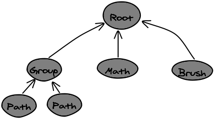
Nodes can have children. Nodes can be configured with different properties. For example, the PathNode has a property for the fillStyle, lineWidth, strokeStyle, and text. In the example above, the paths would have a "path" property that has a list of points through which the path flows. The BrushNode would have a list of points, a lineWidth, and a fillStyle. All nodes are required to have a 2-D transformation matrix that tells how to draw them.
There are several types of nodes that could be in the document, and they are listed under Types of nodes
Among others, Nodes of the document may implement two important methods:
| Method Name | Method Description |
|---|---|
| format | Calculates the bounding rectangle of the node, and any other data that is required to quickly draw it to the screen. format() is guaranteed to be called whenever one or more properties change, before drawing. |
| draw | draw the node to the given Canvas drawing context. The drawing context has already been transformed to take into account any movement, rotation, or stretching of the node by the user. |
Data Storage
The Zwibbler application can save or export data in several formats. See Export formats.
Zwibbler can only open a document in the "zwibbler3" or "changedata", or "zwibblerclip" format. It cannot open a document from a PNG file, although a PNG file can be inserted into a new document as an ImageNode. Likewise, pages from a PDF can be inserted into the document.
Here is a short description of the file format used by Zwibbler. The file format consists of the string "zwibbler3." Followed by a JSON array. Each array element is a JSON object, with keys and values equal to the properties of the node. Properties whose value is a transformation matrix receive special handling. The matrix of the form
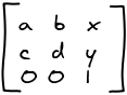
is stored as an array [a, b, c, d, x, y].
In addition, the object has three additional members:
- id is the numeric id of the node. It is assigned based on the order that the shapes were created by the user.
- type is the type of the node. For example, "PathNode" or "TextNode".
- parent, if present, is the numeric id of the parent node of the item. For example, all top-level shapes and groups are children of the root node "0" and objects which are grouped would be the children of some other GroupNode.
Sharing and Collaboration
If you require collaboration features, a collaboration server written in Go has been provided to you. You can also implement your own collaboration server and test it online.
Please see the example in the tutorial
By default, a demonstration collaboration server on zwibbler.com is used. However, it has no uptime guarantees and may be removed at any time.
Using your own collaboration protocol
Using your own sockets for collaboration is difficult. The general idea is to keep a document, which is a string, on the server. Each client will connect and append to the document. When this happens, you will broadcast the changes to all the other clients. When a new client connects, send it the contents of the document that it does not already have.
The other important detail is implementing a set of keys / values for each document. Zwibbler uses these keys for user presence and broadcasting mouse movements. When a client disconnects, the server ensures its keys are deleted and all other clients are notified.
Using your own collaboration protocol is not recommended. You should use the Zwibbler collaboration server. Here are some important considerations that have already been solved by the Zwibbler collaboration server. You will need to consider them if you write your own.
- A valid Zwibbler document needs some initial data. There must be only one copy of this data. When multiple users connect to a session at the same instant and try to create a document, one of them should succeed and the others should be notified of failure, and their document should be replaced by the agreed upon shared one.
- When users disconnect, and later reconnect, they should receive only the data that they need.
- Some clients may be on a slow connection. Each client should have a queue of messages that are being sent to it. In the case of set-key messages, you should have the ability to update set-key messages in the queue to be the most recently received ones. This will ensure pointer movements are smooth.
- Zwibbler data is a string, but it may contain JSON. If you include this data within a JSON string, it may be doubly-escaped and unnecessarily large.
The protocol used by the Zwibbler Collaboration Server is described here. When implementing your own, this protocol will not be used and you will receive raw change information from Zwibbler as the user draws.
See also
set-keys, getSessionKeys, getLocalSessionKeys, getNewLocalSessionKeys, local-keys, markChangesSent, addRemoteChanges, getLocalChanges, local-changes
See also
createSharedSession, joinSharedSession, leaveSharedSession, setSessionKey
Path Commands
/** @constructor
    @param {Array.=} commands

    Path commands are an array of commands for drawing shapes. Each command
    other than CLOSE_SHAPE has the command type and the final x and y
    coordinates. Depending on the command type, there may be other coordinates.
 */
function PathCommands(commands) {
  this.init(commands);
}

PathCommands.prototype = {
  init: function (commands) {
    if (commands === undefined) {
      this.commands = [];
    } else {
      this.commands = commands;
    }
  },

  moveTo: function (x, y) {
    this.commands.push(0);
    this.commands.push(x);
    this.commands.push(y);
  },

  lineTo: function (x, y) {
    this.commands.push(1);
    this.commands.push(x);
    this.commands.push(y);
  },

  curveTo: function (x, y) {
    this.commands.push(5);
    this.commands.push(x);
    this.commands.push(y);
  },

  quadraticTo: function (cx, cy, x, y) {
    this.commands.push(2);
    this.commands.push(x);
    this.commands.push(y);
    this.commands.push(cx);
    this.commands.push(cy);
  },

  cornerTo: function (cx, cy, x, y) {
    this.commands.push(6);
    this.commands.push(x);
    this.commands.push(y);
    this.commands.push(cx);
    this.commands.push(cy);
  },

  bezierTo: function (c1x, c1y, c2x, c2y, x, y) {
    this.commands.push(4);
    this.commands.push(x);
    this.commands.push(y);
    this.commands.push(c1x);
    this.commands.push(c1y);
    this.commands.push(c2x);
    this.commands.push(c2y);
  },

  arcTo: function (x1, y1, x2, y2, radius) {
    this.commands.push(3);
    this.commands.push(x2);
    this.commands.push(y2);
    this.commands.push(x1);
    this.commands.push(y1);
    this.commands.push(radius);
  },

  arc: function (
    centreX,
    centreY,
    radius,
    startAngle,
    endAngle,
    counterClockwise
  ) {
    // not documented. Email support.
  },

  closePath: function () {
    this.commands.push(7);
  },

  toArray: function () {
    return this.commands;
  },
};

function CreateCirclePath(centre, radius) {
  var commands = new PathCommands();
  commands.moveTo(centre.x, centre.y - radius);
  commands.cornerTo(
    centre.x + radius,
    centre.y - radius,
    centre.x + radius,
    centre.y
  );
  commands.cornerTo(
    centre.x + radius,
    centre.y + radius,
    centre.x,
    centre.y + radius
  );
  commands.cornerTo(
    centre.x - radius,
    centre.y + radius,
    centre.x - radius,
    centre.y
  );
  commands.cornerTo(
    centre.x - radius,
    centre.y - radius,
    centre.x,
    centre.y - radius
  );
  commands.closePath();

  return commands.toArray();
}

var circle = zwibbler.createNode("PathNode", {
  commands: CreateCirclePath({ x: 100, y: 100 }, 50),
  fillStyle: "#880000",
  strokeStyle: "#000000",
  linewidth: 20,
});
A path is defined by an array of numbers. Each segment of the path is prefixed by a number from 0 to 8 describing the kind of command it is. The rest of the command is parameters pertaining to the command.
Change History
October 2025 - December 2025
There were improvements to SVG rendering (gradients) and arrow appearance, as well as new configuration settings.
- Feature: selectBoxColour setting lets you change the colour of the selection box and rotation handle.
- Feature: You can now have multiple expressions in z-directives, separated by semicolons.
- Feature: Implemented RADIALGRADIENT in displayed SVG files.
- Feature: For transitions, the
visibleclass is added to popups shortly after appearing. - Bugfix: xlink inside of LINEARGRADIENT was not working.
- Bugfix: When stamping an SVG image, if you clicked before it was loaded, it would have positioning issues and the ghost image would stay on the canvas.
- Bugfix: sometimes single click brushstrokes were not drawn.
- Bugfix: Dashes with arrows, and general improvements to how arrows look.
July 2025 - September 2025
There were bugfixes to HTML and hidden nodes, as well as other minor improvements.
- Added undo/redo, html-resize, and mousedown events
- Increased the ruler thickness when necessary so larger numbers fit on it.
- Grid and ruler marking are not aligned to pixels and no longer fuzzy.
- Bugfix: Copy/paste to localStorage was causing an error when used in an Android webview.
- Bugfix: The box shadoes on HTML components was not showing up if there was a page background. Also, border-radius was resulting in white borders.
- Bugfix: Reszing an HTML component was not taking min-width/min-height/max-width/max-height into account.
- Bugfix: It was possible to select hidden nodes by dragging the selection rectangle around them.
- Bugfix: When pasting nodes and immediately setting them to hidden, they would still be selected.
- Bugfix: If user clicked on a button that was over the campus and that dialog disappeared to enter the stamp tool, the stamp tool was not appearing until the user moved the mouse
- Bugfix: When viewMargin was set, the background did not extend all the way to the edge of the viewport.
- Bugfix: When the ruler was shown, the scrollbars would not extend all the way to the bottom of the screen.
April 2025 - June 2025
There were fixes for using the z-page directive to show page previews. HTML nodes can now be resized from the corners non-proportionally.
- Feature: When we find the z-sizeable="stretch" attribute on an HTML component, then the default will be to not lock the aspect ratio when dragging the corners.
- Feature: useCustomTool() can now be used even when in readOnly mode.
- Bugfix: When
z-rectis used withz-page, the expression is now evaluated every time it is read. Previously, it was only evaluated once. - Bugfix: When the z-page directive was use and Zwibbler was destroyed within 10ms of creation, it would cause errors in the console and leak memory.
- Bugfix: The legacy, undocumented Zwibbler.propertyPanel() method, which adds items to the built-in property panel, was not working properly.
- Bugfix: In some cases, the draw event was not sent after the document changed.
January 2025 - March 2025
There were bugfixes to address specific customer issues.
- Feature: When z-property is on a button and z-value set to "true" then it toggles between true and false.
- Feature: The key held down to select multiple objects can be configured with the keyMultiselect setting
- addToGroup, getGroupParent(), and getGroupMembers() will now work with HTML components that contain other HTML components.
- getAllNodes() can optionally return nodes from all pages, instead of just the current page.
- Bugfix: The Zwibbler.save() on the global object was not working properly when saving a specific page.
- Bugfix: When saving a specific page as an image, it was using the current page size rather than the one specified.
- Bugfix: When saving a PDF with no fixed page size, items would be cut off from pages other than the first.
- Bugfix: When using the text tool, the "text" property should be in the property summary.
- Bugfix: We could not set arbitrary properties starting with "_" when using the text tool.
- Bugfix: node-clicked is no longer emitted if you clicked on a decoration.
- Bugfix: When opening a document, HTML components on pages other than the first were not being shown.
- Bugfix: When panning with the keyboard while selecting, it was possible for the selection box to remain after the user released the mouse button.
- Bugfix: useShapeTool() when used with a node-type other than PathNode was always putting the shape on the default layer rather than the active layer.
- Bugfix: When using small SVGs and fillMode="custom", curves would be changed into polylines and the shapes would appear blocky.
- Bugfix: getNodeRectangle() on a hidden HTML node was returning an empty rectangle.
- Bugfix: createHTMLNodeFromDrag() was ignoring the active layer and always using the default layer.
- Bugfix: Pasting a snippet with an unregistered custom node should not throw errors. Instead, show a placeholder.
October 2024 - December 2024
The focus was on the release of the graphing calculator, which is available as a separate product. Minor fixes were made to Zwibbler.
- Release graphing calculator extension
- Feature: Added duplicatePage() method method
- the start-transform event is now sent when HTML nodes are moved. Previously it was only sent for drawable nodes.
- Added toolName option to useShapeTool()
- Fix spurious node-changed events when using HTML nodes.
July 2024 - September 2024
Saving PDF files will now be faster. Various other important bugs were fixed, including when using lines and arrows with dashes.
- The distributeNodes() method now takes a minimumGap parameter
- The keepPagesInDom setting can resolve issues when using angular components on multi-page documents
- There can now be more than one callback for the draw event.
- The default page selector now shows the page number as a hover text.
- Added the removeConfig() method
- Added the rulerNumbers setting
- Added the getPageBackground() method
- Bugfix: Deleting the first node of a closed shape was not working. Also, when deleting from a closed path, it will no longer be possible to leave it with fewer than three.
- Bugfix: It was not possible to unselect nodes using the shift key.
- Bugfix: It was not possible to redefine the copy/paste keys
- Bugfix: z-page was not reacting to changes in page number
- Bugfix: When the user uses the line tool, spurious nodes-added and nodes-removed events were being sent.
- Bugfix: DataNodes were not being returned by copy()
- Bugfix: Adaptive brush width was not working correctly.
- Bugfix: Very long lines with dashes were causing performance issues.
- Bugfix: PDF saving is optimized for speed
- Bugfix: Dashed arrows were no longer possible, since November 2023
April 2024 - June 2024
The usability of the crop tool is improved. SVG now supports POLYLINE and POLYGON tags. There is also limited support for LINEARGRADIENT. Drawing lines by clicking points is much better.
- Bugfix: When the ruler was showing, it was not possible to scroll all the way to the bottom of the page.
- Bugfix: Fix issues with auto-scrolling when the ruler is visible.
- Bugfix: Calling deleteSelection() while the user was drawing a line by clicking points would result in an error.
- Feature: Path-aware intelligent grid snapping for edit nodes. When changing a shape by dragging its points, they will snap intelligently.
- Bugfix: Knife tool sometimes did not work when the snap distance was large.
- Bugfix: Undo/redo while drawing a line by clicking will work and affect the drawn points.
- Feature: You can invert an svg file using the filter property
- A ghost image will be shown when using the crop tool to aid in positioning.
- Mouse cursor changes when over image crop handles.
- Feature: The crop handle can be moved within the image by dragging it.
- You can optionally ignore the current paste offset when calling the paste() method
- Bugfix: Panning using the keyboard (eg, spacebar) will now work without canceling the current tool.
- Bugfix: When setting the fillStyle of text, if there are other node types selected too, ignore the setting for text. It is often not what the user intended to do.
- Bugfix: Corp handles were drawn slightly misaligned.
- When showing the size of shapes while dragging, it is rounded more intelligently depending on the units.
- Feature: The showSize setting controls the display of sizes when creating or resizing shapes.
- Bugfix: When drawing an SVG shape using useShapeTool, the measurement text was not positioned correctly.
- Bugfix: When resizing the shape, the measurement no longer includes the outline thickness of closed shapes.
- Feature: The stokeAlign property controls whether the stroke is inside, outside, or along the edge of shapes.
- When z-model was used with an input box, it was not updating the textbox in some cases.
- Feature: keyAspectLock and keyAspectUnlock provide greater control over whether corner handles change the aspect ratio by default.
- Bugfix: Problems when resizing etxt when wrap=false while editing it.
- Feature: SVG now supports POLYLINE and POLYGON tags. There is also limited support for LINEARGRADIENT
- Bugfix: getNodeRectangle() will now return the correct x,y, but not width/height if called before the image is loaded. You should use the onComplete method for more accurate information.
- onGesture() can be implemented by custom tools.
January 2024 - March 2024
Several ways to freeze the browser by using extreme values were fixed. There are more ways to control the display of dimensions while resizing shapes. It is now easier to use the line tool when you are drawing lines by tapping the points rather than dragging.
- Feature: textCenterMethod=maxdist will visually center text in a PathNode or SvgNode using its actual shape, instead of its bounding box.
- Feature: You can hold shift while dragging a corner to resize non-proportionally.
- Feature: textOrientation=upright for vertical text.
- The maximum zoom setting is now enforced when zooming to full page or page width.
- When tapping the screen to place points on a line, undo/redo is now possible as well as pinch-zoom without cancelling the line.
- When drawing shapes, the dimensions are now shown with extra spaces, eg "100 x 100" instead of "100x100"
- Dimensions are shown while resizing a shape in addition to creating it. Size display can be turned off in the drawOptions when entering the tool.
- When double-clicking to edit a shape, we now always return to the pick tool when done, ignoring the autoPickToolText setting.
- In brush mode, allow zooming with the mouse wheel while the Ctrl key is pressed, even if the wheelAdjustsBrush is set.
- The snap is now taking into account when calculating the paste offset.
- Bugfix: in z-editable user interface elements, pressing Cmd+C on Safari to copy was instead inserting a C character.
- Bugfix: Decorations should not be affected by zoom level.
- Bugfix: When initially creating a textbox and user resized it, it would then snap back to the original size when the user types again.
- Bugfix: Brush strokes were jumping to different locations after drawing. Problem since December, 2023.
- Bugfix: allowTextInShape=false would disable the user being able to double click a text node in pick tool to edit it. Broken since November 2023.
- Bugfix: When calling paste() within a transaction, the result of getNodeRectangle for the pasted nodes would not be accurate until the transaction was committed.
- Bugfix: When using z-property on an input[type=number], the user could still type values outside the max/min range
- Bugfix: With a background set, repeatedly pinch-zooming on chrome/safari based browsers would eventually crash the web page due to memory issues.
- Bugfix: When exporting as a JPEG, there was sometimes a grey line to the right or bottom of the exported image.
- Bugfix: When zoomed out > 1296 times, if you drew a brush stroke with dashes, it would freeze the page.
- Bugfix: When text lineWidth was greater than 1000, the browser would freeze.
- Bugfix: Pinch-zooming using the trackpad on Mac was too slow.
- Bugfix: When using large snap values, it was sometimes not possible to draw lines by clicking individual points.
- Bugfix: Changing arrowSize while a dashed shape is selected would remove the dashes from the shape.
- Bugfix: Allow adding edit-nodes to arrows by double-clicking.
October 2023 - December 2023
Japanese and text with different writing modes is now implemented. There is a distributeNodes() method for arranging nodes into a grid.
- Feature: Collaboration server now supports redis-cluster
- Feature: Text tool supports 'vertical-tl' writing mode for Japanese
- Feature: You can now prevent the deletion or duplication of certain nodes using the start-transform event.
- Feature: Can double-click to insert an edit point in a shape.
- Feature: textIndent property can set a paragraph indent for text.
- Feature: allowSelectBox=true now completely disables two finger gestures to manipulate shapes. Document will pan instead.
- Feature: "circle" arrow type.
- Feature: rulercolour and rulerBackgroundColour settings
- Feature: Setting the lockText property can individually override the allowTexTInShape setting for a shape
- Feature: distributeNodes()
- Setting the "collaborationServer" setting will now take effect immediately
- Much reduced memory usage when using large shared documents containing base64 images.
- Reduced size of documents containing many brush strokes by 80%
- Added onRedraw, onKeyCommand and onContextMenu to custom mouse handler.
- When confine=page, try harder to keep nodes on the page during shape creation, scaling and rotating.
- When drawing a shape, the size display will now be rounded off.
- The node-changed event now includes a list of changed properties.
- Draw a small dot at the origin of the grid background to give users a reference point.
- If zoomed in, do not automatically scale inserted image to fit in the view.
- Bugfix: isPointOverHandle() was not checking edit handles
- Bugfix: When the fastDraw setting was false and using brush tool, it would continuously redraw the screen and eventually consume all browser memory in chrome.
- Bugfix: Only show mouse trails if on the same page
- Bugfix: An existing textFillStyle in a PathNode was not being used when the user subsequently added text to it.
- Bugfix: lockAspectRatio was not working on HTML components with the z-sizeable attribute.
- Bugfix: Image crop handles were displayed incorrectly if image was flipped.
- Bugfix: Gestures to scale/zoom shapes were broken. They weren't showing the changes while you were moving your fingers. Broken since September 2022.
- Bugfix: textStrokeStyle was ignored and always set to black.
- Bugfix: browser attempted to load non-existent toolbar images, even when built-in toolbar was disabled.
- Bugfix: "Bad initializer for matrix" error when extremely large scaling factors were used.
- Bugfix: Moving edit points of an arrow was buggy. Bug was introduced August 27, 2023.
- Bugfix: colour picker was not showing when in fullscreen mode.
- Bugfix: When z-property is present in a property panel, sometimes switching from brush to line to brush switches the brush stroke style to the shape fill style.
- Bugfix: Displayed SVG files should be clipped to their viewBox
- Bugfix: Problems with z-editable
- Bugfix: Resizing HTML nodes was causing flashing, and dragging the corners was not proportionally scaling.
- Bugfix: Resize handles are now drawn on HTML nodes.
- Bugfix: Fix potential crash: "nid xxxx does not exist"
July - September 2023
The image crop tool is easier to use. Various minor fixes.
- Feature: You can configure it to pan using the right mouse button
- Feature: Images can be distorted into a quadrilateral shape using the distortQuad property, but there is no built-in editor for this.
- Feature: getNodesInRectangle() method
- Feature: Zwibbler.addCustomBackground() can add other backgrounds that are manually drawn to the canvas other than 'grid' but it is not documented.
- SVG files with fillMode=custom will now render much more quickly.
- Edit handles are more visible. Crop handles now look more like those in other tools, and you can crop from the corners instead of only the edges.
- You can hold Ctrl+⌘ when dragging shapes to duplicate them. This is an alternative to Ctrl+Alt
- Fixed warnings about passive listeners in some browsers.
- Zwibbler's SVG renderer is exposed using Zwibbler.NewSvgImage() but is undocumented.
- SVG files using ex units are now handled.
- Zwibbler now supports
#0000and#00000000hex formats for opacity. - Mouse trails are hidden when over toolbars or anywhere other than the canvas.
- There is an undocumented getRevisionInfo() method to get information about an item in the change history,
- Bugfix: Using an HTML select box for font size would sometimes lead to an unrecoverable error in the text tool. The number as a string was being used in a matrix, resulting in NaN values.
- Bugfix: When multiple text boxes were created with the autoPickToolText set to false, the first would remain selected and changes to the focused one would apply to both
- Bugfix: Drawing shapes was causing extraneous items in the history, which could be seen in getHistory()
- Bugfix: text properties were appearing even when allowTextInShape configuration setting was false
- Bugfix: Using the image stamp tool with SVG files with no width/height will now work in chrome & edge. But for firefox, you need to modify the SVG file itself and add this information for it to work.
- Bugfix: Zooming with using two fingers on the trackpad was too fast.
- Bugfix: Screen blanking while using the brush tool on lenovo notebooks when using the stylus.
- Bugfix: When showing a popup, the user could right-click the overlay on the rest of the page and see the menu.
- Bugfix: Corrected the property summary when using the bezier tool.
- Bugfix: When switching pages while editing text, the text was not changed.
- Bugfix: Since July 21, the properies for the brush tool was showing arrow options when it should not.
- Bugfix: Changing the fillStyle while using the line tool was also changing the strokeStyle.
- Bugfix: Deleting a node from within the zwibbler-drop handler would result in a ghost node on the canvas.
- Bugfix: Clicking the middle of a line segment would sometimes select it instead of making its edit handles appear.
- Bugfix: When drawing and the mouse moves outside of the canvas we would lose track of it and the button state.
- Bugfix: DataNode was not returned in the results of getAllNdoes()
- Bugfix: When joining a shared session, the defaultZoom setting was ignored.
- Bugfix: Whlie temporarily panning and not using the pan tool, the highlighted tool was changing unnecessarily.
April 2023 - June 2023
Many minor bug fixes. The most significant is resolving problems writing with a stylus on the iPad Pro.
- Feature: scrollIntoView() method is documented.
- Feature: useShapeTool() method is documented.
- Feature: When the multitouch setting is enabled, the brush tool will work with multiple fingers.
- Feature: Added canMoveUp() and canMoveDown() so UI buttons can be grayed out.
- Feature: A perspective transformation can be applied to an image using the perspectiveQuad property, although there is no built-in editor for this.
- Feature: Bezier curves can be drawn using the useFreehandTool() method
- Feature: Precise z-ordering using setDrawOrder() and getDrawOrder()
- Middle-button or keypress panning will show the grab cursor when active.
- The stamp tool no longer scrolls the document when you get close to the screen edge. Scrolling should only be done while holding a button.
- The goToRevision() method will now automatically switch pages to where the change occurred.
- Text is more precisely positioned to where you clicked.
- The rotation handle is changed to look less like the letter 'G'
- If the lineWidth is set to 0, the textStrokeStyle no longer appears in the property summary.
- Bugfix: In certain situations involving popups, a missed pointerup event would cause the screen to start panning.
- Bugfix: When the browser was full-screen, popups were not showing.
- Bugfix: Chrome browser was emitting a warning about a "passive mousewheel violation"
- Bugfix: When exporting a PDF, it was possible for the wrong background to be drawn.
- Bugfix: Some SVG files with the "fillMode=custom" property were not drawn correctly.
- Bugfix: Dragging images onto the canvas was broken since April, 2023
- Bugfix: HTML elements in the document were being partially obscured by white squares when the zoomlevel was not 1.0
- Bugfix: The z-click directive was allowing disabled buttons to be clicked.
- Bugfix: Fixed problems when writing with a stylus on the iPad Pro.
- Bugfix: Eliminated redudant tool-changed events when selecting shapes by dragging.
- Bugfix: Chrome and edge browsers were not detecting network disconnection during collaboration.
January 2023 - March 2023
Working with text on small screens works better. Many fixes were made in a variety of areas.
- BREAKING CHANGE: For consistency with custom tools, the methods used in setCustomMouseHandler() should return false if they want Zwibbler to handle the event, and any other value otherwise.
- Feature: keySnappingOff lets you have a key to disable snapping, rather than one to enable it.
- Feature: The loading event lets you notify the user when the document or images are loading.
- Feature: The middle mouse button can pan in brush mode, in addition to when using the pick tool.
- Feature: You can create components with an <svg> root element.
- Feature: The z-destroy directive lets components clean up.
- Feature: The snapAngle setting lets you configure the angles when snapping is used.
- Bugfix: Problems detecting clicks inside of popups on IOS
- Bugfix: When auto-zooming text inside a shape on a small screen, take into account its vertical position so it remains centered in the top half of the screen before the virtual keyboard pops up.
- Bugfix: If the textbox won't fit on the screen, don't try to clamp it to the edges during auto-zooming.
- Bugfix: Popups were not appearing after repeated destruction/creation of Zwibbler.
- Bugfix: When exporting a document to PDF, boxes were appearing at the end of text lines.
- Bugfix: Text was not exactly vertically centered in shapes.
- Bugfix: Bugfix: When in a collaborative session, and the user draws a shape, the other users would see it appear in the uppe left until the mouse button is released.
- Bugfix: A document containing a brush stroke and text with a background, when exported to SVG or PDF, would have the stroke coloured incorrectly.
- Bugfix: Export of objects with transparency to SVG/PDF were not having the correct opacity.
- Bugfix: The brush cursor more precisely matches the size of the brush on retina displays.
- Bugfix: Popups were positioned incorrectly when the web page was scrolled down.
- Bugfix: When exporting PDF and page numbers were specified, the the size of the first page of the document was used instead.
Bugfix: When scrolled beyond the document area, and you used the mouse wheel, it was snapping back. Now it will continue in the direction you scroll.
Bugfix: When working on zoomed-out documents, the hittest regions of the selection handles were too large. You could not double-click on text to edit; it would rotate.
Bugfix: Including jQuery in the page would result in an error similar to
"invalid 'instanceof' operand window.jQueryBugfix; when zoomed in or out and HTML nodes were placed over a background, they would get a white square around them or be cut off.
Bugfix: When drawing multiple lines (autoPickTool=false) the hint text was not shown properly
Bugfix: On Windows, the mouse cursor was invisible while outside of the page. This was due to the 50% gray colour. It has been lightened so the cursor will be visible.
Bugfix: isPointOverHandle() now checks for both selection handles and edit handles.
Bugfix: The first always-on edit handle was not being moved if you click on it and the object was not already selected.
The cursor is now left as the arrow when we are in readOnly mode.
Custom nodes can now apply additional snapping to their edit handles.
The z-editable directive will submit its text when it looses focus.
The hintFont setting lets you change the font fo the hint text.
The touch-radius for pointer mode is increased to make it easier to click on edit handles. The getTouchRadius method lets you retrieve the value used.
When auto-zooming text, attempt to zoom around where the cursor will be rather than at the top left.
mouseout/mouseover events are no longer canceled. They are necessary for some frameworks such as materialUI to function properly.
While images are loading, do not show a placeholder unless the image fails to load.
Switching between pages programmatically will now emit set-page only once, for the last one.
The mouse cursor is now hidden while using the image stamp tool.
Added the getCanvasSize() method
alignNodes() will now emit the start-transform event for each individual node.
October 2022 - December 2022
It is now easier to use while zoomed out on mobile, with larger hit regions on tiny shapes, and automatic zooming while editing text. Drawing performance is increased.
- Feature: the lineHeight property for text.
- Feature: It is now easier to click on shapes when zoomed out on mobile.
- Drawing performance is increased when repeatedly drawing during resize animations.
- Format only nodes on the current page. With care, this can avoid loading all images in the document. Note the page selector forces all pages to be loaded anyway.
- Added maxReconnectSeconds configuration setting to control how reconnection attempts are made when collaborating.
- Added scrollbarStyle setting, minAutoZoomTextSize setting, autoZoomTextSize setting
- Added wheelAdjustsBrush to prevent the mouse wheel from adjusting the brush size.
- The allowDragDrop setting can prevent Zwibbler from handling dropped images.
- You can set allowSelectBox to
falseto disable panning even when touch is used. - The selectTransparent setting allows you to select shapes by clicking inside the transparent regions.
- Bugfix: Sometimes, scrollbars appeared unnecessarily while zoomed to the page.
- Bugfix: Removed unnecessary text resize handles while editing text inside a shape.
- Bugfix: When using proportional scaling and drawing a shape, the previewed measurements were wrong.
- Bugfix: rotating text beyond 90 degrees made it wrap to single-characters.
- When editing text right-aligned within a shape, the end of the text entry field would overlap the edge of the shape.
- Bugfix: The underline property on text inside shape wasn't working. Additionally, sometimes underline was not being applied to text.
- Bugfix: When using auto-zoom in text edit mode, text was changing size.
- Bugfix: When editing text and zoomed out, textbox was resizing unnecessarily when finishing editing.
- Bugfix: On IOS, a click on a popup-button was being registered twice, resulting in multiple-undos
- Bugfix: When using snapping, and you duplicated or pasted objects, they would be misaligned with the rest of the drawing.
- Bugfix: When switching pages or doing undo/redo while user is editing text, stop editing text.
- Bugfix: Setting a colour (or any property) identically twice would require two undos to undo
- Bugfix: On MacOS, the width of the scrollbar did not match the genuine one.
- Bugfix: Using line dashes when drawing a custom node would not be reset back and thus all shapes in the document would be dotted.
- Bugfix: When clicking to create a shape, they were not aligned to the snapping grid. Now, shapes will be warped to fit.
- Bugfix: When drawing triangles and other polygons, they extended outside of where the user dragged.
- Bugfix: Selecting a larger font during text editing would result in text being cut off.
- Bugfix: z-hide was not working properly with elements that had inline styles.
- Bugfix: Zwibbler was crashing when displaying the "Unknown node", when you failed to register a custom node.
July 2022 - September 2022
The collaboration protocol is updated to allow for longer JSON Web Tokens to be used as document identifiers, providing greater security for whiteboards.
If you repeatedly destroy the whiteboard and recreate it in the same page, as is done in react or angular, it should now work properly.
- Feature: Mouse wheel changes brush size when drawing.
- Feature: Pages can have not only a size, but an origin set using setPageSize()
- Feature: Dashes in the brush tool, and arrowheads automatically increase in size with thickner lines, so they will still look right.
- Feature: The zwibbler-vertical-scroll, zwibbler-horizontal-scroll classes are added to the zwibbler element so you can detect this condition and alter CSS styles.
- Feature: The start-transform event can be used to alter the list of nodes just before a user drags them.
- Feature: allowSelectBox=pan
- Feature: blendMode property for the brush tool, to implement 100% opacity highlighters.
- Feature: Different arrow styles for either end of lines. Ball-type arrowheads.
- Feature: setCustomSelectionRectangleFn() lets you draw your own selection rectangle, instead of the default dashed outline.
- Feature: PathNode now works with the strokeStyle=url() syntax which takes an image and uses repeated copies of it to stroke the path.
- Feature: You can force the user to enter text immediately after she draws a shape.
- Feature: The hand cursor now appears when you mouse over any shape using the pick tool.
- Feature: the selectMode setting lets you determine how to handle shapes that partially overlap the selected region.
- Feature: When editing text, automatically zoom in if it is too small on the screen.
- Feature: Fonts exported to PDF now support font mapping and faux italics. Just add all versions (regular, italic, bolditalic) of a font by url and Zwibbler will sort out the styles by itself.
- The stamp tool now preserves SVG images instead of converting them to pixels.
- Added isPointOverHandle()
- Since unknown HTML elements are difficult in react, you can now instantiate a component using z-use-component instead.
- newDocument() now sets the zoom level back to the default.
- When you press '=' to zoom 1:1, the centre of the vieport is preserved.
- z-property will now work on custom components, if they define a 'value' property in the scope.
- Zwibbler.getBuildDate() lets you check version information, returning the Javascript Date object on which the code was built.
- When you use setProperty() to change a colour, the colour-clicked event will be emitted.
- You can now hold down either shift or control to draw proportional shapes. Before, it was only control.
- Added MacOS key combinations ⌘+G and ⌘+Shift+G for grouping/ungrouping, ⌘+A for select-all
- Added ctx.clearTimeout(), setInterval/clearInterval methods that will be automatically cancelled upon destruction.
- Added Zwibbler.openFile() HTML helper method.
- The dashed outline of the textarea while typing is removed.
- The thin blue line that appears while you are rotating a shape has been removed.
- Bugfix: rotation handle should stay outside the selection box. Broken since February 25, 2022
- Bugfix: When using a shape tool, if you changed the colour before drawing the shape, the colour change would be ignored.
- Bugfix: Opacity should appear in the property summary when drawing a shape or lines.
- Bugfix: Property summary for text was not showing updates to fill/stroke style
- Bugfix: Stacked dismissable popups. You can now have multiple popups with click-to-dismiss and they will disappear in reverse order instead of all at once.
- Bugfix: Arrowheads had dashes drawn in them.
- Bugfix: z-property was not working for checkboxes, with a boolean property.
- Bugfix: Textarea expansion caused scrolling. When typing new text at the right edge of the screen, the textarea was allowed to expand past the edge of the screen and this caused scrolling of the Zwibbler viewport and made its border visible. Prevent such expansion if it would cause the textarea to expand past the right edge of the screen.
- Bugfix: On safari, ctrl-drag to create a shape cause the browser to display the context menu instead.
- Bugfix: Calling getViewRectangle() while the canvas was hidden was returning incorrect results.
- Bugfix: When setPageSize() was used, it would also affect the size of images on the page.
- Bugfix: Toggling underline while editing text was not working.
- Bugfix: If you defined a custom mouse pointer component and had 'ctx' defined in its scope, it would crash.
- Bugfix: Clicking on HTML elements overlapping the canvas would also draw on the canvas.
- Bugfix: When drawing lines and zoomed in or out, the hint text was placed in the wrong position.
- Bugfix: When a custom HTML element defines a preview image, the image was drawn in the wrong position.
- Bugfix: Re-setting the broadcastMouse setting to the same object value was not updating the mouse pointer.
- Bugfix: Dashes were not showing in the property summary.
- Bugfix: Do not show text properties in summary for lines and open paths.
- Bugfix: getHistory() was returning timestamps in milliseconds, but seconds is the correct one.
- Bugfix: Reposition popups as images inside them load.
- Bugfix: verticalAlign of text in shapes was not working properly.
- Bugfix: When the stamp tool was used with multiple=true, images after the first one would be placed in the wrong position.
- Bugfix: getLayerNodes() was returning nodes from all pages. It should be limited to the current page.
- Bugfix: Pasting entire pages now preserves any layers on them. The behavour for individual objects is still to paste them in the current layer.
- Bugfix: Changing the size of the textarea while editing was being ignored, verticalAlign was not being immediately shown.
- Bugfix: On IOS, clicking any button inside a popup was not working.
- Bugfix: Shapes filled with the 'erase' style were filled with a shifted background.
- Bugfix: z-if on a component was not working on repeated toggling.
- Bugfix: Destroying and recreating Zwibbler on the same HTML elements was not working properly.
- Bugfix: In cases where you used z-if or popups, and then called ctx.destroy(), Zwibbler was not properly destroyed.
- Bugfix: In a collaborative session, when two users are editing the same text inside a shape, after one user submits, the other would see their text overlapping the one in the shape.
April 2022 - June 2022
Bugfixes for grouped objects and imported SVG files.
- Feature: Collaboration server management API can optionally provide increased security.
- Feature: save() can save the new
change-dataformat, which is larger but is compatible with the collaboration server. - Feature: Zwibbler.downloadBlob() lets you save files from Javascript cross-browser.
- Bugfix: interpretation of 3 digit hex colour codes was wrong.
- Bugfix: When a group is selected, the selection rectangle was sometimes too big.
- Bugfix: Properties summary was incorrect for grouped objects.
- Bugfix: Drag and drop png files on the canvas, with extension ".svg.png" was not working.
- Bugfix: insertImage() was not using CORS headers.
- Bugfix: When page is scrolled, accessible keyboard cursor had an offset.
- Bugfix: When importing SVG files, skewX/skewY, rotate transforms, and font sizes without units were causing problems.
- Bugfix: Rendering certain SVG files would cause node.js version to crash.
- Added the selected-region event.
- insertImage() can take coordinates to insert the image at.
- Added getSessionKeys() method.
- Added ctx.setTimeout() method to make it easier to avoid memory leaks on destruction.
January 2022 - March 2022
Better handling of SVG images in the document, and many bugfixes. A notable fix prevents crashing on iPAD when panning the document. Performance of documents containing many images is further improved.
- Feature: Text inside of a shape will word-wrap precisely.
- Feature: SvgNodes can have images drawn on top of them.
- Feature: Colour palette can now be navigated using tab/enter.
- Bugfix: When moving a dot created using the shape-brush tool, Zwibbler would crash.
- Bugfix: Implemented <use> inside of svg files
- Bugfix: Web page was not cleaned up properly when page selector is displayed, and you destroyed Zwibbler.
- Bugfix: Calling download() twice in quick succession would leak memory.
- Bugfix: Fixed crashes on iOS Safari when using a background.
- Bugfix: When zoomed to extreme magnification on iPAD, Zwibbler would freeze.
- Bugfix: PDF download on iPAD
- Bugfix: Middle-button panning when zoomed out was not working properly.
- Bugfix: Moving the mouse wheel while zoomed to page would cause the page to jump to the upper left corner.
- Bugfix: When the on-screen ruler was visible, scrolling the mouse wheel made the view scroll to the right.
- Bugfix: If Zwibbler is repositioned on a page without being resized, there would be a cursor offset.
- Bugfix: SVG Arc commands were not working properly.
- Bugfix: Added support for SVG vector-effect:non-scaling-stroke
- Bugfix: goToRevision() was not working since July 2020
- Bugfix: Precise snapping of shapes when scaling them and snapping is enabled.
- Bugfix: Documents with many images caused slowdown when page selector is displayed, or when many are on the same page.
- Bugfix: When autoPickTool is configured to false, and drawing multiple consecutive shapes, they would be placed in the wrong spot.
- Bugfix: Could not scroll using scrollbars when brush tool was active.
- Bugfix: It was possible to move shapes with lockPosition=true using touch gestures.
- Bugfix: colour-clicked was not allowing the override of colour.
- save() method is changed to support saving as a Blob.
- Any configuration option starting with "_" is allowed for your use.
- paste() now returns the nodes that were created.
- Added document-opened event
- Added getDocumentProperties() method.
- Setting allowSelectBox=true will now turn off one-finger panning on touchscreens.
- ZwibblerContext can now be used inside node.js to open and manipulate documents.
- setZoom will now zoom about the view's center, by default.
October 2021 - December 2021
Major fixes include speeding up documents that load many images, and more ways to activate the panning mode.
- Feature: cut() can take a parameter to indicate the exact nodes to cut.
- Feature: Added clipToPage setting.
- Feature: One-touch panning. When dragging finger on empty space, automatically pan the view on mobile instead of drawing the select box.
- Feature: View is panned when the user holds down the middle mouse button.
- Feature: Selection handles can be hidden with the useSelectionHandles setting.
- Feature: confine=page setting will make it impossible to move shapes off the edge of the page.
- Feature: More information is included in the drop-shape event.
- Feature: You can control which key activates duplicate through keyDragDuplicate
- Feature: You can now set the key which, which held down, activates panning mode. It can be set to spacebar using " ".
- (Undocumented): Expose the PDF canvas writer through Zwibbler.newPdfContext()
- (Undocumented): Many improvements to custom nodes.
- (Undocumented): Zwibbler.propertyPanel() can define custom properties on the built-in property panel.
- Bugfix: Speed up loading documents with many images.
- Bugfix: Scroll wheel was sometimes scrolling the page sideways.
- Bugfix: When fonts are added using Zwibbler.addFont, ensure they are loaded by the browser.
- Bugfix: showColourPicker('') works as intended.
- Bugfix: Copy from another layer and paste on default layer would instead paste on the other layer.
- Bugfix: Pasting an image was going on the wrong layer.
- Bugfix: getGroupParent() was returning the page, but should return "" if the item is not grouped.
- Bugfix: z-model was not working properly with option groups and z-for.
- Bugfix: When calling ctx.draw(), the on("draw") event was not being fired.
- Bugfix: Selection handles will now be drawn even if outside the page area.
- Bugfix: showLayer() now works with the background layer, so the background can be hidden.
- Bugfix: It was possible to use two-finger panning to move outside of the document view. Now scrolling is restricted in all cases.
- Bugfix: Node.js Zwibbler.save() method did not render images from data-uris.
- Bugfix: Node.js Zwibbler.save() was not rending a file produced using copy()
July 2021 - September 2021
There were many bugfixes related to grouped objects.
- Feature: Auto-scroll while selecting.
- Feature: useLineTool() can take a setting to only allow open lines, not closed shapes.
- Feature: viewMargin setting
- Feature: z-editable directive can make the text in an HTML element editable by the user.
- Bugfix: Loading the a document with many images was very slow.
- Bugfix: When opening a document containing grouped shapes, the shapes were not drawn.
- Bugfix: ungroup() was deleting nodes. Broken since July 8, 2021.
- Bugfix: Locking groups of objects was not working properly.
- Bugfix: Grouping HTML Nodes with regular shapes was not working properly.
- Bugfix: Could not scale an object negatively to fix it. Broken since April 21, 2021.
- Bugfix: When window was resized, in some circumstances the cursor clicks would be offset.
- Bugfix: Scrollbars appeared unnecessarily at startup.
- Bugfix: Don't show fontSize property in getPropertySummary() for open paths.
- Bugfix: clicking a button in a popup with z-click-dismiss should dismiss the popup. Broken since May 2021.
- Bugfix: Memory leak related to keyboard events.
- When a new image is inserted, enter the pick tool so the user can move it.
- When transforming shapes, change the cursor to show move / resize.
- Expose getNodeObject(), untransformPoint(), untransformCanvas(), for use by custom nodes.
- change z-model to work as expected when two or more select boxes depend on one another.
- Exposed Zwibbler's unified touch/pointer library in Zwibbler.NewTouchListener() (not documented)
- When rendering a canvas to an image, draw HTML elements as a grey square if the component lacks a draw() method.
- nodes-added, nodes-removed, nodes-changed event have a "remote" parameter to distinguish remote from local changes.
April 2021 - June 2021
The new roughness property for shapes allows you to render them in an improved sketchy way, and supercedes the old sloppiness property.
There were bugfixes and improvements to visible mouse pointers and making HTML nodes work like regular shapes. Features that used to require setting a page size now work when no page size is set.
- Feature: Shapes created with usePolygonTool() have a
sidesproperty. - Feature:
roughnessproperty is an improved method for sketchy drawing of shapes and fills. - Feature: You can scroll in horizontal and vertical directions using the touchpad.
- Feature: added the zoomOnResize setting.
- Feature: added the
allowCropconfiguration setting. - Feature: The appearance of the mouse cursor when broadcastMouse is set can be customized by redefining the
MousePointercomponent. - Feature:
z-rectcan be specified to set a custom size for thez-pagedirective. - Feature: showOwnPointer, showOtherPointers configuration settings.
- Feature: Added
z-click-dismiss="outside"which lets a mouse click act on what you clicked on as well as dismiss a popup. - Feature: Added the
$indexvariable inside of thez-fordirective - Feature: You can duplicate HTML nodes using Ctrl+Alt drag.
- Feature: Support for hex8 colours like #00000080
- Feature: Added the z-ref directive to obtain a reference to an HTML element on the scope.
- Feature: setZoom("width") and pageInflation now works even when no page size is set.
- Other: Added debugOutlineColour configuration setting.
- Other: Unused variable checking was enabled for the source code, and all unused variables were removed.
- Other: You can use Zwibbler.getContext(element) to get the Zwibbler context for an HTML element, if it exists.
- Other: ctx.on() works monitoring changes to configuration settings.
- Other: Zwibbler.addFont() now automatically adds the font to the
fontsconfig setting. - Bugfix: Fix insertImage() positioning when a width is used.
- Bugfix: HTML elements jump when being dragged.
- Bugfix: When snapping to a grid, scaling a rectangle was not accurate.
- Bugfix: Pinch-to-zoom was not respecting minimumZoom and maximumZoom settings.
- Bugfix: When HTML nodes were dragged, they were moved to front.
- Bugfix: Resize cursors on HTML nodes were not showing.
- Bugfix: The keyboard cursor would not allow you to drag shapes.
- Bugfix: When scaling shapes, it was possible to get errors relating to NaN in matrix.
- Bugfix: When text was in a shape with the wrap property set, it was not wrapped after saving and reopening until the user moved the shape.
- Bugfix: Image cropping was not working since March 8, 2021.
- Bugfix: showing mouse trails using broadcastMouse was not working in full-screen mode.
- Bugfix: When using decorations, the hover image was always on.
- Bugfix: When calling setProperty of dashes, it should be saved as the new default.
- Bugfix: HTML nodes under shapes should not be draggable.
- Bugfix: "confine=view" configuration setting was not working for HTML Nodes.
- Bugfix: A square white outline appeared when moving HTML nodes and shapes at the same time.
- Bugfix: Visible mouse pointers were offset if zwibbler was not placed in the top, left corner of the page. This has been an issue since May 5, 2021.
- Bugfix: roundRadius was not working since May 3, 2021.
- Bugfix: When the document had different page sizes, scrollbars would be shown on some pages unnecessarily.
- Bugfix: When an HTML node and regular shape is selected, drag both together.
- Bugfix: getNodeRectangle() was not accurage for groups.
- Bugfix: When entering edit mode on a node, you could not click on the other nodes.
- Bugfix: At high zoom levels (30X) you could not deselect by clicking elsewhere.
- Bugfix: When zoomed in, collaborator's mouse pointers were not automatically repositioned to match.
January 2021 - March 2021
I made improvements for handling SVG files. Also, when images are inserted by the user they will be scaled to fit in the viewport and centred.
- Feature: When selecting a line or arrow, you can immediately drag the two points without clicking again.
- Feature: Added confine="view" config setting
- Feature: Hold down the alt key to turn off snap-to-grid
- Feature: SVG files can be dragged from the filesystem onto the canvas.
- Feature: Node.js version can save multiple pages.
- Feature: Pressing F4 will zoom to the document size if no page size is set.
- Feature: SVG file can be used with the image stamp tool
- Bugfix: Background image was fuzzy when using retina display.
- Bugfix: Opacity set while in brush mode was being ignored.
- Bugfix: Improve character kerning when rendering to a PDF
- Bugfix: doubleArrow property was not appearing in the summary when the arrow tool was activated.
- Bugfix: using broadcastMouse with non-ascii characters in the username was causing JSON errors.
- Bugfix: Sometimes the background was not entirely rendered when exporting to PNG
- Bugfix: Pinch zooming was not respecting the minimum / maximum zoom.
- Bugfix: Error in ctx.destroy() when text tool is active.
- Bugfix: When using page previews with no page size set, if a shape was moved past the top of the screen, then the page previews would disappear.
- Bugfix: Pasting with multiple instances on the page would incorrectly page into all instances.
- Bugfix: Setting the strokeStyle in text mode is now remembered for the next time the user uses text. Ensure the correct lineWidth is returned for text.
- Bugfix: When showRuler was set, HTML nodes were partially hidden by a white square.
- Bugfix: When a PDF was used with a background image, the same background was incorrectly used for every page.
- Node properties that you set beginning with _ will be included in the SVG output as attributes.
October 2020 - December 2020
- Critical: When collaborating, drawing a polygon was not mirrored between connections. Broken since August 10, 2020
- Critical: When collaborating, if different users simultaneously delete pages such that all the pages in the document are deleted, the document would become corrupt.
- Critical: When collaborating, if one user drew on a page and another user simultaneously deleted the page, it might crash.
- Critical: When collaborating, undo/redo could result in shapes in the wrong order.
- Critical: Undo/redo of drawing arrows and lines was not working. Broken since October 10
- Feature: Hold down Ctrl to zoom using the mouse wheel.
- Feature: Hold Ctrl+Alt to duplicate a shape when dragging.
- Feature: Exposed scrollIntoView method. Furthermore, when dragging HTML elements, the canvas will automatically scroll when you near the edge.
- Feature: When lines with only two points are selected, they immediately go into point-edit mode.
- Feature: Arrow heads get bigger when the line width increases
- Feature: A new look for the edit handles: a small white circle.
- Feature: Added drop-shape event
- Feature: TextNodes have a border-width and border-color property to separately set the border properties.
- Feature: New node type: SvgNode that natively draws an SVG file without converting to an image. Dragging and dropping an SVG file onto the canvas will use this node type.
- Feature: New z-hide Zwibbler framework directive
- Feature: Zeact components can define their own scoped popups.
- Feature: Added stopEditingText() method
- Feature: setCustomMouseHandler allows you to override the behaviour of the pick tool.
- Feature: decorations
- Feature: SVG files can be dragged and dropped onto the canvas and they will create an SvgNode instead of ImageNode
- Feature: You can define a component that implements z-model by changing its scope.value member.
- Feature: insertImage() can take an argument for the properties, and only prompts the user for the image if it is not provided.
- Feature: colour-clicked event
- Bugfix: Copy inside a group and paste should paste to the same group.
- Bugfix: It should be possible to copy from one layer and paste to another.
- Bugfix: Position of text editing box was incorrect when Zwibbler is inside of a popup dialog box.
- Bugfix: Changing fillStyle / fontSize while editing text did not save the changes.
- Bugfix: setConfig() for keyboard configurations take effect immediately.
- Bugfix: getNodeRectangle() should work with HTML nodes.
- Bugfix: getDocumentCoordinates() was not working properly while zoomed.
- Bugfix: Fix white covering over corners of HTML nodes.
- Bugfix: setCustomBackgroundFn was broken
- Bugfix: When you drag an image onto the canvas, it should be dropped at the location to which you dragged it.
- Bugfix: After duplicating an HTML node, it was incorrectly jumping to a new position after moving it.
- Bugfix: Stamp tool was overriding clicks on the toolbar and stamping instead.
- Bugfix: When grid was set, and you created a new document, the new page would have a clear background. Broken since August 7, 2020
- Bugfix: Issues with the keyboard focus. (eg, pressing delete not deleting shapes)
- Bugfix: Fix infinite loop when a zero-width canvas is used.
- Bugfix: Potential crash when drawing lines
- Bugfix: Clicking a textarea in an HTML component would not alow you to enter text.
- Bugfix: when adding text to a shape, the default font and the shape's textFillStyle was being ignored.
- Bugfix: Backgrounds should extend beyond the document size, if pageView is set to false.
- Bugfix: Issues with beingToFront()/sendToBack() in combination with undo/redo
- Bugfix: Tainted canvas exception when saving a document containing a video to an image.
- Bugfix: It was possible for other elements to overlap the colour picker.
- Bugfix: z-click could result in calling the handler twice, if the handler called an alert() box. Broken since December 18, 2020
- All API methods are type checked at run time. This may now cause errors in your app if you are using the API incorrectly.
- While drawing arrows, setting a fill colour will now set the default fill colour for future objects instead of the stroke.
- Only show mousetrail labels for other users.
- Changed cursor for pan tool to a hand instead of crosshairs.
July, 2020 - September 2020
- Feature: Scrollbars are drawn in either a Windows or iOS style automatically to match the browser.
- Feature: You can click on the rotation handle for a 90 degree rotation.
- Feature: The collaboration server data format can be opened with ctx.load()
- Feature: getNodesUnderPoint() can take a radius as a parameter.
- Feature: Images have a "colour" property that makes every pixel to this colour.
- Feature: Can now redo with Ctrl+Y
- Feature: Each page can have a different background colour, and the background is saved with the document. Added setPageBackground()
- Feature: alignNodes()
- Feature: TextNode can have a padding property.
- Feature: You can have multiple active layers at once.
- Feature: When using insertImage(), the image automatically shrinks to the size of the viewport.
- Feature: When the selection is small, the handles are shrunk so they do not get in the way.
- Feature: You can stroke with an image, by setting strokeStyle to an url() for a PathNode. The image is rotated and tiled side-by-side to form the line.
- Bugfix: Drawing performance on iPad was sometimes poor.
- Bugfix: Cropping images was not working.
- Bugfix: Fixed collaboration errors like: "Asked to remove 1gpm4j:29 but it is in a different index"
- Bugfix: Undo/redo was switching to the wrong pages.
- Bugfix: Shapes drawn with the magic brush had no edit mode.
- Bugfix: Fix issues with z-click-dismiss not working on ipad.
- Bugfix: When allowTextInShape was false, it was still allowing you to add text to a shape with the text tool
- Bugfix: moveToFront()/sendToBack() were broken; since April 2020, they had merely been swapping the back and front layers.
- Bugfix: Since July 2020, text entered in traditional chinese was not transfered correctly during collaboration.
- Bugfix: We can undo/redo adding a page when another user has edited it in between.
- Bugfix: Scrollbars were not immediately appearing/disappearing when setConfig("scrollbars", ...) was called.
- Bugfix: When saving a document, Uncaught TypeError: f[k].Ob is not a function
- Bugfix: Could not undo/redo with the keyboard while in brush mode.
- Bugfix: The text tool places text exactly where you click, when textAlign is set to centre.
- Bugfix: deletePage() was ignoring the page passed in and always removing the current page.
- Bugfix: getChild(2) but there are only two children error when deleting pages.
- Bugfix: Smart-quotes are now disabled in text mode. When using a chinese font, they would cause a full-width quote character to be inserted and apparent spacing issues.
- Bugfix: Pan tool respects the minimumZoom and maximumZoom setting.
- Bugfix: showFontSizeProperty / showFontNameProperty settings had no effect.
- Bugfix: ctx.download() was not working in IE11.
- Bugfix: When in readOnly mode, it was possible to drag and drop, or paste an image.
- Colour palette popup now takes human perception into account, so columns appear more distinct.
- Saved drawings with the brush tool will take up less space
- Arrow head is no longer drawn in dashed pen, if stem is dashed.
- Added touchRadius setting
- Added session-error event
- nodes-removed event now gives the properties of the deleted node.
- Collaboration file format has changed and is not compatible with previous versions.
- node-ids are now strings not numbers. The empty string represents none.
- fastDraw configuration option can turn off the use of canvas layers, to enable screen recording.
April 2020 - June 2020
- Feature: New HtmlNode node type replaces DomNode. It provides more flexible drag and drop interactions.
- Feature: getHistory() / goToRevision()
- Feature: Brush strokes are smoother
- Feature: isPointOverCanvas() method.
- Feature: mouseTrails
- Feature: PathNode fillStyle can be url() to fill it with a pattern.
- Feature: Zwibbler.releaseMemory() can be used to clear all cached memory.
- Bugfix: First saved page of a PDF was not the correct page size.
- Bugfix: When you click to edit text, the font size in the editor will match what is on the screen.
- Bugfix: Fix problems with erase / backgroundImage
- Bugfix: If you called setProperty("fontSize") with a string instead of the number, it would freeze.
- Bugfix: Line tool would not let you click on the toolbar to exit it.
- Bugfix: click-to-dismiss issues on popups.
- Bugfix: Can copy/paste whole pages.
- Bugfix: newDocument() not working.
- Bugfix: "Asked to remove asdfdas:5 but it is in a diferent index" during shared session.
- Bugfix: Add -webkit-user-select:none to colour palette, to fix problems on iPad.
- Bugfix: Collaborative sharing was broken on older Edge browser since March 2020, due to use of TextDecoder()
- Bugfix: Memory leak if an image failed to load, ctx.destroy() would not release memory.
- Bugfix: Document properties were not loaded when opening files.
- Bugfix: Nudging selection with arrow keys resulting in select box getting out of alignment with selection.
- Bugfix: download() PDF on ipad should open a new tab, not replace the current tab.
- Bugfix: Delete shape / undo resulted in a gray square. Broken since April 2020
- Bugfix: Joining a different session without making a new document would result in error: "getLocalChanges() first batch returned null"
- Bugfix: Holding down the mouse on the page selector resulted in pinch-to-zoom being activated.
- Bugfix: If text was scaled, the font size in the edit text box would be too large or small.
- Bugfix: getPropertySummary() was not handling grouped nodes.
- Bugfix: Double-click to end a curve made text box pop up.
- Bugfix: Text in shapes was left-aligned and should be centered.
- openFile() is modified to return a promise that resolves to the contentType to. This is a breaking change!
- You can rename the Zwibbler namespace to something else using ?module= in the script filename.
- Popup colour palette colours are changed using human perceptual distance, removing the two green columns that were too close.
January 2020 - March 2020
- Important: The new Zwibbler Collaboration Server is required to use collaboration features. Zwibbler is no longer compatible with the older server protocol. This protocol is more efficient when dealing with large documents.
- Feature: Added z-html directive to Zwibbler framework.
- Feature: addToGroup, getGroupMembers, getGroupParent methods
- Feature: Enable system clipboard by default.
- Bugfix: showColourPIcker() was not showing up while in full-screen mode.
- BugFix: When showColourPicker() was used to select a colour, it was not updating the colour of future shapes drawn.
- Bugfix: Selecting fill colour while the brush tool was active was not updating the colour of the brush.
- Bugfix: Since December 2019, touchscreen was broken with Micrsoft Edge
- Page shadow size is reduced when zoomed out, so it won't look so huge.
October 2019 - December 2019
- Feature: Can drag and drop images from the filesystem onto the canvas.
- Feature: Zoomin/zoomout now zooms from the centre of the view, instead of the top left corner of the document.
- Feature: Each page may have a different size.
- Feature: Added rotatePage() method
- Feature: getNodeTransform() method
- Feature: Documented insertImage(), openFile() methods
- Feature: Can specify what nodes to affect in bringToFront(), sendToBack()
- Feature: autozoom setting and scoll event.
- Feature: Improved support for DomNodes. They can be moved on top of eachother and behave more like Zwibbler shapes.
- Bugfix: delete -> undo -> delete was not working right
- Bugfix: Save as BMP was not working.
- Bugfix: Pan tool was not working since September.
- Bugfix: deletePage() on a single page document now clears the page instead of doing nothing.
- Bugfix: It was difficult ot create a closed shape using the polygon tool when snap-to-grid was enabled.
- Bugfix: Added a tool name to image stamp.
- Bugfix: Cursor was offset when toggleFullscreen() called. Added isFullScreenSupported() method
July 2019 - September 2019
- Feature: getNodesUnderPoint() method lets you hit-test all nodes layered under a point.
- Bugfix: Touch support on Microsoft Surface with Chrome/Firefox was not working.
- Bugfix: lockSize property was not working.
- Bugfix: Double-tap was no longer stopping drawing lines on touch.
- Bugfix: Selecting a new tool should commit a partially drawn line.
April 2019 - June 2019
- Feature: getNodeCoordinates() method lets you convert screen coordinates to ones on an image in the document.
- Feature: Custom edit handles let you use your own images as the corners of the selection to scale shapes.
- Feature: openFromComputer() method makes it easy to open files on the user's machine.
- Feature: adaptiveBrushWidth / adaptiveLineWidth configuration settings keeps the brush the same width on the screen when zoomed in/out.
- Bugfix: Text background now covers descenders, for example g j y.
- Bugfix: Draw SVG images as sharp as possible when zoomed in.
- Bugfix: When a document is reopened and text is added, upon adding the text a shape in the document shifted over.
- Bugfix: In read-only mode, user could still double-click to change text.
- Bugfix: Restore IE compatibility
- Bugfix: Added a name "pan" for the pan tool so it is reported in tool-change, getCurrentTool()
- Bugfix: Further fixes to Zwibbler reactive framework
January 2019 - March 2019
- Feature: Zwibbler runs under node.js to generate images
- Feature: Built-in reactive framework for creating toolbars
- Feature: Can drop images onto the canvas and set the z-width attribute
- Feature: setDocumentProperty() / getDocumentProperty() for attaching custom data to the entire document
- Bugfix: Fix issue with Zwibbler inside scrolling divs. Clicks would be offset.
- Bugfix: defaultTextAlign, defaultTextDecoration not working properly
- Bugfix: Spot highlight, when drawn dragging from bottom left to top right would not appear.
- Bugfix: In some cases, it was possible to alter a document in readOnly mode.
- Bugfix: Can set the imageFolder setting using setConfig()
- Bugfix: Ensured destroy() releases all javascript memory
- Bugfix: Automatically redraw when new fonts are loaded by the browser.
- Removed unused code to reduce the size of the javascript file
- Removed "symmetry" option and StampLine tool
October 2018 - December 2018
- Feature: Setting a lineWidth / strokeStyle for images now adds a border to it. Warning -- these were ignored before
- Feature: snap() method in API to snap arbitrary points according to current settings.
- Bugfix: In Surface Pro using Chrome and Edge, the Pen Flick gestures for scrolling interfere with PointerEvents. Fixed now.
- Bugfix: Dragging the upper corners while cropping images would cause it to jump.
- Bugfix: Spothighlight was broken for a few months. Also it would crash when saving as SVG. Now it works and can save as SVG and PDF.
- Use only a known-good version of the closure compiler to build.
July 2018 - September 2018
- Feature: Rhombus tool now possible with usePolygonTool() and matrix.
- Feature: defaultTextDecoration, defaultTextAlign config settings.
- Feature: PathNode can have a backgroundImage.
- Feature: ImageNode can have brightness / contrast / gamma adjustment
- Feature: verticalAlign property for text, text in PathNode
- Bugfix: Editing text in a shape, the text was always the same colour as the shape's fill and therefore invisible.
- Bugfix: Brush cursor was too big on high-DPI screens.
- Bugfix: setFocus setting was broken, had no effect.
- Bugfix: PathNode lets you change more of its text properties instead of igoring them.
- Bugfix: defaultTextFillStyle had no effect.
- Bugfix: showPropertyPanel can now be set using setConfig
- Bugfix: If the zwibbler script was injected dynamically, it would not obtain the toolbar images from the right location.
- Custom tools may have onKeyCommand() method.
- getNodeUnderPoint() takes current selection into account.
April 2018 - June 2018
- Feature: copy(), paste() now works for whole pages, using getPageNode()
- Feature: when allowSystemClipboard is set, allow copy/paste from the system clipboard.
- Feature: DomNodes can have a preview image that appears in the page preview (url in the preview property)
- Feature: A screen ruler can be configured using showRuler, units, and pixelsPerUnit settings
- Bugfix: DomNodes / videos were appearing on the wrong page again.
- Bugfix: Handle missing pointerup using pointermove
January 2018 - March 2018
- Code is now written in TypeScript.
- Feature: Multi-user collaboration (Experimental).
- Bugfix: DOM Nodes / Videos appeared on wrong pages when multiple pages were used.
- Added the allowPointerEvents setting.
- usePolygonTool() can take properties now.
- Don't assume locked images are the background image
- TextArea can expand as the user types.
- Added the movePage() method
- textDecoration property allows underline and strike-through text
- Added customData property to nodes for your use.
- Exported SVG files are tagged with zwibbler:id and zwibbler:tag
- Feature: copy()/paste() works for pages too.
- Feature: Images can be pasted from the system clipboard when "allowSystemClipboard" is set to true.
November 2017 - December 2017
- Bugfix: PDF Text not filled when a stroke outline was set.
- Missed pointer-up events will be detected, helpful when dragging things offscreen and back again.
- Feature: Undo/Redo will switch pages to where the change occured
August 2017 - October 2017
- Brush tool no longer snaps to grid under any circumstances.
- Single-clicking no longer places a rectangle or circle. You must drag to create.
- Bugfix: When deleting multiple shapes, and then undoing the action, they would be replaced in the wrong order.
- Bugfix: printing from ipad
May - July 2017
- added colourPalette setting (LATER REMOVED June 2020)
- added getPropertySummary() method for building property panels.
- make it easier to select thin brush strokes
- Add waveRadius, doubleLine feature to PathNode
- Improved performance of the brush to allow handwriting.
January - April 2017
- Bugfix: When allowZoom was set to false, pinching was still allowed on the ipad.
- ctx.download() now supports the zwibbler3 format.
- Bugfix: When destroy() is called, certain resources were not being released.
- add pageBorderColour setting, pageInflation setting
- Setting wrap=false for a text node allows you to stretch and deform the text.
- When allowZoom is false, pass pinch movements through to the web browser so the user can zoom the whole web page.
- Bugfix: Double-clicking was broken on Chrome
- Bugfix: Fix a problem with double-clicking to end a line.
- When the zoom is changed, zoom the brush cursor too
October - December 2016
- Bugfix: Draw background image on PDF
- Bugfix: Would not work on certain versions of Internet Explorer.
- Bugfix: setCurrentPage() can be used in a transaction.
- Support pinch / zoom gestures on android and all other touch devices.
- Images can be saved as BMP file
- Images can have an opacity property.
- added editNodeText()
- added cloudRadius property to PathNode
- If there is a node in a layer called "background" then it is treated as the background image.
July - September 2016
- High DPI support. Zwibbler drawings will be smooth and crisp on high dpi displays and when web page is zoomed.
- All configuration options can be updated after creation now.
- Bugfix: Text edit boxes will always appear completely onscreen now.
- The "erase" fill style will now allow you to erase the drawing but keep the background image behind it.
- Handle clicking a colour for future shapes while typing text.
- Most tools now support pan/zoom gestures on iOS devices.
April - June 2016
- The setFocus configuration option, when set to false, prevents Zwibbler from scrolling into view when page is loaded.
- You can now click shapes under a shape that is transparent.
- You can click with the brush tool to place a dot.
- Bugfix: show scrollbars when needed. This was not always working properly.
- Brush tool shows the outline of the brush now.
- Bugfix: SVG files with fonts with spaces in the names were malformed.
- Bugfix: zIndex was not working properly when the zIndex had more than one digit.
- destroy() now releases all memory and resources.
- Added drawCircleStyle property for PowerPoint style circle drawing.
January - March 2016
- Bugfix: when a colour is clicked while brush is active, ensure future colours are set properly.
- Bugfix: Curve tool was not working on IE or touch screens
- Remove all potential use of eval()
- Added lockRotate and rotationHandles, lockAspectRatio, lockEditMode, lockPosition property
- scaleNode takes an optional origin for the scaling.
- bugfix: PageView not showing background colours
- Ctrl+arrows nudge by one pixel, configurable using "preciseNudge"
- Added "preciseNudge", "pageShadow" configuration properties.
December 2015
- Bugfix: When zooming and pageView was true, there were problems with clipping.
- Added Spot Highlight feature.
- Use cross-origin image requests when necessary. Images from other servers must have the appropriate CORS headers.
- Added getCanvasScale().
- Added useEditHandleTool(nodeId).
November 2015
- Added quadratic Bezier tool. This is accessed using useFreeHandTool(colour, thickness, "quadratic").
- Added flipNodes()
- Bugfix: When zooming and pageView was true, there were problems with clipping.
October 2015
- On mobile devices, don't use the "select box" because then the user cannot scroll the page, because the select box appears instead. The configuration option "allowSelectBox" controls it.
- Bugfix: Colours selected in brush mode were not being applied to paths subsequently drawn.
- Bugfix: Use touch identifiers for multi-touch brush tool drawing.
- Bugfix: Don't let the text edit box get too small to type in.
September 2015
- Added getPathAsPoints()
- Bug: While drawing with the brush, the result had "spikes" temporarily appear.
- Added "persistent" config option
- Added "draw" event
- Bugfix: DOMNodes would disappear when moved down ("PageDown") pressed
- Bugfix: SVG was not handling transparency.
August 2015
- getCurrentTool() added
- Bugfix: Make it easier to move small shapes
- save() / download() / print() can now accept a rectangle region.
- added "double-click" event when the canvas is double-clicked
- added "pagePlacement" configuration option in case you don't want the page centered on the screen.
- Added useCustomTool() and the ability to define custom tools.
- Bugfix: don't allow text editing by double-clicking a shape, if the config option allowTextInShape is false.
- Added setNodeVisibility() method to temporarily hide a shape. on document-changed event, pass a list of nodes added, removed, or updated.
- Bugfix: Redo "duplicate" command ("Ctrl+D") was broken.
- Added "allowZoom" configuration option.
July 2015
- Bugfix: The rectangle and circle tool was not handling colour changes when active.
- Added the "outsidePageColour" configuration option.
- Added bold and italic text, and the ability to set defaultBold/defaultItalic.
- Can now save as "jpeg" in most browsers.
- Bugfix: Assertion failed on "redo"
- Added a 50% opacity button to the colour palette.
June 2015
- Pan tool now supports zooming using the mouse wheel.
- Added defaultArrowSize, defaultArrowSmoothness configuration properties.
- Bugfix: Zoom-to-page issues on initial browser resize.
- Bugfix: The page selector was not taking into account the width of the scrollbar.
- Bugfix: Was not resizing the drawing when the canvas was resized and the zoom mode was set to "with" or "page"
May 2015
- Save as PDF
- Added setLayerName(), isLayerVisible, getActiveLayer(), getLayerNodes()
April 2015
- Don't allow drawing outside of the page.
- Allow setPaperSize("none")
- Bugfix: Colour changes were ignored while the brush tool was active.
- Added showPageSelectorControls configuration option
- Bugfix: issues with getViewRectangle() / setViewRectangle()
March 2015
- Added svg output to save() method
- Bugfix: some modifications were allowed in "readOnly" mode.
February 2015
- Bugfix: Placement issues with text in shapes.
- Add-on to draw angles in shapes.
- Better centring of text in shapes.
- Text can wrap in shapes.
- Bugfix: lockSize node property was no longer working properly.
January 2015
- Paths can be drawn with rectangles for lines, like "walls" when the shapeWidth property is set.
December 2014
- allowResize configuration option.
- Rotation handle is now placed on top of the shape.
- Added onComplete() method.
- Added getBackgroundImage().
- Bugfix: Rotating while snapping to grid works better.
- Added rotateNode(), clearSelection().
- Added addToLanguage(), getNodeRectangle()
- Added gridColour, gridBlocks config options
November 2014
- Added useStampTool()
- Lines can now be drawn by dragging from one point to another instead of clicking.
- Bugfix: undoing a setNodeProperty() on a group was not working properly.
- Added Pan tool
- Added getViewRectangle() / setViewRectangle()
October 2014
- BugFix: IE11 was not working properly! Use MS Pointer Events on that platform.
- Brush tool can be dashed now.
- Brush can work as an eraser; set strokeStyle to "erase"
September 2014
- Bugfix: when nodes are deleted, send the selected-nodes event.
- Bugfix with cropping an image placed in the document
- Added usePolygonTool()
- Added cut()
- Added allowTextInShapes config option
- Bugfix: Double-clicking to edit text works better now.
- Bugfix: Better text wrapping
- Bugfix: deleting a page was not working properly.
- Added useRoundRectTool()
August 2014
- Implement text wrapping to text nodes
- Bugfix: Moving the nodes of a path was not added to the undo stack.
- New feature: image cropping
- Power-point style transforms. When rotated, as you stretch a shape, it will stretch in the direction of the rotation and not deform.
- Bugfix: Drawing stops when returning from full screen mode.
July 2014
- Paths will auto close when ended near their start.
- Added render() function
- Rectangles can now be drawn by dragging on the canvas, instead of just appearing.
- Added autoPickTool config option
- Added bringToFront(), sendToBack(), moveDown(), moveUp()
- Added getSelectedNodes()
- Added getScreenCoordinate()
- Added getBoundingRectangle()
- Added tool-changed event
- Added duplicate()
Support
Support will normally be given by email for a minimum of one year from the date of purchase. Email support@zwibbler.com.